
The standard business card size is 3.5 × 2 inches (88.9 × 50.8 mm), the finished trim dimension used across the US and Canada. Print-ready files should add a 0.125 inch (3 mm) bleed on every side, keep text and logos 0.125 inch inside the trim line, and export at 300 DPI, which works out to 1050 × 600 pixels at trim size or 1125 × 675 pixels including bleed.
TL;DR:
- US, European, and Japanese business card sizes differ slightly, with regional formats respecting local wallet standards and business customs.
- Bleed, safe zone, and trim dimensions must be precisely set, with 0.125 inch bleed and critical elements kept inside a safe zone to prevent clipping.
- Export files at 300 DPI in CMYK color mode, embedding fonts and using vector logos, to ensure color accuracy and print quality.
- Alternative shapes like square, mini, or die-cut cards can stand out but may reduce wallet fit and increase costs or discard rates.
- Proper setup and coordination with print vendors, including proofs and specifications, help prevent common mistakes like text placement errors and low-resolution images.
Table of Contents
- What Are the Standard Business Card Size Dimensions Worldwide?
- How Do Bleed, Trim, and Safe Zone Actually Work?
- Which Business Card Size Should You Use for International Clients?
- What Are the Best Alternative Business Card Shapes and Sizes?
- What’s the Print-Ready Design Checklist Before You Send Files?
- Which Paper Stock and Finish Options Should You Choose?
- How Many Business Cards Fit on an 8.5 × 11 Sheet?
- What File Mistakes Do We See Most Often at All City Graphix?
- What Fonts and Typography Work Best at Business Card Size?
- How Do You Make a Business Card Accessible to Read?
- DIY or Hire a Designer: How Do You Decide?
- Get Print-Ready Business Cards Without the Trial and Error
- Where Can You Verify Business Card Dimensions and Print Specs?
- Sources
- FAQ
What Are the Standard Business Card Size Dimensions Worldwide?
Every country settled on roughly the same footprint, but not exactly the same one, and the difference matters the moment you print for an international client. The table below covers the trim size, bleed, safe zone, and pixel dimensions at 300 DPI for the formats you’ll actually run into.
The US standard fits every wallet slot and card holder built for it, which is exactly why it dominates North America. The European format runs slightly shorter and narrower, tuned to fit European wallet manufacturing standards, while Japan’s meishi size runs a touch wider, a small but real distinction if you’re handing cards to someone in Tokyo. Square and mini formats trade wallet fit for shelf presence or a design flex, a tradeoff worth weighing before you commit to print.
How Do Bleed, Trim, and Safe Zone Actually Work?
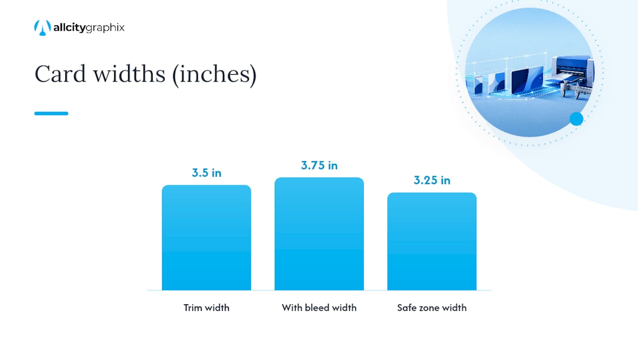
Trim is the finished card size after cutting, 3.5 × 2 inches for the US standard. Bleed is the extra 0.125 inch of artwork extending past the trim line on all four sides, so any background color or image that touches the edge doesn’t leave a thin white sliver if the cut shifts slightly. Safe zone sits on the opposite end: it’s a 0.125 inch buffer inside the trim line where all text, logos, and critical graphics need to live so nothing gets clipped by the guillotine cutter.
Converting those numbers to pixels at 300 DPI is simple multiplication: inches × 300 = pixels. That gives you:
- Trim size: 3.5 × 2 in → 1050 × 600 px
- With bleed: 3.75 × 2.25 in → 1125 × 675 px
- Safe zone boundary: 3.25 × 1.75 in inside the trim
For color, set your document to CMYK before you start designing, not after. Converting from RGB late in the process shifts hues, especially blues and greens, and forces rework you could have avoided. When you’re ready to export, Printability’s setup guide recommends a press-ready PDF with:
- Fonts embedded, not just linked
- Vector artwork for logos and line art
- Images placed at 300 DPI or higher at final size
- Crop marks enabled so the printer knows exactly where to cut
Pro Tip: Name your file with the trim size and color mode baked in, like “SmithCo_BizCard_3.5x2_CMYK_Bleed.pdf.” Print vendors handle dozens of files a day, and a clear filename cuts down on the back-and-forth emails asking what they’re looking at.
Which Business Card Size Should You Use for International Clients?
Sending a US-sized card to a client in Osaka is a small mistake, but it’s a noticeable one. Regional card sizes carry cultural weight that goes beyond simple measurement.
- Europe/UK (85 × 55 mm): Slightly more compact than the US card, standard across the EU and UK.
- Japan (91 × 55 mm): The meishi format is wider than the US standard and follows exchange rituals that treat the card almost like a small formal document.
- Australia/NZ (90 × 55 mm): Close to the US size but not identical, so a US card can feel slightly undersized in a local holder.
The meishi exchange in Japan involves precise handling, presenting the card face up, receiving it with both hands, and studying it briefly before putting it away. Showing up with an oddly sized card, even one that’s only a few millimeters off, can read as unfamiliarity with local business norms. If you regularly work across borders, keep separate print files per region rather than reusing one template and hoping it translates. A card sized for Chicago won’t sit right in a Tokyo cardholder, and a Tokyo-sized card will look slightly oversized in a US wallet slot.
What Are the Best Alternative Business Card Shapes and Sizes?
Standard isn’t the only option, and sometimes it’s not even the best one for a particular brand. Here’s how the common alternatives stack up:
- Square (2.5 × 2.5 in): Distinctive on a desk or in a stack, but it won’t fit most standard wallet card slots, which raises the odds it gets set aside rather than carried.
- Mini/slim (roughly 3.5 × 1.5 in): Fits most wallets fine and stands out for its narrower profile, popular with stylists and consultants who want a lighter, less bulky card.
- Vertical orientation (still 3.5 × 2 in): Same footprint as standard, just rotated, works in any standard holder and often reads as more modern without sacrificing fit.
- Die-cut shapes: Custom outlines (rounded corners, notches, contour cuts) require a separate die line file from your printer and nearly always cost more. Shopify’s guide to card dimensions notes that oversized or oddly shaped cards can also see higher discard rates simply because they don’t fit where people expect to store them.
The tradeoff is straightforward: unusual shapes get noticed, but they also get left behind more often if they don’t fit a wallet. Rounded corners and other die-cuts shift the visible trim line slightly, so always ask your printer for a physical proof before running a full batch.
What’s the Print-Ready Design Checklist Before You Send Files?
Skipping a step here is how text ends up sliced in half after cutting. Work through this order every time:
- Set document size to trim plus bleed. For a US card, that’s 3.75 × 2.25 inches (3.5 × 2 in trim + 0.125 in bleed on each side), at 300 DPI.
- Switch to CMYK color mode at the start of the project, not the end.
- Keep every critical element inside the safe zone, 0.125 inch inside the trim line on all sides. That means your logo, contact text, and any border design.
- Embed or outline all fonts so nothing reflows or substitutes on the printer’s end.
- Link images at full resolution, minimum 300 DPI at final print size, and use vector files for logos wherever possible.
- Export a press-ready PDF with crop marks and bleed included, not just a flattened trim-size file.
- Confirm stock, finish, and corner style with your printer before submitting, since these affect how the file needs to be set up.
- Request a digital or physical proof for any custom die-cut or specialty finish before the full run prints.
Pro Tip: Zoom into 400% on your logo and body text before export. If letters look soft or pixelated at that zoom level, they’ll print soft too, particularly on gloss stock where light reflects off imperfections.
Which Paper Stock and Finish Options Should You Choose?
Thickness and finish do more to signal quality than most people expect. A card printed on thin stock with a flat matte finish reads as budget no matter how good the logo is.
- 14–16pt: The standard weight for most small business runs, sturdy enough to hand over without feeling flimsy.
- 18–32pt: Premium thickness, noticeably stiffer, often chosen by law firms, real estate agents, and design studios that want the card itself to signal quality.
- Plastic or vinyl: Water resistant and nearly impossible to bend accidentally, popular for salons, gyms, and hospitality brands that want a card that survives a gym bag or a wet bar top.
- Uncoated: Takes pen ink well, good if clients write notes on the back, but shows fingerprints and wear faster.
- Matte: Low glare, easy to read under any lighting, slightly less vibrant on photo-heavy designs.
- Gloss: Punches up color saturation, especially on photography, but shows smudges and scratches more visibly.
- Soft-touch (laminated): A velvety texture that feels premium and resists fingerprints, though it adds cost and a few days to turnaround.
Heavier stock and specialty finishes both add cost and, in some cases, mailing weight if you’re sending cards by post rather than handing them out directly.
How Many Business Cards Fit on an 8.5 × 11 Sheet?
A standard letter sheet fits 10 business cards at 3.5 × 2 inches when arranged in a 2-column by 5-row grid with the sheet in portrait orientation, leaving room for margins and a gutter between cards.
| Layout | Cards per sheet | Orientation | Notes |
|---|---|---|---|
| 2 × 5 grid | 10 | Portrait sheet, landscape cards | Standard imposition, minimal waste |
| 2 × 4 grid | 8 | Portrait sheet, more margin | Wider margins for tighter trim tolerance |
To set this up correctly:
- Leave a 0.25 inch outer margin on all sides of the sheet to keep cards away from the printer’s unprintable edge.
- Add a 0.125 to 0.25 inch gutter between each card so the guillotine cutter has clean space to work without slicing into neighboring cards.
- Export the imposed layout as a single print-ready PDF with crop marks at each card boundary, then proof one full sheet before running the full batch.
What File Mistakes Do We See Most Often at All City Graphix?
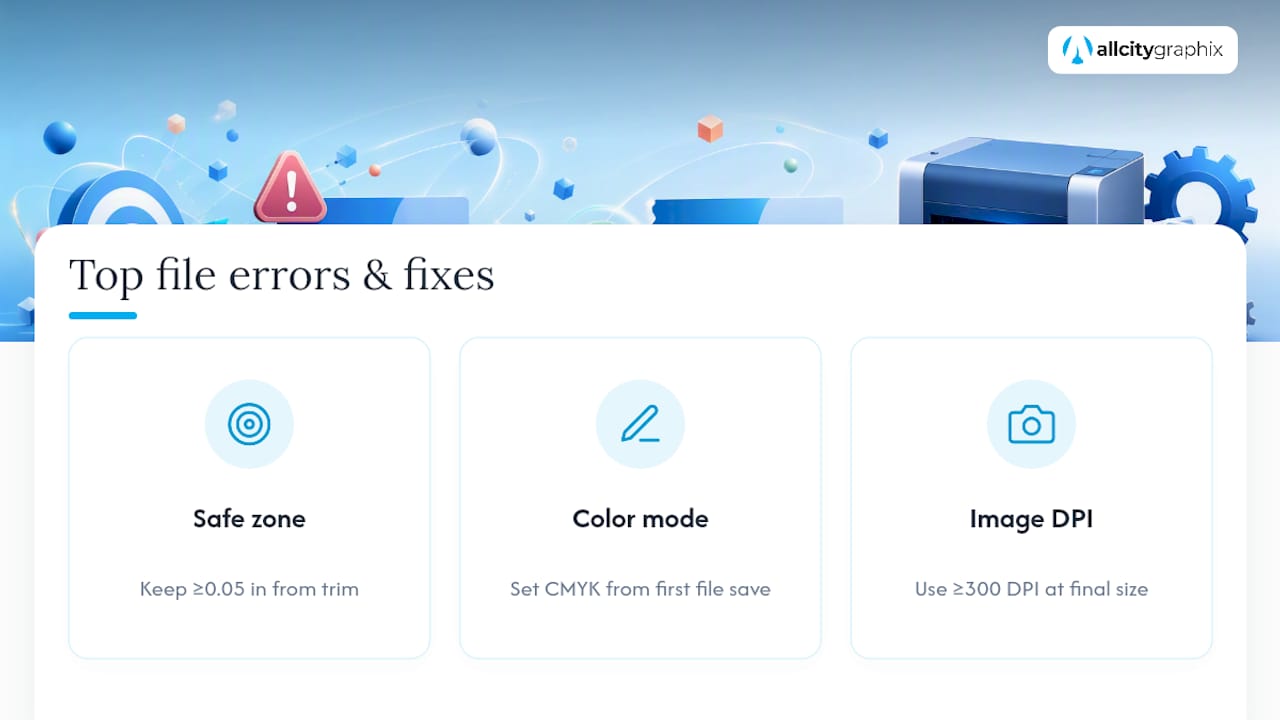
After years of building brand assets for small businesses across New York City and beyond, All City Graphix sees the same handful of file errors on repeat. Text sitting too close to the trim line tops the list. A phone number or tagline placed 0.05 inch from the edge looks fine on screen and then gets clipped the moment the cutter shifts by even a hair.
RGB color files are the second most common issue. A logo that looks vibrant blue on a laptop screen often prints muddier and slightly purple in CMYK, because the two color models don’t map perfectly onto each other. Catching this before submission, not after the proof arrives, saves a reprint.
Low-resolution images round out the list, usually a logo pulled from a website at 72 DPI and dropped straight into a print file. At business card size that might look acceptable on screen, but it prints visibly soft or pixelated. The fix in every case is the same: build with the safe zone respected, set CMYK from the first file save, and never place an image below 300 DPI at final size. All City Graphix’s Bronx design studio has caught and corrected each of these on client jobs before they ever reached a print run.
What Fonts and Typography Work Best at Business Card Size?
At 3.5 × 2 inches, there’s no room for a decorative font to carry your contact information. Stick to clean, highly legible typefaces, sans-serifs like Helvetica, Futura, or Montserrat for names and titles, and a simple serif like Georgia only if it fits the brand’s tone.
Keep name and company text between 8 and 10 point size, with body details like phone numbers and email addresses no smaller than 7 point. Anything smaller starts to blur when printed, especially on uncoated stock where ink spreads slightly into the paper fiber. Limit yourself to two typefaces total, one for the name or logo treatment and one for supporting details, since three or more fonts on a card this small reads as cluttered rather than polished.
Letter spacing matters more at small sizes than people expect. Tight kerning that looks fine on a business card at 400% zoom on screen can turn into a smudged block of text at real-world size, particularly with bold weights. Give text room to breathe, and avoid all-caps for anything longer than a job title, since long strings of capital letters slow down reading at a glance.
Hierarchy should guide the eye in under two seconds: name first, title or company second, contact details last. If a recipient has to hunt for a phone number, the card has already failed its one job.
How Do You Make a Business Card Accessible to Read?
Color contrast is the most overlooked accessibility issue on printed cards. Light gray text on a white background might look sleek in a mockup, but it’s nearly unreadable for anyone with low vision, and it photographs poorly under fluorescent office lighting too. Aim for a strong contrast ratio between text and background, dark text on light stock or light text on a solid dark background, rather than pairing two midtone colors that blend together.
Font size ties directly into accessibility as well. Body text under 7 point becomes genuinely difficult to read for anyone over 40, and print doesn’t offer a zoom function the way a screen does. If a card is meant to be handed to a wide range of people, including at conferences or events where lighting is inconsistent, err toward the larger end of the size ranges covered earlier rather than squeezing in extra detail.
Finish choice affects readability too. Glossy stock can create glare under bright lighting that washes out text, while matte or soft-touch finishes keep text legible from more angles. Avoid placing text over a busy photograph or textured background unless you add a solid color block behind it first. A card that looks accessible on your monitor needs to hold up under a dim restaurant light or a bright trade show booth, since that’s where it usually gets read.
DIY or Hire a Designer: How Do You Decide?
If the budget is tight, the brand is new, and the design is simple text on a solid color, doing it yourself in a template tool is a reasonable call. That changes once the card needs to carry a real brand system, a wordmark, a specific color palette, a layout that has to work across a full stationery suite, not just one card.
Complexity and timeline matter more than most people admit. A rushed DIY card with a slightly off bleed setting or a font substitution can cost more in reprints than hiring a designer would have upfront. There are instances where a founder’s first self-designed card came back from the printer with clipped text or muddy color, and the reprint cost more than a professional file setup would have. When the card is one piece of a larger brand rollout, a professional pass tends to pay for itself the first time it prevents a wasted print run, a point worth weighing before choosing the next step for your own project.
— Alex
Get Print-Ready Business Cards Without the Trial and Error
This approach offers an alternative to guessing your way through bleed settings and color mode conversions. Instead of troubleshooting a rejected file at the print shop, a designer may set up trim, bleed, safe zone, and CMYK correctly the first time, and coordinate directly with the print vendor so nothing gets lost in translation.

Business cards are rarely a standalone project. They’re usually one piece of a bigger identity system, logo, website, packaging, signage, that needs to look consistent everywhere it shows up. Consistency can be built in from the start rather than patching it together card by card.
Here’s what that looks like in practice:
- Print-ready PDFs built to exact trim, bleed, and safe-zone specs, no reprint surprises
- Direct coordination with your print vendor on stock, finish, and file format
- Brand-consistent design that carries your logo, colors, and typography across every touchpoint, not just the card
If you’re ready to skip the trial-and-error version of file setup, check out All City Graphix’s design services and get a project started with a team that builds business cards, logos, and full brand systems under one roof.
Where Can You Verify Business Card Dimensions and Print Specs?
A few sources are worth bookmarking if you regularly prepare print files:
- Picturesizes: Best for confirming exact trim, bleed, and pixel dimensions at 300 DPI across US, EU, and Japan formats.
- Printability’s paper size guide: Useful for document setup steps and press-ready PDF export advice, especially if you’re new to print file preparation.
- PaperSizeChart’s regional business card guide: The one to check before designing for an international client, since it covers cultural context alongside the raw measurements.
- Shopify’s guide to business card dimensions: Good for weighing standard versus nonstandard formats and understanding wallet compatibility tradeoffs.
Cross-check any figure against your specific print vendor’s template too, since some shops build in slightly different bleed requirements.
Sources
- Picturesizes
- Business Card Size | Printability
- Business card sizes (regional differences) | PaperSizeChart
- Best Business Card Dimensions and Design Considerations (Shopify)
FAQ
Is a Business Card 2 × 3 Inches?
Not quite. The US standard is 3.5 × 2 inches, not 2 × 3, though the two numbers get transposed often enough in casual conversation that the confusion is common.
How Many Business Cards Fit on an 8.5 × 11 Sheet?
Ten standard 3.5 × 2 inch cards fit on a letter sheet using a 2 column by 5 row grid, leaving margin space for trimming and a gutter between each card.
What Is the Size of a Business Card Holder?
Most standard card holders and wallet slots are built around the 3.5 × 2 inch US card size, which is also why that dimension has stayed the default for so long.
Are Business Cards A7 Size?
No. A7 paper is noticeably larger than any standard business card format, including the US, European, or Japanese sizes covered above.
What Pixel Size Should I Use for a Business Card at 300 DPI?
Use 1050 × 600 pixels for the trim size or 1125 × 675 pixels if you’re including the 0.125 inch bleed, both calculated at 300 DPI for a US standard card.