

A landing page should make one clear promise and make it effortless to act on. That means a benefit-led headline, a single visible call to action above the fold, and a form as short as the offer allows. Get that trio right and everything else, from color choices to load speed, exists to protect it.
TL;DR:
- A high-converting landing page should have a clear promise, a single call to action above the fold, and a short form limited to three to five fields.
- Relevance, a strong value proposition, proof near the point of hesitation, and a clear action are crucial for guiding visitors through the decision process.
- The layout must match the campaign goal, such as lead generation, product launch, or ecommerce, with visuals and proof strategically placed to address common objections.
- Mobile-first design is essential, involving compressing images, optimizing load speed, and designing for thumb reach to prevent frustration and abandonment.
- Testing should prioritize headline and CTA copy, with message match from ads or emails, and run long enough to gather meaningful data before making change decisions.
Table of Contents
- What Makes Great Landing Page Design? Learn From Real Examples
- What Are the Core Elements of a High-Converting Landing Page?
- Which Layout Fits Your Campaign Goal?
- How Do You Choose Images and Video That Actually Sell?
- Why Does Mobile-First Design Matter So Much for Landing Pages?
- What Should You Test First, and How Do You Read the Results?
- Which Tools and Templates Help You Build Faster?
- What’s the Fastest Way to Ship a Landing Page Today?
- What Landing Page Mistakes Do Agencies See Most Often?
- Build a Landing Page With All City Graphix
- Where to Learn More About Landing Page Optimization
- Sources
- FAQ
What Makes Great Landing Page Design? Learn From Real Examples
You do not need a design degree to spot good landing page design. You need to know where to look and what to steal (legally, structurally, not pixel for pixel).
For raw visual inspiration, screenshot-heavy galleries like Landingfolio show real, published pages across dozens of industries, which beats scrolling generic mockups because you see what actually shipped. For ready-to-edit templates, most visual builders and marketplaces bundle starter kits by industry. For components (accordions, sticky headers, testimonial carousels), Figma community files and component libraries save the most time once you know your layout.
Here’s the framework for breaking down any example you like:
- Hero: headline, subhead, and the first CTA a visitor sees
- CTA: the button copy, color, and how many times it repeats
- Proof: testimonials, logos, or stats near the point of hesitation
- Form: field count and what happens after submission
- Footer: trust links, contact info, secondary navigation (or the lack of it)
Adapt the structure, not the surface. Copying someone else’s colors and fonts onto your offer is how you end up with a page that looks nice and converts nobody.
What Are the Core Elements of a High-Converting Landing Page?
Every high-performing page follows roughly the same decision order: relevance, offer, proof, then action. Visitors decide whether they’re in the right place, what you’re offering, whether they believe you, and only then whether to click. Skip a step and the buyer’s decision order breaks down, usually at the proof stage.
- Headline and subhead first. The headline states the benefit; the subhead adds the one detail that makes it credible. Order matters: headline, subhead, CTA, visual, trust signal, in that sequence down the fold.
- Value proposition under 30 words. If you can’t say what you do and who it’s for in two sentences, the page is doing the reasoning your copy should be doing.
- Forms capped at 3 to 5 fields for lead generation. Every extra field costs you leads. Collect the rest later through progressive profiling, once the person has already said yes once.
- Social proof placed where doubt peaks, not just parked in a footer, using specific numbers or named clients rather than a vague pull quote.
Pro Tip: Write your headline last. Draft the CTA and the proof section first, then write a headline that makes both of them feel inevitable.
Removing site navigation entirely on a campaign page, so there’s nowhere to go but toward the CTA, is one of the simplest changes that reliably lifts conversion, according to Involve Digital’s design analysis.
Which Layout Fits Your Campaign Goal?
The right landing page layout depends on what you’re asking the visitor to do, not just what you’re selling.
- Lead generation: Short hero, a lean form, and an immediate trust signal (a client logo strip or a one-line stat) right next to the fold, so hesitation gets answered before it forms.
- Click-through to checkout: A product hero, three or four benefit statements, and one CTA that repeats at the top, middle, and bottom of the page saying the exact same thing each time.
- Ecommerce or product launch: A short demo loop or product-in-use image, real customer photos near the CTA, and reviews positioned right where price objections usually surface.
- Single-screen vs. long-form: Use a single screen when the offer is familiar and the ask is small (a newsletter signup). Go long-form when the price is high or the audience needs educating before they’ll act.
How Do You Choose Images and Video That Actually Sell?
Generic stock photography of people smiling at laptops tells a visitor nothing about your product. Contextual shots, your actual dashboard, your actual packaging, a ten-second product demo loop, do the explaining that a paragraph of copy can’t.
- Use modern compressed formats like WebP or AVIF instead of full-size JPEGs or PNGs.
- Lazy-load anything below the fold so it doesn’t compete with your hero for load priority.
- Add alt text to every image, both for accessibility and because it’s free SEO.
- Reserve video for a short demo or a real testimonial, and always caption it.
Pro Tip: If a video needs sound to make sense, most mobile visitors will scroll past it muted. Design the visual to carry the message on its own.
Why Does Mobile-First Design Matter So Much for Landing Pages?
Most landing page traffic in 2026 arrives on a phone, which means Shopify’s guidance to treat mobile as the primary experience, not the adapted one, is the right mental model. Design the single-column flow first, then scale up to desktop, not the reverse.
- Keep the CTA button within thumb reach, not buried above the natural scroll stop.
- Compress every image, trim third-party scripts, and serve assets through a CDN with caching enabled.
- Use
telandemailinput types so mobile keyboards adjust automatically. - Add tap targets large enough to hit accurately, and use a sticky CTA bar for anything longer than one screen.
A slow, cramped mobile experience undoes good copy faster than almost anything else on the page. All City Graphix’s responsive web design work exists largely to fix exactly this gap between desktop mockups and real phone behavior.
What Should You Test First, and How Do You Read the Results?
Test one variable at a time, run it long enough to reach a real sample size, and resist the urge to call a winner after two days of traffic.
- Pick a primary KPI before you start: conversion rate for most pages, ROAS for paid campaigns, and micro-conversions (scroll depth, video plays) as early signals when traffic is thin.
- Test high-leverage elements first. Headline and CTA copy tend to move the needle more than color tweaks, which is why conversion research consistently points to them as the highest-ROI starting point.
- Set a stopping rule in advance. Decide your minimum run time and sample size before launch, and kill a test early only if it’s clearly failing, not because you’re impatient for a result.
Message match between your ad or email and the landing page headline is worth testing on its own. Aligning that language exactly can lift conversion by 20 to 40 percent, which makes it one of the cheapest tests you’ll ever run.
Which Tools and Templates Help You Build Faster?
Match the tool to your skill level, not the other way around. Drag-and-drop visual builders work fine for a straightforward lead-gen page. Figma kits and component libraries make sense once you’re designing something more custom and handing it to a developer.
- Visual builders for speed when you’re working solo and the campaign is simple.
- Figma or component libraries when you need design fidelity before a build.
- Template marketplaces when you want a proven structure and just need to swap copy and images.
- For SEO-ready copy and metadata, a resource like AmmarAI’s guide to using AI for SEO is worth a read before you finalize page text.
Whatever you choose, hand developers a clean packet: final assets, exact copy, tracking pixels, and a performance budget so nobody adds a script that tanks your load time.
What’s the Fastest Way to Ship a Landing Page Today?
Work through this in order, and don’t skip a step just because it feels obvious:
- Confirm message match: does the headline echo the ad or email that sent the click?
- Build the hero: headline, subhead, single CTA, supporting visual.
- Cap the form at 3 to 5 fields, with labels above each one.
- Place one proof element (a stat, logo, or testimonial) near the fold.
- Check the mobile layout in isolation, not as an afterthought to desktop.
- Compress images and test load speed before launch.
- Install analytics and conversion tracking, then submit a test form to confirm it fires.
For CTA microcopy, skip generic “Submit” buttons. Try “Get My Quote,” “Start Free Trial,” or “See Pricing,” phrasing that names the actual next step rather than the mechanics of clicking. Before launch, double-check your tracking pixel loads, your confirmation page (or message) actually appears, and your SEO metadata is filled in, not left as placeholder text.
What Landing Page Mistakes Do Agencies See Most Often?
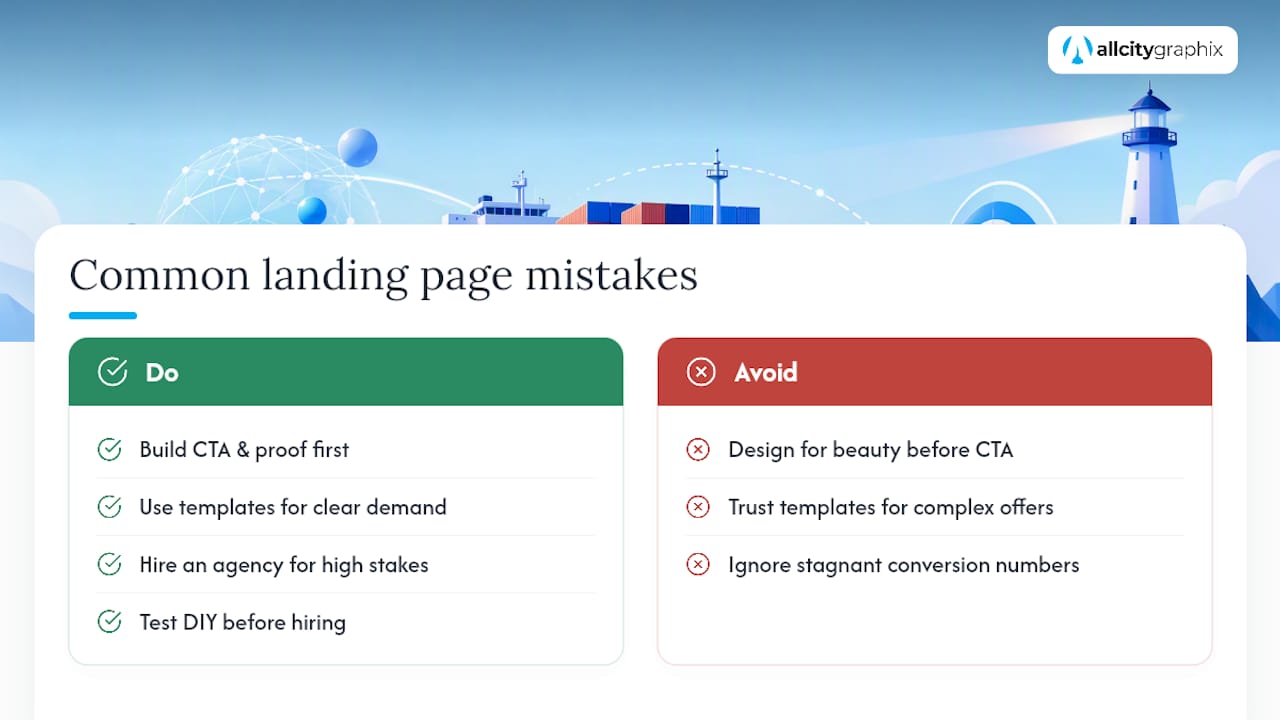
Most clients ask for a beautiful page first and a working one second. That’s backwards. The CTA and proof section should be built before touching color palettes, because a page can be visually plain and still convert, but never the reverse.
Templates work fine for straightforward offers with clear demand. Hire an agency when the stakes are higher, the audience needs real persuasion, or you’ve tested a DIY page and the numbers aren’t moving.
— Alex
Build a Landing Page With All City Graphix
Conversion-focused landing pages are designed and built the way this guide describes: message match first, one clear CTA, proof placed where doubt peaks, and mobile treated as the primary layout instead of an afterthought.
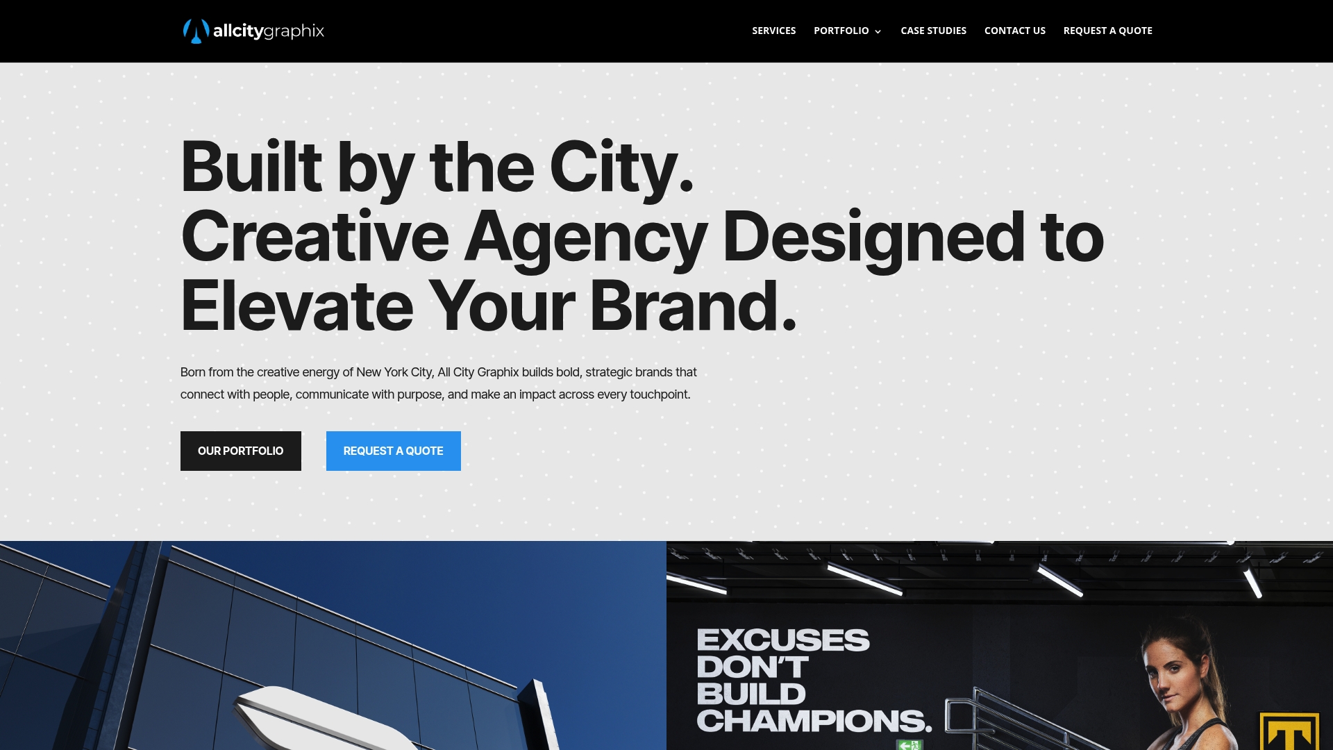
A typical engagement starts with a discovery conversation about your offer and audience, moves into design and copy, then into build, QA, and launch, with brand elements like your logo and a broader brand style guide folded in so the page actually looks like you, not a template with your name pasted on it. If speed is the bottleneck on your current site, website speed optimization is often the fastest fix available before a full rebuild. Browse the web design portfolio for examples of past work, or head to the services page to start a project conversation.
Where to Learn More About Landing Page Optimization
- Semrush: testing workflows and optimization fundamentals.
- Shopify: mobile-first design and speed guidance.
- Swipe Pages: the buyer decision order and testing priorities.
- MadeGoodDesigns: form length and social proof specifics.
Sources
- What Is Landing Page Optimization? And How to Do It | Semrush
- Landing page optimization tips | Shopify
- The 10 Elements of high converting landing pages | Swipe Pages Blog
- Landing Page Design: A Complete Guide for 2026 | MadeGoodDesigns
FAQ
What Is the Most Important Element of Landing Page Design?
The headline and the primary call to action matter most, since they determine whether a visitor understands the offer and knows exactly what to do next.
How Many Form Fields Should a Landing Page Have?
Cap lead-generation forms at a small number of fields, and use progressive profiling to collect additional information after the first conversion.
Does Landing Page Length Matter?
Length should match the offer: shorter pages suit familiar, low-commitment asks, while longer pages fit higher-priced or unfamiliar offers that need more explanation before someone acts.
How Do I Know If My Landing Page Is Working?
Track conversion rate as your primary metric, watch bounce rate and micro-conversions as early warning signs, and test one variable, like headline or CTA copy, at a time.
Should I Build My Own Page or Hire a Designer?
Templates and visual builders work well for simple, well-defined offers, but hiring a design firm is worth considering when the audience needs real persuasion or a DIY page has already been tested and isn’t converting.