

Conversion focused web design means every page is built to guide a visitor toward one clear action, using visual hierarchy, trust signals, and reduced friction instead of decoration for its own sake. The single highest impact move you can make today is stripping your homepage down to one dominant call to action and removing every link that competes with it. Everything else in this guide, from form fields to page speed, either supports that one action or gets in its way.
TL;DR:
- Focusing on a single primary call to action and removing competing links can significantly boost conversions, especially with quick, targeted changes.
- Fixing CTA contrast and rewriting the hero section to clearly state an outcome are the top priority quick wins to implement immediately.
- Reducing form fields and adding mobile-specific optimizations, such as sticky CTA bars and click-to-call, improve mobile conversion rates and should be prioritized.
- Placing trust signals near the CTA and using outcome-focused copy enhance credibility without slowing down the decision process.
- Systematic A/B testing, heatmap analysis, and a structured agency process help validate and refine conversions-driven designs over time.
Table of Contents
- What Conversion Focused Web Design Actually Means
- Quick Wins You Can Ship This Sprint
- Mobile Design Choices That Move the Needle
- Forms and CTAs: The Words and Placement That Reduce Friction
- Trust Signals: What Belongs Near Your CTA
- How to Test, Measure, and Actually Improve What You Build
- Implementing Conversion Focused Design: What an Agency-Backed Process Looks Like
- The Trade-Off Nobody Talks About
- Get a Conversion Audit From All City Graphix
- Sources
- FAQ
What Conversion Focused Web Design Actually Means
The industry term for this discipline is conversion-centered design (CCD), a framework that arranges page elements specifically to guide a visitor toward a single desired action through visual hierarchy, minimized friction, and focused calls to action, as Shopify explains it. You’ll also see it called conversion centered design, design for conversions, or website conversion design. They all point at the same idea: a page is not a brochure, it’s a machine for producing a specific outcome, and every pixel either moves that outcome forward or drags on it.
That distinction matters more than most business owners realize when they hire a designer. A designer trained on portfolio aesthetics will optimize for “does this look impressive.” A designer trained on conversion principles optimizes for “does this get the visitor to click the one thing that matters.” Those two goals overlap sometimes and conflict often. Conversion Design treats every visual decision as a conversion lever, not an aesthetic preference, which is a genuinely different way to brief a project than “make it look modern.”
The core principles you need to apply everywhere
Webflow’s research identifies seven practical principles behind CCD: create focus, build structure, stay consistent, show benefits, draw attention, design for trust, and reduce friction, as Webflow’s guide to conversion-centered design lays out. These aren’t abstract values. They translate into specific layout decisions.
Start with visual hierarchy. A converting page reads in a predictable order: headline states the promise, a short block of copy explains the value, then a CTA button captures the decision. Eye-tracking research on F-pattern and Z-pattern scanning shows people process pages in fairly consistent paths, and Webflow’s breakdown of these layout patterns is worth studying if you’ve never designed around them. If your headline is buried under a slider, or your CTA sits below three paragraphs of company history, you’re fighting the way people actually read.
One page, one primary goal. This is the rule most business sites break constantly. A homepage that tries to sell a product, promote a blog post, capture a newsletter signup, and push a job posting all in the same hero section accomplishes none of them well. Aim for something close to a 1:1 attention ratio, meaning one primary action per page, with secondary actions visually demoted (smaller, less contrasted, lower on the page).
Contrast and white space aren’t decoration, they’re direction. A CTA button that’s the same blue as your navigation bar doesn’t stand out. Space around a form isn’t wasted, it’s what makes the form feel approachable instead of cluttered. This is one of the places where “looks clean” and “converts well” genuinely align.
Trust and speed function as immediate constraints, not later-stage polish items. A visitor decides in seconds whether a page feels credible and whether it’s worth waiting for. Get either wrong and the visual hierarchy work above becomes irrelevant because nobody sticks around to scan it.
A few structural habits tend to separate high-converting pages from the rest:
- The primary CTA appears above the fold, in a color that contrasts with everything around it.
- Headlines state a specific outcome (“Cut onboarding time by half”) rather than a vague identity claim (“Innovative Solutions for Modern Business”).
- Secondary navigation items shrink or disappear on high-intent landing pages.
- Body copy is scannable in under 15 seconds, using short paragraphs and bolded key phrases.
- Every added visual element has to justify its place by supporting the primary action, not just filling space.
None of this requires a total rebrand. It requires deciding, page by page, what you actually want the visitor to do next, and then ruthlessly demoting everything that isn’t that.
Quick Wins You Can Ship This Sprint
You don’t need a redesign to see movement. A handful of tactical fixes, done in priority order, tend to produce the fastest measurable lift. Small, prioritized sprints focused on above-the-fold changes and a single CTA are often the quickest path to a measurable uplift, according to VWO’s guide to conversion focused web design, and that matches what most agencies see in practice.
- Rewrite the hero section. Swap vague taglines for a specific outcome statement, and make sure the primary CTA is the most visually dominant element on the screen. Remove or shrink any competing links (extra nav items, secondary buttons) that pull attention away from it.
- Fix CTA contrast. If your button color blends into your palette, change it. The goal isn’t to match your brand guide perfectly, it’s to make the button impossible to miss.
- Cut form fields to the minimum. Every field you remove reduces drop-off. If you need more data later, collect it after the first conversion, not before it.
- Add mobile shortcuts. Auto-formatting phone number fields, enabling autofill, and using the correct input type (email keyboard for email fields) removes friction that’s invisible on desktop but painful on a phone.
- Move trust elements closer to the CTA. A testimonial, review count, or guarantee badge placed right next to the button reduces hesitation at the exact moment it matters.
- Compress images and defer non-critical scripts. Large hero images and unoptimized third-party scripts are usually the biggest speed offenders on small business sites.
- Inline critical CSS and lazy-load below-the-fold content. This keeps the first paint fast without touching your overall design.
Pro Tip: Do the hero rewrite and CTA contrast fix first, before touching anything else. They take an afternoon, they’re visible to every visitor, and they tend to surface the clearest before-and-after numbers when you check your analytics a week later.
Performance deserves its own line item on this list because it’s not a “nice to have.” Treating page speed as a design constraint, not an afterthought, measurably improves conversion outcomes, according to Cloudflare’s research on website performance. A beautifully designed page that takes six seconds to load has already lost a meaningful share of visitors before they see any of it.
Mobile Design Choices That Move the Needle
Most of your traffic is probably arriving on a phone, and the design choices that work on a 24-inch monitor often actively hurt conversions on a 6-inch screen. Thumb-zone placement is the first thing to get right: the natural reach zone for a thumb holding a phone is the bottom third of the screen, which is exactly where a sticky CTA bar tends to outperform a button buried at the top of a long page.
A few mobile-specific patterns consistently outperform their desktop equivalents:
- Full-width buttons instead of small, centered ones that are easy to miss with a thumb.
- Single-column layouts that remove the need to zoom or scroll sideways.
- Type sizes large enough to read without pinching (16px minimum for body copy is a reasonable floor).
- Sticky bottom CTA bars on long-scroll pages, so the action is always one tap away.
- Click-to-call buttons for service businesses, since dialing a number is often faster than filling a form on mobile.
Performance work carries even more weight on mobile than on desktop, because cellular connections and older devices amplify every inefficiency. Compressing images, inlining critical CSS so the above-the-fold content renders immediately, and optimizing web fonts (or using system fonts where brand guidelines allow) all shave real time off load speed. Responsive web design as a discipline exists precisely to solve this, adapting layout and asset delivery to the device instead of just shrinking a desktop design and hoping for the best.
Test mobile separately from desktop. It’s tempting to look at one blended conversion rate and call it done, but mobile and desktop visitors often behave differently enough that averaging them hides real problems. Segment your analytics by device before you draw conclusions about what’s working.
Forms and CTAs: The Words and Placement That Reduce Friction
CTA copy carries more weight than most business owners give it credit for. “Submit” and “Learn More” are dead weight, generic enough to mean nothing. Outcome-focused, first-person microcopy, like “Get My Free Quote” or “Start My Trial,” consistently outperforms generic labels because it restates the benefit at the exact moment of decision.
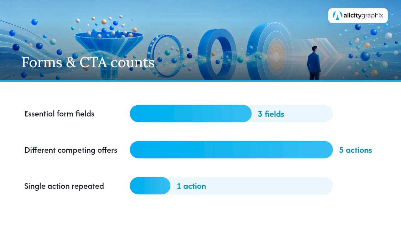
Your primary CTA needs to be visually dominant, not just present. That means unique color, adequate padding, and repetition at logical points down the page, so a visitor who scrolls past the hero without converting gets another clear chance further down. It doesn’t mean repeating five different competing offers. One action, repeated, beats five actions, each shown once.
Form field reduction is one of the highest-leverage changes available, and it’s nearly free to implement. Practitioner tests consistently show that moving trust markers closer to CTAs and cutting form fields materially improves conversions. Every field beyond name, email, and the one piece of information you truly need adds friction. If you need more detail for qualification or personalization, collect it after the initial conversion through progressive profiling, a second short form or a follow-up email, rather than front-loading it.
Structuring intake forms well matters just as much in service businesses as it does in e-commerce. Ringport’s guide to new patient intake forms walks through workflow design that applies well beyond healthcare: shorter forms, clear field labeling, and logical sequencing all reduce abandonment regardless of industry.
Some practical form and CTA rules worth applying without exception:
- Ask only for what you’ll actually use in the next step of the process.
- Label buttons with the specific outcome, not a generic verb.
- Offer alternatives to a form on mobile, like click-to-call or a calendar booking link, since typing on a phone is friction some visitors will simply abandon rather than push through.
- Consider messaging-based conversion paths for younger or mobile-heavy audiences. Mastros’s playbook on lead generation through WhatsApp shows how shifting the conversion point to a messaging app can outperform a traditional form for the right audience.
- Never make a field required unless the process genuinely breaks without it.
Trust Signals: What Belongs Near Your CTA
Trust is the thing that closes the gap between “I’m interested” and “I’ll actually do this.” The types worth using include testimonials, star ratings, client logos, money-back guarantees, and security badges at checkout, but which one matters depends entirely on what you’re selling.
Placement matters as much as the trust element itself. A five-star rating buried in your footer does nothing for the visitor deciding whether to click your CTA right now. Trust markers work best within roughly 200 pixels of the action you want taken, and ideally above the fold when the page is short enough to allow it. That proximity is what actually lowers hesitation at the decision point, not the mere presence of a testimonial somewhere on the page.
Match the proof to the purchase type. An e-commerce product page benefits from review counts and star ratings, because shoppers are comparison-driven and want social validation from people like them. A B2B service page benefits more from recognizable client logos and case study outcomes, because the buyer is evaluating credibility and track record, not popularity.
Photography choices matter here too. Real faces and outcome-focused imagery outperform generic stock photos because visitors can tell the difference, even if they can’t articulate why. A photo of an actual client or an actual result reads as evidence. A stock photo of strangers shaking hands reads as filler.
A short list of what to prioritize, roughly in order of impact:
- Specific, attributed testimonials over vague, unattributed praise.
- Recognizable client or partner logos for B2B offers.
- Security and payment badges directly beside checkout buttons, not on a separate page.
- Guarantee language stated plainly near the CTA, not buried in terms and conditions.
- Review counts and star ratings visible before the visitor has to click through to see them.
How to Test, Measure, and Actually Improve What You Build
None of the principles above matter if you never check whether they worked. Conversion focused web design combines design judgment with data analysis and testing, using behavioral psychology and A/B testing together rather than shipping changes based on opinion alone.
Pick one primary metric per test, whether that’s form completions, add-to-cart clicks, or scheduled calls, and segment results by device and traffic source before you draw conclusions. A change that lifts desktop conversions by 12% might do nothing for mobile, and averaging the two together will hide that entirely.
A/B testing works best when you change one variable at a time: a headline, a CTA color, a form length. Testing everything at once tells you the combination worked, not which piece did the work. A/B testing guidance from VWO makes the same point: tests reveal what actually works for your specific audience and traffic mix, which is often different from what worked for someone else’s case study.
Before you guess at what to test, look. Heatmaps and session recordings show you where visitors actually hover, scroll, and abandon, which surfaces friction you’d never spot by staring at your own design. If a heatmap shows nobody scrolling past your hero section, no amount of CTA copy tweaking further down the page will help.
Pro Tip: Set a stop-loss and a minimum test duration before you launch, not after. Decide in advance how long the test runs and what result counts as a clear winner, so you’re not tempted to call it early the moment the numbers look good.
A few habits keep testing honest:
- Run tests long enough to cover a full weekly cycle, since traffic behavior often shifts between weekdays and weekends.
- Don’t declare a winner from a small sample size just because the trend looks promising.
- Roll out winning variants gradually and keep watching, since novelty effects sometimes fade.
- Document what you tested and why, so six months from now you’re not re-running the same experiment.
Implementing Conversion Focused Design: What an Agency-Backed Process Looks Like
A structured engagement typically moves through six phases: discovery, wireframes, visual execution, build, test, and iterate. Discovery identifies the target user outcome and the one priority CTA the whole page should serve. Wireframing locks in hero and CTA placement before anyone touches color or typography, which keeps the layout decisions grounded in hierarchy rather than aesthetics. Visual execution then applies branding on top of that structure, followed by development, analytics instrumentation with heatmaps, and controlled A/B testing to validate what actually moves the needle before rolling winners out site-wide.
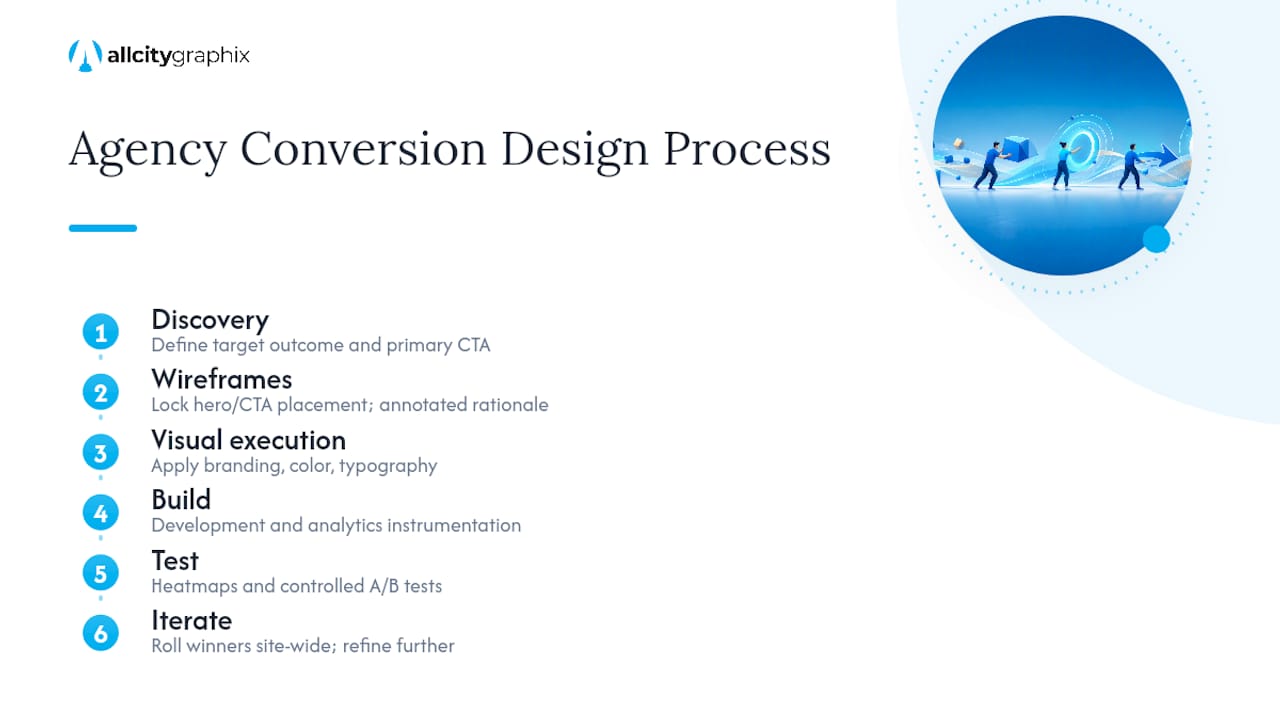
If you’re evaluating an agency for this work, ask for specific deliverables at each phase: annotated wireframes that explain the reasoning behind CTA placement, not just visual mockups; a documented testing plan, not a vague promise to “monitor performance”; and a clear breakdown of which changes are quick wins versus deeper structural work that needs a longer runway.
Deeper architecture work, like a full information redesign or a new content strategy, makes sense when your quick wins have plateaued or when your site structure itself is working against you. All City Graphix’s guide on when a redesign is actually warranted breaks down that decision point in more detail. For most small businesses, though, the sprintable checklist earlier in this guide gets you real movement before you need to consider a rebuild at all.
The Trade-Off Nobody Talks About
Brand polish and conversion clarity pull in different directions more often than people admit. A gorgeous, moody hero image can hurt conversions if it pushes the CTA below the fold or slows the page down. That doesn’t mean design quality doesn’t matter, it means the two goals need to be balanced deliberately, not assumed to align by default.
Small wins compound faster than most owners expect. A 5% lift on a form completion rate feels unimpressive in isolation, but stacked across a dozen sprint cycles it adds up to a fundamentally different business. Measure everything you can, even the changes that feel obviously good, because obvious is wrong more often than anyone likes to admit.
As for hiring versus DIY: test the cheap, fast changes yourself first, the hero rewrite, the CTA contrast, the form field cuts. Bring in outside help when you’re staring at a heatmap that shows a real problem and you don’t have the internal bandwidth or expertise to fix the underlying structure.
— Alex
Get a Conversion Audit From All City Graphix
All City Graphix approaches web design the way this guide does: every layout decision has to earn its place by moving visitors toward one clear action, not just looking good in a portfolio. If your site already gets traffic but the numbers stall out at the conversion step, that’s a design and structure problem, not a marketing spend problem.
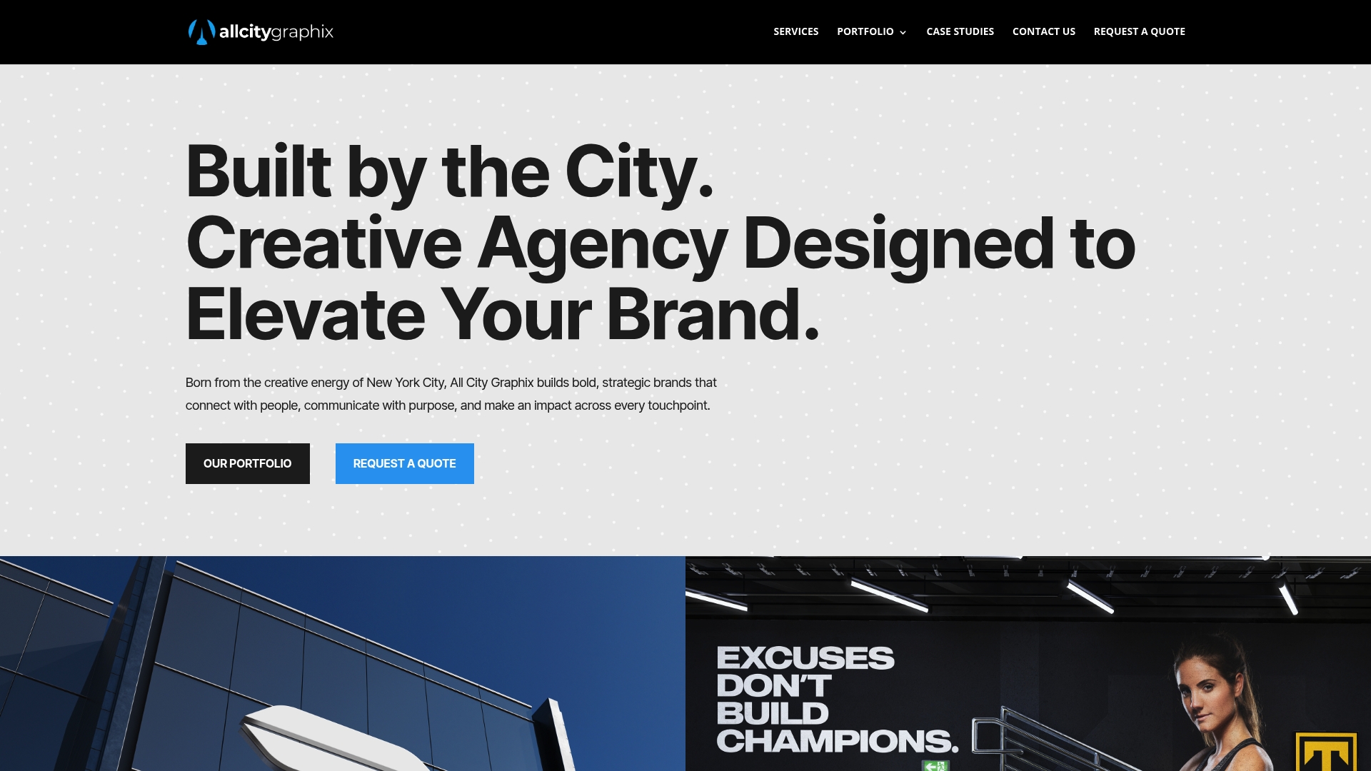
The agency’s web design services cover the full path outlined above: discovery to identify your priority action, wireframes built around hierarchy instead of decoration, and development on WordPress or Shopify depending on what your business needs. A smart starting point if you’re not ready for a full rebuild is a scoped engagement, a conversion audit paired with a single sprint of the highest-impact fixes, which lets you see measurable movement before committing to anything larger. Check out the full services overview or reach out through All City Graphix to talk through what a first sprint would look like for your site.
Sources
- Conversion-Centered Design Explained and How To Apply It (2026) – Shopify
- Conversion-centered design: 7 essential principles plus tips for boosting web conversions | Webflow Blog
- The Complete Guide to Conversion Design: Why Pretty Pages Don’t Convert (And What Does) | Jackson Yew
- Website performance and conversion rates – Cloudflare Learning
FAQ
What is a conversion-focused website?
A conversion-focused website is designed so every element on a page guides visitors toward one specific action, using visual hierarchy, minimal friction, and clear trust signals rather than general-purpose layout choices.
What is conversion-focused design?
Conversion-focused design, also called conversion-centered design, is a framework that arranges page structure, contrast, and copy to direct attention toward a single desired outcome, based on principles like creating focus and reducing friction.
What is conversion in web design?
Conversion in web design refers to the moment a visitor completes the specific action a page was built for, whether that’s submitting a form, making a purchase, or booking a call, and it’s the metric every design decision should be measured against.
How is conversion focused web design different from regular web design?
Regular web design often optimizes for visual appeal or brand consistency first. Conversion focused web design starts with the desired visitor action and works backward, treating aesthetics as something that has to support that action rather than compete with it.
How long does it take to see results from conversion design changes?
Quick wins like hero rewrites and CTA contrast fixes can show measurable movement within a week or two of traffic, while structural changes tested through A/B experiments typically need a full weekly traffic cycle or longer to produce a reliable read.