

Social proof is the pull toward a choice other people have already made and vouched for. The single highest-impact move is placing a specific, verified testimonial or rating right beside the decision point, whether that is a checkout button or a $49 pricing tier. Reviews near a CTA change behavior more reliably than proof buried on an “About” page, and some agencies build this into layouts from the first wireframe.
TL;DR:
- Placing verified reviews, testimonials, or social proof directly beside the checkout or pricing information significantly boosts conversion rates.
- Visual proof such as user-generated photos and videos from social media outperform staged images and neglecting this source leaves a major gap for e-commerce sites.
- Review quantity matters less than quality and specificity; detailed, photo-backed reviews addressing real objections outperform large volumes of generic ratings.
- The optimal placement for social proof is above the fold, next to the CTA, or inside the FAQ, rather than on separate pages or buried deep within the site.
- Automated collection of verified reviews, transparent disclosure of incentivized content, and legal compliance with FTC rules are essential for trustworthy and effective social proof.
Table of Contents
- What Counts as Social Proof on Websites (Types and Examples)
- Where to Place Social Proof for Maximum Conversion Impact
- Collecting and Verifying Reviews Without Breaking FTC Rules
- Measuring Whether Social Proof Actually Moves the Needle
- Social Media Images and Video as Visual Proof
- A Practitioner’s Checklist for Implementing Social Proof
- Common Mistakes That Undercut Social Proof
- Case Studies: What Measurable Social Proof Impact Looks Like
- What the Data Actually Says About Social Proof
- Let All City Graphix Build the Trust Signals Into Your Site
- Sources
- FAQ
What Counts as Social Proof on Websites (Types and Examples)
Not all proof carries equal weight, and using the wrong type in the wrong spot wastes a good testimonial. Here’s the practical breakdown, organized by what each type actually does to a skeptical visitor.
Reviews and star ratings work as a fast credibility scan. A rating bar showing “4.7 out of 5 from 1,240 reviews” answers the question “will this disappoint me?” before a shopper reads a word of copy. Put the aggregate score near the product title and the individual reviews lower on the page, sorted by relevance rather than date alone.
Testimonials go deeper than a star rating because they address a specific objection. A testimonial that says “I was worried this wouldn’t fit my small kitchen, but it’s compact enough” beats a generic “Great product, love it!” every time. Baymard’s testing found that testimonials paired with a real photo are recalled significantly more than logos or bare numbers, because a face gives the brain something to anchor the memory to.
Case studies are the heavy artillery for B2B and higher-ticket purchases. A one-page case study showing a client’s before-and-after, with a specific outcome like “reduced page load time by half” or “grew organic traffic within six months,” does more to close a $5,000 contract than fifty five-star reviews ever could. This is where portfolio work earns its place, showing prospective clients tangible before-and-after branding transformations rather than vague promises.
Client logos signal “companies like yours already trust this,” and they’re most persuasive on B2B landing pages and enterprise pricing tiers. A logo wall alone rarely closes a sale, but it lowers the guard enough for a visitor to keep reading.
User-generated photos and video outperform staged product shots because shoppers trust what other customers actually experienced. Baymard’s research found that 67% of product pages skip social media images from past buyers entirely, even though those images measurably boost buyer confidence. That’s a wide-open gap most competitors haven’t closed.
Real-time activity counters, like “14 people are viewing this right now” or “Sold 6 times in the last hour,” borrow urgency from crowd behavior. Use these sparingly on high-traffic e-commerce pages; they read as gimmicky on a $2,000 consulting service.
Expert and press endorsements work best as a trust shortcut on a homepage hero, especially for newer brands that lack years of customer history. A “Featured in” strip with recognizable outlet names does a lot of quiet work.
Influencer and follower counts matter most for direct-to-consumer brands selling through social channels. A social boost digital analysis found that proof sourced from Instagram and TikTok lifts DTC conversion the most, while LinkedIn-sourced proof does more for B2B lead conversion, and YouTube testimonials move information products.
Quality beats volume across every category here. A Baymard summary on rating distributions found that a handful of detailed, photo-backed reviews often outperform thousands of thin, generic five-star ratings for actually converting a skeptical visitor.
Where each type fits best:
- DTC e-commerce: UGC photos, activity counters, star ratings near the buy button
- B2B services: case studies, client logos, LinkedIn-sourced testimonials
- Pricing pages: reviews with specific outcomes tied to the plan being viewed
- Checkout: verified badges and a repeated aggregate rating, not new content
Statistic Callout: Two thirds of product pages, 67% by Baymard’s count, still don’t show a single social media image from an actual buyer. Fixing that gap alone puts a site ahead of most direct competitors.
Where to Place Social Proof for Maximum Conversion Impact
Placement decides whether great proof gets seen at all. Nielsen Norman Group’s UX research consistently finds that social proof works best when it sits physically near the point of action, not stacked in a separate testimonials page nobody visits.
Four placement rules cover most situations:
- Hero section: A single strong proof element (a rating, a recognizable client logo, or a one-line testimonial) belongs above the fold, especially for new visitors arriving from an ad or search result.
- Beside the price: Whatever a visitor is about to pay for needs proof adjacent to the number itself, not three scrolls below it.
- Next to the CTA button: A short testimonial excerpt or a “Trusted by 12,000 customers” line beside “Add to Cart” or “Book a Call” catches the eye at the exact moment of hesitation.
- Inside the FAQ: Big claims (guarantees, turnaround times, results) deserve a supporting review or data point right where the skeptic is already reading closely.
Format matters as much as placement. A testimonial with a real name, a photo, and a specific role (“Maria T., Small Business Owner”) reads as far more credible than an anonymous quote. Verified purchase badges, when genuinely earned, tell a visitor the review came from someone who actually bought the thing, and research on verified review accountability shows this verification step makes ratings meaningfully more predictive under uncertainty. A rating summary bar (stars plus review count) works better as a persistent element near the top of a product page than as a one-time mention buried in a description.
Small UX patterns add up fast. An inline testimonial card placed directly beside a CTA button, rather than above or below it, keeps the visitor’s eye moving in one direction instead of forcing a scroll-back. A micro strip of UGC thumbnails next to the main product image gallery invites a click without competing with the primary photos. Repeating the aggregate star rating once more near the final checkout button reassures a buyer right before the card details go in, which is often the exact moment doubt creeps in.
Pro Tip: Test your CTA button with a testimonial directly underneath it before testing anything else. Placement changes tend to move conversion faster than collecting more reviews does, because you’re working with proof you already have.
Collecting and Verifying Reviews Without Breaking FTC Rules
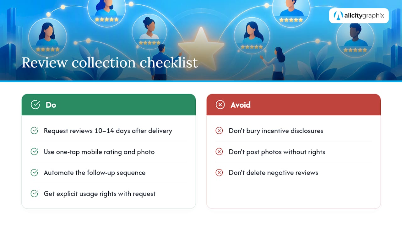
A steady review pipeline starts with timing. Sending a review request 10 to 14 days after delivery, when the product has been used but the experience is still fresh, tends to produce higher response rates and more photo submissions than a request sent the day of purchase. A one-tap mobile rating with an optional photo upload lowers the friction enough that more customers bother finishing the request at all.
Automating that follow-up sequence matters more than most marketers admit. A service follow-up email guide lays out timing and template structures that translate directly to review requests: ask once, ask specifically, and make leaving feedback take under thirty seconds.
Verified purchase badges aren’t just a trust signal for visitors, they change the math on the reviews themselves. Research on verified reviews found that verification increases reviewer accountability and produces ratings that are more predictive of actual product performance, because a badge ties the review to a confirmed transaction instead of an anonymous claim.
Legal exposure is real here, and it’s worth taking seriously. The FTC’s Consumer Reviews and Testimonials Rule, effective October 21, 2024, prohibits fake or deceptive reviews outright and requires clear, conspicuous disclosure any time a review was incentivized, whether through a discount, free product, or payment. A small “This reviewer received a free sample” line, placed where it’s actually visible rather than buried in fine print, keeps a business on the right side of that rule.
UGC brings its own permissions question. Before featuring a customer’s photo or video, get explicit rights to use it, ideally through the same request flow that solicits the review. A simple moderation workflow, someone checking submissions before they go live, catches both spam and anything legally risky before it reaches the page.
Statistic Callout: The FTC’s rule, in effect since October 21, 2024, applies to every business publishing customer endorsements online, not just large retailers, which makes disclosure a baseline requirement rather than an optional best practice.
Negative reviews need a plan too. Respond publicly, briefly, and without defensiveness; a thoughtful reply to a one-star review often does more for trust than hiding it ever would, because it shows a real business behind the storefront.
Measuring Whether Social Proof Actually Moves the Needle
Guessing at impact wastes the proof you’ve already built. Track these metrics before and after any social-proof change:
- Product-page-to-cart rate: the cleanest signal that proof near the buy button is working.
- Overall conversion rate: the lagging but ultimate measure, tracked over a full purchase cycle.
- Micro-engagement with UGC: clicks on photo carousels or expanded review sections, which show whether visitors are actually reading the proof you added.
- Time-on-page near decision points: a short bump here often precedes a conversion lift.
Three tests are worth running before anything else. First, a placement test: identical proof content, moved from the bottom of the page to beside the CTA. Second, a verified-badge test: the same review shown with and without a verification mark, to isolate how much the badge itself contributes. Third, a content-type test: UGC photos against staged product photography in the same carousel slot.
Trust thresholds vary by category, and that matters for how long a test needs to run. A low-cost DTC product might need only a couple thousand sessions per variant to reach significance, while a high-ticket B2B service with a longer sales cycle may need several weeks just to gather enough completed conversions to trust the result.
Pro Tip: Don’t judge a social-proof test on conversion rate alone if your sample size is thin. Watch product-page-to-cart rate first, it moves faster and gives an early read before the full conversion number stabilizes.
Social Media Images and Video as Visual Proof
A staged product photo tells a visitor what the item looks like in ideal light. A customer’s own Instagram photo tells them what it looks like in an actual living room, and that difference is exactly why real images convert better than polished ones.
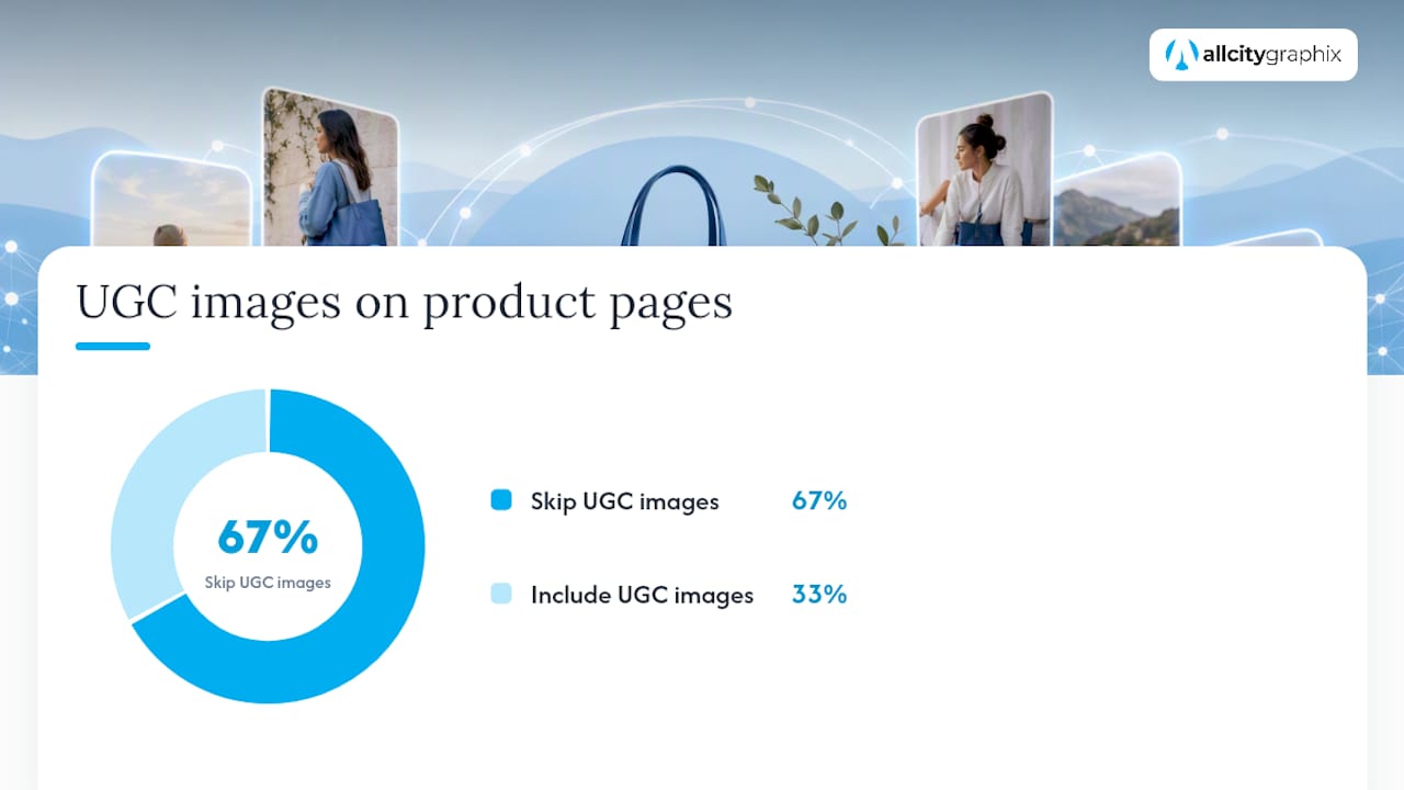
Baymard’s research found that 67% of product pages still skip social media images from past buyers entirely, even though those images measurably increase confidence in the purchase. That gap is one of the easiest wins available to a small business willing to ask customers for permission to repost their photos.
Practical steps for surfacing this content:
- Build a simple image carousel or strip near the main product gallery, pulling from tagged social posts or review-upload submissions.
- Keep the product itself visible and central in every featured image; a great lifestyle shot that hides the product doesn’t do its job.
- Label anything incentivized or provided by an influencer partnership clearly, in line with FTC disclosure expectations.
- Check usage rights before publishing, a quick direct message asking permission is usually all it takes.
- Make image-heavy reviews shoppable where possible, linking a UGC photo directly to the product page or variant shown.
Practitioner benchmarks from Metricuno show that review-with-photo rates and the resulting conversion lift vary meaningfully by product category, but the pattern holds broadly: verified reviews paired with real photos consistently outperform text-only reviews on product detail pages.
A Practitioner’s Checklist for Implementing Social Proof
Most social-proof work fails not from lack of good reviews, but from treating the whole thing as a decoration instead of a system. All City Graphix approaches it as a five-step process, and it holds up regardless of company size:
- Pick proof that answers the actual objection. A shipping-time review solves a different doubt than a durability review; know which one your page needs.
- Place it at the decision point, not on a separate page nobody clicks into.
- Collect on a schedule, using automated post-purchase prompts rather than hoping customers volunteer feedback.
- Verify and label every piece of proof honestly, badges, disclosures, and all.
- Measure the change, using a real before-and-after comparison instead of a gut feeling.
Placement is often the low-hanging fruit. Moving proof you already have to sit directly beside the decision frequently produces faster, measurable lift than spending weeks collecting more reviews you don’t yet need.
That five-step discovery-to-measurement process is close to how All City Graphix’s services approach client web design projects, treating trust signals as a UX decision made early, not an afterthought bolted on before launch.
Common Mistakes That Undercut Social Proof
The most common failure is quantity without specificity. A wall of forty identical “Great service!” reviews reads as filler, while three detailed testimonials addressing real objections do more work.
Fake or manufactured reviews are the second big one, and they’re now a direct legal liability under the FTC’s 2024 rule, not just a reputational risk.
Mismatched proof is a subtler mistake: showing enterprise client logos on a page selling to solo freelancers signals “this isn’t for you” instead of building trust. Outdated proof causes similar damage, a testimonial dated three years ago, or a “Featured in” badge from a defunct publication, reads as neglect rather than credibility.
Overcrowding is the opposite failure. Stacking five different proof types onto one page (reviews, logos, counters, badges, and a case study link) overwhelms the visitor and dilutes the strongest piece of proof you have. Pick the one or two types that answer this specific page’s objection and let them do the work. Finally, hiding proof below the fold or on a separate page defeats the purpose entirely; if a visitor has to go looking for trust signals, most won’t bother.
Case Studies: What Measurable Social Proof Impact Looks Like
The clearest way to understand social proof’s real weight is through outcomes tied to specific changes, not general claims. A Metricuno benchmark analysis tracking product detail page performance found that adding verified reviews alongside customer photos improved PDP conversion, with the size of the lift varying by product category depending on how much buyers rely on visual context before purchasing.
That vertical variation matters for how a business should set expectations. A category where shoppers can’t physically touch or try the product before buying, furniture, apparel, skincare, tends to see a larger response to photo-based reviews than a category where the purchase decision relies more on price or brand recognition than visual confirmation.
The pattern shows up again in platform-specific research. Social boost digital’s analysis found that DTC brands leaning on Instagram and TikTok-sourced social proof saw the strongest conversion response among e-commerce categories, while B2B companies saw more movement from LinkedIn-sourced testimonials and case studies. The lesson for any business assembling proof: matching the proof source to where your specific buyer already spends attention beats generic testimonial collection every time.
What the Data Actually Says About Social Proof
Most advice on social proof stops at “add testimonials,” which misses the point entirely. The real lever isn’t whether proof exists on a page, it’s whether it sits close enough to the decision to interrupt hesitation at the exact second it happens. A five-star badge in a footer does almost nothing; the same badge repeated beside a checkout button does real work.
Conventional advice also overvalues volume. Chasing hundreds of generic five-star reviews wastes effort that would be better spent getting three or four customers to record a specific answer to a real objection, with a photo attached. The research on rating distributions backs this up plainly: quality and specificity beat sheer quantity almost every time.
If you’re prioritizing one thing this quarter, it’s placement, not collection. Most businesses already have decent proof sitting on a testimonials page nobody visits. Moving it beside the CTA is a smaller project than most people assume, and it tends to show results faster than any new review campaign will.
— Alex
Let All City Graphix Build the Trust Signals Into Your Site
All City Graphix gives you a faster route to a site that actually converts than trying to retrofit trust signals onto a template yourself. Instead of guessing where a testimonial belongs or hand-coding a review widget, you get a team that builds placement, verification badges, and UGC display directly into the web design itself, alongside custom photography that replaces the stock imagery most competitors are stuck using.

The process draws on the same discovery-first approach behind every project in the All City Graphix portfolio: a strategy conversation first, then a custom build that treats reviews, case studies, and client logos as UX decisions rather than an afterthought. If review widgets and live customer displays are part of the plan, a resource like EmbedSocial’s storefront review approach shows what’s possible on the technical side, and some agencies can bring that kind of implementation into your own site.
If your current site buries its best proof three scrolls down, or has none at all, that’s the first fix worth making. Visit the services page to start a discovery conversation about redesigning the pages where your customers actually make decisions.
Sources
- Offer Social Media Images on Product Pages – Baymard
- Consumer reviews and testimonials rule: Questions & answers — FTC
- When reviews tell the truth: the power of verified — Journal (emerald)
FAQ
What is social proof on a website?
Social proof on a website is any signal showing that other real people have chosen, used, or vouched for a product or service, including reviews, testimonials, case studies, and client logos. It works because visitors use other buyers’ choices as a shortcut for judging quality when they can’t inspect the product themselves.
How do I add social proof to my website?
Start by placing existing reviews or testimonials directly beside your main CTA or price, since UX research shows proximity to the decision point matters more than volume. From there, set up an automated post-purchase request 10 to 14 days after delivery to build a steady pipeline of verified reviews and customer photos.
What is a social proof example?
A common example is a product page showing a high star rating from many verified reviews directly under the price, paired with a customer photo carousel below the main gallery. Another is a B2B case study showing a named client’s specific measurable result, which All City Graphix’s portfolio uses to demonstrate real branding outcomes rather than vague promises.
Is social proof legit?
Genuine social proof, meaning real, verifiable customer feedback, is both legitimate and legally required to be honest under the FTC’s 2024 rule, which bans fake reviews and mandates disclosure for incentivized ones. Fabricated or manufactured reviews aren’t legitimate social proof at all, and using them creates real legal exposure alongside the reputational risk.