

An effective homepage states who it serves in one glance, puts the primary task in front of the right visitor, and makes that task instantly clickable, all while loading fast and working for people using a keyboard, a screen reader, or a phone on a slow connection. This checklist walks through the value proposition, hero structure, navigation, content choices, performance targets, and accessibility basics that designers and marketers need to get a homepage to actually convert.
TL;DR:
- Ensuring the hero section clearly states the business’s purpose with a specific headline and an outcome-supported visual boosts first impressions and relevance.
- Navigation should prioritize top tasks with keyword-based labels, limit top-level items to four or six, and facilitate quick task completion in two clicks or fewer.
- Actual content, social proof, and recent work build trust more effectively than vague claims, with case studies and verified badges placed strategically near calls to action.
- The primary call to action must be obvious, specific, and above the fold, with supporting secondary options styled to avoid competing for attention.
- Optimizing load speed by compressing images, deferring non-critical scripts, and reserving space for dynamic content significantly improves Core Web Vitals metrics.
Table of Contents
- Five core homepage principles to apply first
- Designing the hero and writing a one-line value proposition
- Build navigation and search around your top tasks
- Choosing homepage content: examples, proof, and featured work
- Calls to action and conversion paths that reduce friction
- Guide attention with visual hierarchy, type, and imagery
- Performance: Core Web Vitals and the fixes that matter most
- Accessibility and inclusive design basics for the homepage
- Homepage SEO and metadata without sacrificing clarity
- Measure, test, and iterate on the homepage over time
- Loading speed optimization techniques beyond Core Web Vitals
- User experience personalization strategies
- Updating and maintaining homepage content on a schedule
- Internationalization and localization for global audiences
- What agencies get right and wrong about homepage trade-offs
- If a homepage audit turns up more problems than time allows for, we handle the strategy and the rebuild together rather than handing over a list and leaving the execution to you. Our process starts with a discovery conversation about who your top-task visitors actually are, then moves into the creative and technical work that gets a homepage to reflect that answer.
- FAQ
- Sources
Five core homepage principles to apply first
Before touching layout or color, confirm the homepage covers these five fundamentals. They come from decades of usability testing and still hold up because they address how people actually scan a page rather than how we wish they would read it.
- State a clear tagline. A one-sentence description of what the business does and who it serves belongs near the top, in plain words, not requiring context to decode.
- Design around top tasks. Identify the two or three things most visitors came to do, then give those tasks the strongest visual weight on the page.
- Show real content, not claims. Actual product shots, portfolio pieces, or article previews build more trust than adjectives like “leading” or “trusted.”
- Make the next step obvious. A single dominant call to action, written as a specific action rather than a vague “Learn More,” should sit above the fold.
- Keep it light and fast. Every added script, carousel, or oversized image competes with load time, and load time competes with conversions.
Shopify’s research on effective websites ties these qualities together: clear purpose, visual appeal, strong performance, accessibility, and clear calls to action work as a set, not as isolated checkboxes. Skipping one tends to undercut the others, since a beautiful hero image means little if the page takes six seconds to paint, and a fast page means little if visitors cannot tell what the business does.
These five rules also map to the sections that follow. Hero design handles the tagline and the primary call to action. Navigation and content selection handle top tasks and real evidence. Performance and accessibility make sure the fast, inclusive part actually holds up under testing rather than just looking good in a mockup. Treat this list as the frame, and treat every other section in this guide as the detail work that fills it in.
Designing the hero and writing a one-line value proposition
Visitors form an opinion about a page’s visual appeal almost instantly. NN/g’s research on first impressions finds that judgments of visual appeal can happen in as little as 0.05 seconds, long before anyone reads a word of copy. That means the hero section carries more weight than any other part of the homepage, and it has to communicate purpose before it tries to be clever.
Start by identifying the “Key Yes”: the single decision-maker whose approval matters most for the primary conversion. A software vendor selling to both IT managers and end users, for instance, usually needs to pick one as the hero audience and support the other further down the page. Trying to speak to everyone in the hero headline usually means speaking clearly to no one.
A workable hero structure looks like this:
- H1: a specific, concrete statement of what the business does and for whom, not a tagline that needs translation.
- Supporting sentence: one line that adds a result, a timeframe, or a differentiator the H1 did not have room for.
- Visual: a real photo or screenshot, not generic stock art of people pointing at laptops.
- Primary CTA: one button, worded as the action itself (“Start Your Free Trial,” “Get a Quote”), not a generic “Submit.”
Write the supporting sentence around a concrete outcome when possible. Choose hero images carefully, since the hero image is frequently the page’s Largest Contentful Paint element, and an oversized, unoptimized photo there will slow the entire page.
Pro Tip: Test two hero headlines, one feature-led and one outcome-led, against each other for two to four weeks before committing to either.
Build navigation and search around your top tasks
Visitors decide whether a page is useful based on whether the link labels match what they are trying to do. NN/g’s homepage usability guidelines recommend naming links around the user’s goal rather than internal department names, and that principle has not aged even though the research is decades old.
- Lead link labels with the keyword that matters, so “Pricing” beats “Our Plans” and “Contact Us” beats “Get in Touch” when visitors are scanning quickly.
- Limit the top-level menu to primary tasks, typically four to six items, and move secondary links into a footer or a “More” menu instead of cramming everything into one bar.
- Add a visible search box on content-heavy sites, since a hidden search icon costs clicks on sites with large catalogs or article archives.
- Keep mobile nav menus easy to reach, with a visible menu button, tap targets of at least 44 pixels, and no nested flyouts that require precise finger placement.
- Surface contact or booking links in the header when that action is a common top task, rather than burying it three clicks deep.
A homepage that gets navigation right lets a visitor complete their task in two clicks or fewer. If analytics show people bouncing from the homepage without reaching a key page, the nav labels or hierarchy are usually the first place to check.
Choosing homepage content: examples, proof, and featured work
The homepage earns trust through specifics, not adjectives. Abstract claims like “award-winning service” or “industry-leading quality” do less work than a single real example a visitor can evaluate for themselves.
- Show actual samples of the product, portfolio, or articles, since real work gives visitors something concrete to judge instead of asking them to take a claim on faith.
- Use social proof that can be verified, such as named client logos, specific review counts, or case studies with real outcomes, rather than unattributed quotes.
- Keep a short recent-features list with a link to a full archive, which satisfies returning visitors checking for updates without cluttering the page for first-time visitors.
- Balance freshness with stability, so the overall layout stays familiar even as individual content blocks rotate, which keeps repeat visitors from having to relearn the page.
- Place case studies mid-page and testimonials near the CTA, since case studies support the “how does this work” question while testimonials support the “should I trust this” question right before someone commits.
A Verified covers badges, visible contact information, and clear policies as the kind of detail that reassures a skeptical visitor, which matters most right before a conversion point rather than buried in a footer. A portfolio of finished work, organized by type of project, tends to do more convincing than a paragraph describing years of experience.
Calls to action and conversion paths that reduce friction
A homepage with five equally weighted buttons gives a visitor five reasons to hesitate. Prioritization is the entire job here.
- Pick one dominant primary CTA above the fold and write it as a specific action, such as “Start Your Free Trial” or “Request a Quote,” paired with one line of microcopy that removes a hesitation (“No credit card required”).
- Add supportive secondary CTAs for other common tasks, styled with less visual weight so they do not compete with the primary action, such as a text link to “See Pricing” near a button for “Get Started.”
- Design for obvious affordance, using sufficient color contrast, a button shape that reads as clickable, and enough padding that the tap target is comfortable on a phone screen.
- Map each CTA to a landing page built for that specific intent, and track the micro-conversions in between, like a scroll depth or a video play, that signal engagement before the final conversion.
- Audit for conflicting CTAs, since a hero asking visitors to “Sign Up” while a banner above it asks them to “Download Our Guide” forces a decision the page should be making for them.
Practical patterns for this kind of prioritization show up in writeups on high-converting landing page design, where a single clear action consistently outperforms a page offering several competing paths. The same logic applies to a homepage, just with more sections pulling for attention.
Guide attention with visual hierarchy, type, and imagery
Visual hierarchy is what tells a visitor’s eye where to go first, second, and third, without them consciously thinking about it. Get this wrong and even strong copy and a fast page will not convert, because nothing on the page signals what matters most.
- Set a typographic scale with three or four sizes and apply them consistently, so headings, subheads, and body copy are always visually distinct from each other.
- Use weight and contrast to create one clear focal point per section, since two bold, high-contrast elements fighting for attention in the same viewport cancel each other out.
- Crop images to emphasize the subject, which helps both visual clarity and Largest Contentful Paint, because a tightly cropped image is usually a smaller file than an uncropped wide shot stretched to fit.
- Minimize autoplay motion and give visitors a pause control, since unexpected movement draws the eye away from the task at hand and can violate accessibility guidance.
- Write in scannable chunks, with descriptive subheads and short paragraphs, so a visitor skimming the page in three seconds still picks up the gist.
Pro Tip: Squint at your homepage mockup, or blur it, and check whether the one thing you want noticed first is still the brightest, boldest element on the page.
Performance: Core Web Vitals and the fixes that matter most
A homepage that looks right in a mockup can still fail in the browser if it loads slowly. Google’s Core Web Vitals thresholds define “good” performance as Largest Contentful Paint at 2.5 seconds or faster, Interaction to Next Paint at 200 milliseconds or faster, and Cumulative Layout Shift at 0.1 or lower, all measured at the 75th percentile of real page loads rather than a single lab test.
The homepage’s hero image is almost always the Largest Contentful Paint element, which makes image delivery the single highest-leverage performance fix on most redesigns.
| Vitals metric | Common homepage fix |
|---|---|
| Largest Contentful Paint | Compress and preload the hero image; serve responsive sizes with srcset |
| Interaction to Next Paint | Defer non-critical JavaScript; reduce main-thread work from trackers and widgets |
| Cumulative Layout Shift | Reserve space for images and embeds with explicit width and height attributes |
Layout shift usually comes from images, ads, or embedded content loading after the surrounding text has already rendered, pushing everything else down the page. Reserving space in advance, with explicit dimensions or aspect-ratio boxes, prevents that jump.
For the developer handoff, designers should flag which images are above the fold for preloading, confirm font-loading strategy will not cause text reflow, and note any third-party scripts that can load after the main content. A deeper walkthrough of these fixes lives in our guide to fixing Core Web Vitals, which covers TTFB, LCP, INP, and CLS from the development side.
Accessibility and inclusive design basics for the homepage
Accessibility is not a separate pass at the end of a project. It shapes color choices, type sizes, and interaction patterns from the first wireframe.
- Write descriptive alt text for every meaningful image and leave decorative images with empty alt attributes so screen readers skip them cleanly.
- Meet color contrast minimums for text against its background, and avoid relying on color alone to convey status or priority.
- Keep type legible, generally 16 pixels or larger for body copy, with enough line height that paragraphs do not feel cramped.
- Make every interactive element keyboard-operable with a visible focus state, since a mouse-only homepage locks out people who navigate by keyboard.
- Use a logical heading structure and descriptive link text, so “Download the 2026 Pricing Guide” replaces a bare “Click Here.”
- Add pause, stop, or hide controls for any auto-advancing content, which WCAG 2.1 guidance requires for moving or auto-updating content that lasts more than five seconds.
Testing with an actual screen reader, even briefly, surfaces problems that automated checkers miss, particularly around heading order and ARIA labeling on custom components.
Homepage SEO and metadata without sacrificing clarity
Homepage SEO works best when it follows clarity rather than fighting it. Ahrefs’ guidance on homepage SEO is direct about this: the H1 should describe what the business actually offers, and the target phrase belongs there only if it reads naturally, not forced in for keyword density.
- Write the H1 as an accurate, specific description of the site’s main offer, including the primary keyword phrase when it fits without sounding stiff.
- Keep the title tag concise and specific, and write the meta description as an honest one or two sentence summary that earns the click rather than oversells it.
- Add organization schema markup so search engines can surface logo, social profiles, and contact details directly in results.
- Link internally to the pages visitors are most likely to need next, such as services, pricing, or a portfolio, using descriptive anchor text rather than generic “click here” links.
- Do not push the homepage to rank for narrow or technical queries, since those searches are better served by a dedicated page that can go deeper than a homepage reasonably should.
Measure, test, and iterate on the homepage over time
A homepage is never finished. The best ones get revisited on a schedule, with real data driving each change rather than opinion.
- Track a small set of key metrics, including hero CTA click-through rate, bounce rate on the top task paths, and Core Web Vitals scores from real user data.
- Run A/B tests on one variable at a time, such as headline wording or CTA color, and let each test run long enough to reach a meaningful sample rather than calling it after a few days.
- Watch session recordings and funnel drop-off points to catch friction that numbers alone will not explain, like visitors repeatedly hovering over a non-clickable element.
- Use quick moderated usability tests with five or six participants when a redesign introduces a new layout, since that small a group typically surfaces the most glaring issues.
- Set a recurring review cadence, quarterly at minimum, to check whether featured content, offers, or CTAs still reflect current priorities.
Treat the homepage as a living asset tied to actual visitor behavior, not a one-time design deliverable that gets approved and forgotten.
Loading speed optimization techniques beyond Core Web Vitals
Core Web Vitals set the baseline, but a few additional techniques push a homepage from passable to genuinely fast. Serving images in modern formats like WebP or AVIF typically cuts file size substantially compared to JPEG at equivalent quality, and pairing that with a content delivery network shortens the physical distance data has to travel to a visitor’s browser.
Minifying CSS and JavaScript, combined with removing unused code, reduces the amount a browser has to parse before it can render anything. Lazy-loading images and videos below the fold means the browser only fetches what is visible first, saving bandwidth for content a visitor may never scroll to. Caching headers that let returning visitors reuse previously downloaded assets make a second visit noticeably faster than the first, which matters since most homepages see repeat traffic from the same audience.
Font loading deserves its own attention: self-hosting fonts and using font-display: swap prevents invisible text while a custom typeface downloads. A deeper walkthrough of these techniques, including server response time and compression settings, lives in our practical guide to website speed optimization, which developers can use alongside the Core Web Vitals handoff checklist above.
User experience personalization strategies
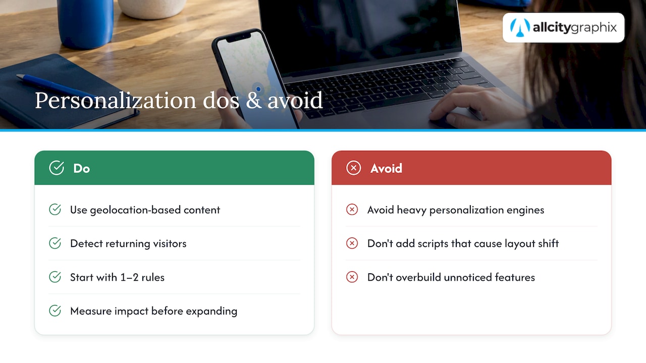
Personalization on a homepage ranges from simple to involved, and the simple versions usually deliver the most reliable return. Geolocation-based content, such as showing a location-specific phone number or service area, requires minimal setup and immediately feels more relevant to a visitor.
Returning-visitor detection is another low-effort option: a homepage can swap a “Welcome” message for a “Welcome back” state, or highlight a different CTA for someone who already viewed a pricing page on a prior visit. Behavioral triggers, like showing a different hero message to visitors who arrived from a specific ad campaign versus organic search, let the same page serve different intents without building separate landing pages for each.
The trade-off worth watching is complexity versus payoff. Heavy personalization engines add JavaScript weight and can introduce layout shift if content swaps after the initial render, working against the Core Web Vitals targets covered earlier. A reasonable approach starts with one or two personalization rules, measures whether they move the metrics that matter, and only adds more once the first ones prove their worth. Overbuilt personalization that nobody notices is wasted engineering effort and a performance cost with nothing to show for it.
Updating and maintaining homepage content on a schedule
A homepage that looks the same in 2026 as it did three years ago usually signals a business that has not reevaluated its offer, its top tasks, or its competitive position in a while. Stale content also tends to accumulate outdated claims, retired products, or broken promotional banners that quietly undercut trust.
Set a maintenance cadence rather than waiting for a full redesign to fix small issues. A monthly check can confirm that featured content, testimonials, and any promotional banners are current. A quarterly review is a better fit for reassessing whether the primary CTA still matches the business’s current priority, since goals shift as a company grows or adds offerings. An annual audit should revisit the full page against current performance data, accessibility standards, and competitor positioning.
Assign clear ownership for each type of update: who swaps out featured work, who updates copy when offerings change, and who checks that links still resolve. A homepage with no owner tends to drift until a redesign becomes the only fix, which costs more time and money than steady small updates would have.
Internationalization and localization for global audiences
A homepage serving visitors across multiple countries or languages needs more than a translated copy of the original page. Text that expands or contracts significantly when translated, such as German compounds running longer than their English equivalents, can break a layout that was only tested in one language.
Date formats, currency symbols, and measurement units should match the visitor’s region rather than defaulting to one market’s convention throughout. A language or region switcher belongs somewhere visible, typically in the header or footer, and should be easy to find without forcing a visitor to guess an abbreviation. Images with embedded text, like a hero graphic with a slogan baked into the file, do not translate at all and should be avoided in favor of text rendered separately from the image.
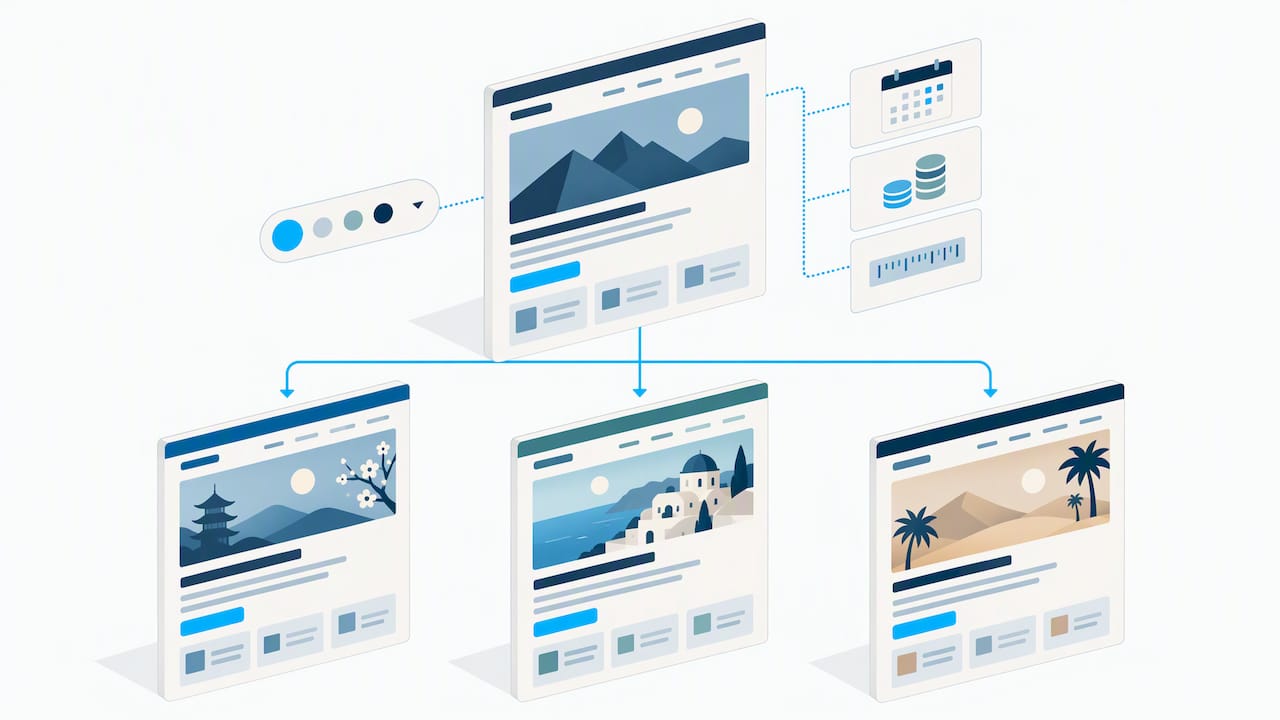
Cultural context matters beyond language. Color associations, imagery choices, and even the directness of CTA copy can read differently across markets, so a homepage built for one audience may need adjusted tone, not just translated words, when it serves another.
What agencies get right and wrong about homepage trade-offs
Every homepage project runs into the same tension: a stakeholder wants a large, cinematic hero image, and performance data says that image is the reason the page misses its Largest Contentful Paint target. The honest answer is that brand and speed are not opposites, but they do require trade-offs, and someone has to make the call on which one wins when they conflict.
A workable rule of thumb: protect the primary conversion path first, protect load time second, and treat everything else, including decorative flourishes, as negotiable. A homepage that looks slightly less dramatic but loads in two seconds and gets the right visitor to the right CTA will outperform a stunning page that takes five seconds to paint. Brand expression still matters, it just has to earn its place rather than being assumed.
**
If a homepage audit turns up more problems than time allows for, we handle the strategy and the rebuild together rather than handing over a list and leaving the execution to you. Our process starts with a discovery conversation about who your top-task visitors actually are, then moves into the creative and technical work that gets a homepage to reflect that answer.

Services that map directly to the sections above include:
- Brand Strategy and Brand Identity for the tagline, voice, and visual consistency that make a first impression land.
- UX/UI Design and Web Design for hero structure, navigation, and visual hierarchy built around your actual top tasks.
- Web Development and E Commerce Development for the performance work behind Core Web Vitals targets.
- Search Engine Optimization for homepage metadata, schema, and internal linking that support discoverability without compromising clarity.
A redesign does not have to start from a blank page. If you want a second opinion on an existing homepage, or a full rebuild, our services page outlines where to start, and a portfolio review is a straightforward way to see how these principles translate into finished work.
FAQ
What are the 5 golden rules of web design?
A common version of this rule set includes clarity of purpose, intuitive navigation, visual consistency, fast performance, and accessibility for all users. These principles align closely with the homepage checklist above: a clear tagline, obvious top tasks, consistent type and spacing, a page that meets Core Web Vitals thresholds, and support for keyboard and screen reader use.
What are the 4 C’s of website design?
Definitions vary, but a frequently cited version covers clarity, consistency, credibility, and conversion. Clarity means visitors understand the offer immediately, consistency means type and layout patterns repeat predictably, credibility comes from real content and social proof, and conversion means the path to the primary action stays unobstructed.
What are the best practices for designing a web page?
The core practices are a clear value proposition, visual hierarchy that emphasizes top tasks, fast load times measured against Core Web Vitals, and accessible design for keyboard and screen reader users. Shopify’s research on effective websites ties these together, noting that purpose, performance, accessibility, and clear CTAs work best as a combined set rather than isolated fixes.
How fast should a homepage load?
A homepage should aim to meet the Core Web Vitals thresholds: Largest Contentful Paint at 2.5 seconds or faster, Interaction to Next Paint at 200 milliseconds or faster, and Cumulative Layout Shift at 0.1 or lower, each measured at the 75th percentile of real page loads. Hero image optimization is usually the single biggest lever for hitting the LCP target.
Should the homepage try to rank for every keyword?
No. Homepage SEO works best when the H1 and metadata describe the business clearly, with the primary keyword included only where it reads naturally, as Ahrefs recommends. Narrow or technical search queries are better served by dedicated pages that can go into more depth than a homepage reasonably should.
Sources
- Web
- First impressions: how people judge visual appeal — NN/g
- Homepage SEO: Yes, It Exists & Here’s How to Do It — Ahrefs
- What makes a good website? 11 qualities of effective websites — Shopify