

Make your footer a predictable, accessible utility that helps people find support and critical pages, not a catch-all dump for every link on your site. That means prioritizing a short list of high-value items, writing link text that stands on its own, testing patterns across devices, and keeping the layout consistent from page to page. Get those basics right and the footer stops being an afterthought and starts pulling its weight.
TL;DR:
- Choose a utility footer for small sites, grouped navigation for deep catalogs, a sitemap for large hierarchies, or engagement elements for audience building.
- Rank footer links by click data, keep contact, legal, and support links prominent, and move rarely used destinations to a dedicated sitemap page.
- Keep footer text at the site’s readable base size, maintain strong contrast, and ensure link labels make sense when screen reader users encounter them alone.
- On phones, stack columns, tuck secondary groups into accessible accordions, preserve generous tap targets, and avoid heavy widgets that slow page loading.
- Measure individual link clicks before and after targeted footer changes, revisit results quarterly, and avoid treating holiday spikes or short tests as proof.
Table of Contents
- Footer roles and design patterns you should know
- What to put in your footer: a prioritized checklist
- Accessibility and legibility rules your footer must follow
- Footer links, anchor text, and SEO considerations
- Mobile and responsive footer patterns worth copying
- Calls to action and conversions that belong in a footer
- Legal, contact, and trust items your footer needs
- Testing and measuring whether your footer actually works
- How we approach footer strategy for client sites
- Get your footer built right the first time
- FAQ
- Sources
Footer roles and design patterns you should know
A footer isn’t one thing. It plays different jobs depending on the site, and picking the wrong pattern is the most common reason footers feel cluttered or useless. Nielsen Norman Group research describes the footer as a predictable safety net: when people can’t find what they need in the main navigation, they scroll down and expect answers there.
Four patterns cover most use cases. A utility footer holds the bare essentials, contact info, copyright, and a couple of legal links, and fits small sites or single-page apps where there isn’t much else to surface. A doormat footer expands into a mini sitemap with grouped navigation columns, which works well for content-heavy sites or e-commerce stores with deep category structures. A sitemap footer goes further still, listing most of the site’s pages in a structured grid, useful for large publishers or marketplaces where search and browse both matter. An engagement footer adds conversion elements like newsletter signup or social links on top of a lighter utility base, suited to brands actively building an audience.
- Utility footer: minimal links, best for small or single-purpose sites.
- Doormat footer: grouped navigation columns, best for content or product-heavy sites.
- Sitemap footer: broad page listing, best for large sites with deep hierarchies.
- Engagement footer: utility plus signup or social prompts, best for audience-building brands.
Whichever pattern fits, consistency matters more than any single design choice. Keep the same footer structure, order, and wording across every page so returning visitors build a mental map of where things live. Changing the footer layout page to page undermines the very predictability that makes it useful in the first place.
What to put in your footer: a prioritized checklist
Not every link deserves equal real estate. Treat your footer like a budget: spend the top rows on what people actually search for, and push everything else further down or off the page entirely.
- Contact information: a phone number, email, or contact form link that’s easy to spot.
- Privacy policy and terms of service: required for trust and, in many cases, for legal compliance.
- Support or help center link: especially important for software, SaaS, and e-commerce sites.
- Site map or key category links: a condensed path to your most important pages.
- Copyright notice: simple, short, and updated.
That’s the top tier, the items people look for first when the main navigation fails them. Below that sits a secondary tier: newsletter signup, social media icons, secondary navigation (careers, press, blog), and physical locations if you operate storefronts or offices. These add value without competing for attention with the essentials.
A few items are conditional. Language or region selectors only belong in the footer if you actually serve multiple markets. Certification badges or awards earn a spot only when they’re verifiable and relevant to the buying decision, not decorative. App store badges make sense for products with a companion app and not much else.
Group related links under clear column headers rather than letting them run together in one long list. NN/g’s analysis recommends starting any footer audit with analytics: rank existing footer links by actual click volume, keep the top performers visible, and move rarely used links to a dedicated site map page linked from the footer instead of listing everything inline.
Pro Tip: Pull your footer link click data before redesigning anything, what people actually use should decide what stays above the fold.
Accessibility and legibility rules your footer must follow
Footers get visually deprioritized more than any other part of a page, which makes them an easy place for accessibility problems to hide. Small text, low contrast, and vague link labels pile up here because designers treat the footer as throwaway space.
- Keep body text in the footer at a legible size, generally no smaller than the rest of your site’s base font, and never below what your design system sets as a minimum for readable text.
- Maintain sufficient color contrast between footer text and its background, dark gray on dark gray is a common failure point.
- Never collapse or visually hide footer content in a way that removes it from the accessibility tree, hiding it from sighted users but leaving it for screen readers (or vice versa) creates inconsistent experiences.
- Write link text that describes its destination without relying on surrounding visual context.
That last point matters more than most teams realize. WCAG 2.2’s guidance on link purpose requires that link text make sense on its own, since screen reader users often navigate by pulling up a list of links stripped of their surrounding page context. “Privacy Policy” works. “Click here” does not, no matter how obvious it looks visually.
For links where the destination genuinely can’t be made clear from visible text alone, an ARIA label or aria-describedby attribute can supply the missing context programmatically. Section508 outlines techniques like this for cases where icon-only links (a bare social media icon, for instance) need a text alternative that doesn’t clutter the visual design. A quick accessibility check: tab through your footer with a keyboard only, and pull up a screen reader’s link list to confirm every entry reads clearly out of context.
Footer links, anchor text, and SEO considerations
Footer links do double duty: they help people navigate and they help search engines understand your site’s structure. Google’s own developer guidance recommends using crawlable <a> tags with real href attributes rather than JavaScript-only click handlers, since crawlers follow standard links far more reliably. Image-based footer links, a payment badge linking to a terms page, for example, need descriptive alt text, since Google uses that alt text as the effective anchor text.
- Use descriptive, specific anchor text (“Website Accessibility Guide” rather than “Learn More”).
- Avoid keyword-stuffed link text that reads unnaturally to a human visitor.
- Avoid repeating the exact same block of footer links, word for word, across hundreds of templated pages with no variation.
- Make sure every important page is reachable through a real, crawlable link somewhere on the site, not just the footer.
That last caution is worth taking seriously. Google’s spam policies flag widely distributed, low-value link patterns, the kind of footer that lists forty near-identical location pages with generic anchor text looks more like a directory spam tactic than genuine navigation. A well-structured footer, by contrast, can support stronger sitelinks: Google’s own documentation notes that sitelinks are generated automatically and improve when a site has informative page titles and a logical internal linking structure, which a clean footer naturally reinforces.
Mobile and responsive footer patterns worth copying
A footer that works on desktop can turn into a wall of text on a phone screen. The fix isn’t to delete content, it’s to restructure how that content gets revealed.
- Stack footer columns vertically on mobile instead of forcing a multi-column grid into a narrow viewport.
- Use accordions to collapse secondary link groups, letting visitors tap to expand only what they need.
- Keep touch targets large enough to tap accurately, cramped footer links are a frequent source of mis-taps.
- Reserve sticky mini-footers for infinite-scroll pages, where a traditional footer may never be reached at all.
Industry UX guidance on footer design points out that mobile footers often work best when non-essential items sit behind an accordion and the stacked layout keeps scannability intact. For infinite-scroll product feeds or social-style timelines, a slim sticky mini-footer, showing just a couple of critical links, keeps those pages from losing footer access entirely.
Pro Tip: Test your footer’s accordion behavior on an actual mid-range phone, not just a resized browser window, tap targets and font rendering behave differently on real devices.
Avoid loading the mobile footer with the same heavy widgets (embedded maps, auto-playing carousels, large icon sets) that desktop can absorb without a performance hit. Those add weight exactly where connection speeds are often weakest.
Calls to action and conversions that belong in a footer
A footer can support conversion goals without turning into a second homepage. The key is restraint: one clear ask, not three competing ones.
- Keep newsletter signups to a single email field, with a short privacy hint explaining what subscribers will receive.
- Use progressive capture, ask for just an email first, and request more detail later once someone’s engaged.
- Reserve promotional CTAs (a sale banner, a seasonal offer) for sites where that offer is genuinely time-sensitive and site-wide.
- Prioritize one CTA per footer rather than stacking a newsletter form, a promo banner, and an app download prompt together.
Treat footer CTAs as testable, not assumed. Running a simple before-and-after comparison on signup rate, or an A/B test between two field layouts, tells you whether that real estate is earning its place or just adding visual noise.
Legal, contact, and trust items your footer needs
A handful of items exist in the footer purely to build trust and meet basic expectations, and they’re worth getting right even when they’re not exciting design work.
- Link to your privacy policy and terms of service, kept current and easy to find.
- Include a copyright line with the current year.
- Provide a clear contact method (email, phone, or a linked contact page) rather than making visitors search for it.
- If you have a physical location, link to a map rather than burying an address in plain text.
- Place certifications, awards, or trust badges only when they’re genuine and relevant, and keep them visually secondary to the links above.
Testing and measuring whether your footer actually works
A footer redesign is only as good as the evidence behind it. Treat changes as hypotheses, not assumptions.
- Track click-through rate on individual footer links before and after any change.
- Use heatmaps and click maps to see which footer zones get attention and which get ignored entirely.
- Run A/B tests on specific variants, link order, column count, CTA placement, rather than redesigning everything at once.
- Watch for false positives: a short test window or a holiday traffic spike can make a weak change look like a win.
- Revisit footer analytics quarterly, since what people search for in your footer shifts as your site and content grow.
Pair this testing cadence with the practical, sprintable fixes outlined for conversion-focused web design, many of the same incremental-testing principles apply directly to footer experiments.
How we approach footer strategy for client sites
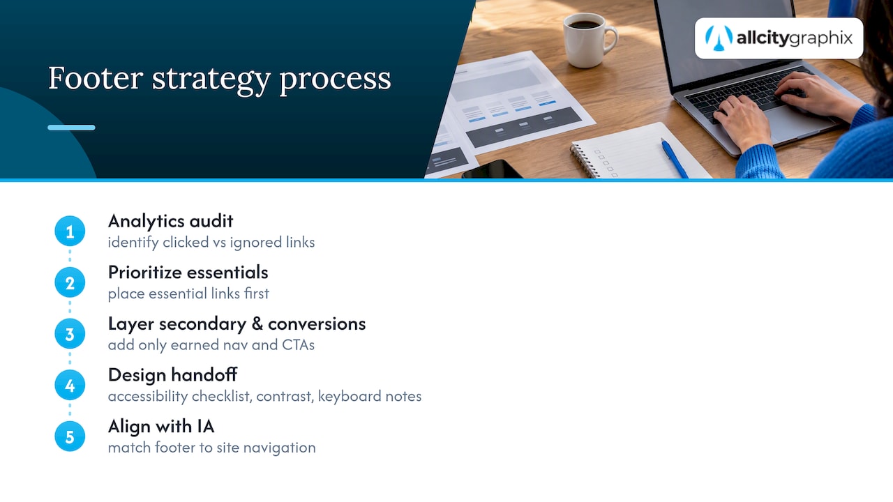
Our process for footer work starts with an analytics audit: which existing links get clicked, which get ignored, and what stakeholders actually need the footer to accomplish, leveraging the expertise of marketing and web design experts to ensure every element supports engagement and visibility. From there we prioritize the essential links first, then layer in secondary navigation and conversion elements only where they earn a place.
Design handoff includes a written accessibility checklist, contrast ratios, link purpose review, keyboard navigation notes, so developers build from clear specs instead of guesswork. That same discovery-to-handoff process shapes our broader approach to website navigation and homepage structure, since a footer only works well when it’s consistent with the rest of the site’s information architecture.
— Alex
Get your footer built right the first time
If your footer currently reads like a junk drawer, or if you’re not sure it meets basic accessibility standards, we handle that as part of our web design work: structure, accessibility review, and content strategy built around what your visitors actually search for, not a generic template dropped onto every page.

We start with a discovery conversation about your site’s goals and audience, then hand off developer-ready specs that cover layout, accessibility, and link priorities for every page, footer included. If you want a second set of eyes on your current site or a full rebuild, our services page outlines the full range of branding, web design, and digital marketing work we take on for small businesses and established companies alike. Reach out and we’ll walk through what your footer, and the rest of your site, needs to actually perform.
FAQ
What should be in the website footer?
A footer should prioritize contact information, privacy policy and terms of service links, a support or help link, and a condensed path to key pages like a site map. Secondary items such as newsletter signup, social links, and location details can follow once the essentials are covered.
What is the best color for a website footer?
There’s no single required color, but whatever palette you choose needs sufficient contrast between text and background to remain legible. Dark backgrounds with light text (or the reverse) work well as long as the contrast ratio meets accessibility standards rather than just looking clean.
What should be inside a footer?
At minimum, include contact details, legal links (privacy policy, terms of service), a copyright notice, and a way to reach support or browse the site’s main sections. Beyond that, what you add depends on your site type, e-commerce sites benefit from category links, while SaaS products often prioritize a help center link.
Should every page have a footer?
Yes, keeping the footer present and consistent across every page builds the predictability that makes it useful, since people expect to find the same essential links no matter where they landed. The only common exception is a focused landing page built for a single conversion action, where a stripped-down or omitted footer can reduce distraction.
Sources
- Understanding Success Criterion 2.4.4: Link Purpose (In Context) | WAI | W3C
- Web Page Footers 101: Design Patterns and When to Use Each
- SEO Link Best Practices for Google | Google Search Central