

Make the primary call to action visually dominant and lead its label with a verb that promises a clear outcome. WCAG 2.2 sets a 3:1 contrast floor for button boundaries, and Nielsen Norman Group warns against vague labels like “OK” or “Next.” Treat accessibility checks and testing as required steps, not afterthoughts. Below you will find microcopy templates and a rollout checklist you can apply today.
TL;DR:
- Most pages contain multiple CTAs, but prioritizing a single, visually dominant primary CTA can significantly improve conversion rates.
- Use size, contrast, and spacing to make the primary button stand out and ensure it visually suggests clickability with affordance cues like shadows and fill shapes.
- Button states such as hover, focus, loading, and disabled should provide immediate, clear feedback within 150 milliseconds to build user trust.
- Write specific, verb-led labels that clearly state the action and outcome, and add microcopy when the CTA involves risk or cost to increase user confidence.
- Place CTAs where users naturally look, such as above the fold or in sticky positions on long pages, and ensure all are accessible with contrast, target size, and proper semantic markup.
Table of Contents
- What counts as a call to action, and where it shows up
- Why CTA design moves conversion numbers
- Core design principles: hierarchy, contrast, and affordance
- Button states and the feedback users need to trust them
- Writing CTA labels that actually convert
- Placement and layout across devices and channels
- Accessibility checklist every CTA should pass
- Ready-to-use CTA templates by channel
- Testing CTA changes without fooling yourself
- How All City Graphix approaches a CTA rollout
- Balancing brand aesthetics with conversion-first design
- Get CTA design and testing support from an experienced design agency
- Sources
- FAQ
What counts as a call to action, and where it shows up
A call to action is any interface element that tells someone what to do next: a button, a text link, a banner, or a form’s submit control. The label and its surrounding design work together to signal that an action is available and worth taking.
Most pages carry more than one CTA, so clarity about rank matters:
- Primary CTA: the one action you want most, visually dominant and singular per screen.
- Secondary CTA: a lower-stakes alternative, styled to support rather than compete.
- Command links versus navigational links: a command link (“Start free trial”) triggers an action, while a navigational link (“Pricing”) just moves someone to another page.
CTAs appear across a hero section, product pages, checkout flows, email campaigns, modals, and mobile screens. Each channel has its own constraints, but the underlying design logic stays consistent: one clear action, stated plainly.
Why CTA design moves conversion numbers
CTA work is worth prioritizing because it sits close to the moment someone decides to act. Track click-through rate, conversion rate, and revenue per visitor as your core metrics, along with micro-conversions like email signups or add-to-cart events that signal intent before a purchase.
Baymard Institute found that roughly 48% of ecommerce sites fail to make their primary checkout CTA prominent enough, a gap that directly costs completed orders.
That single finding reframes CTA design as a conversion lever, not a cosmetic choice. CTA redesign tends to be high-leverage when traffic is healthy but drop-off clusters at a specific step, such as checkout or a signup form. It is lower-leverage when the deeper issue is product-market fit or a mismatch between ad promise and landing page content. Fix the bigger problem first, then let CTA design do its job.
Core design principles: hierarchy, contrast, and affordance
The primary CTA needs to win the eye before it wins the click. Size, color, white space, and isolation from competing links all push toward that goal.
- Size and color: make the primary button larger and bolder than nearby elements, using a color that contrasts with the background and the page’s dominant palette.
- Spacing: give the button room to breathe so it reads as a destination, not part of a text block.
- Isolation: remove or de-emphasize nearby links that could pull attention away from the one action you want taken.
Affordance cues tell people a button is clickable before they touch it. Filled shapes with rectangular or slightly rounded edges and a subtle shadow read as interactive. NN/g research found that solid fills and soft shadows outperform flat, borderless shapes because they visually suggest pressability.
Ghost or outline buttons work for secondary actions, where you want an option available without competing for attention. Build a consistent three-tier system: primary (filled, high contrast), secondary (outline or muted fill), and tertiary (text link). Apply the same tiers across every page so users learn the pattern once.
Pro Tip: When two buttons sit side by side, give only one a filled background; the other should look clearly secondary at a glance.
Button states and the feedback users need to trust them
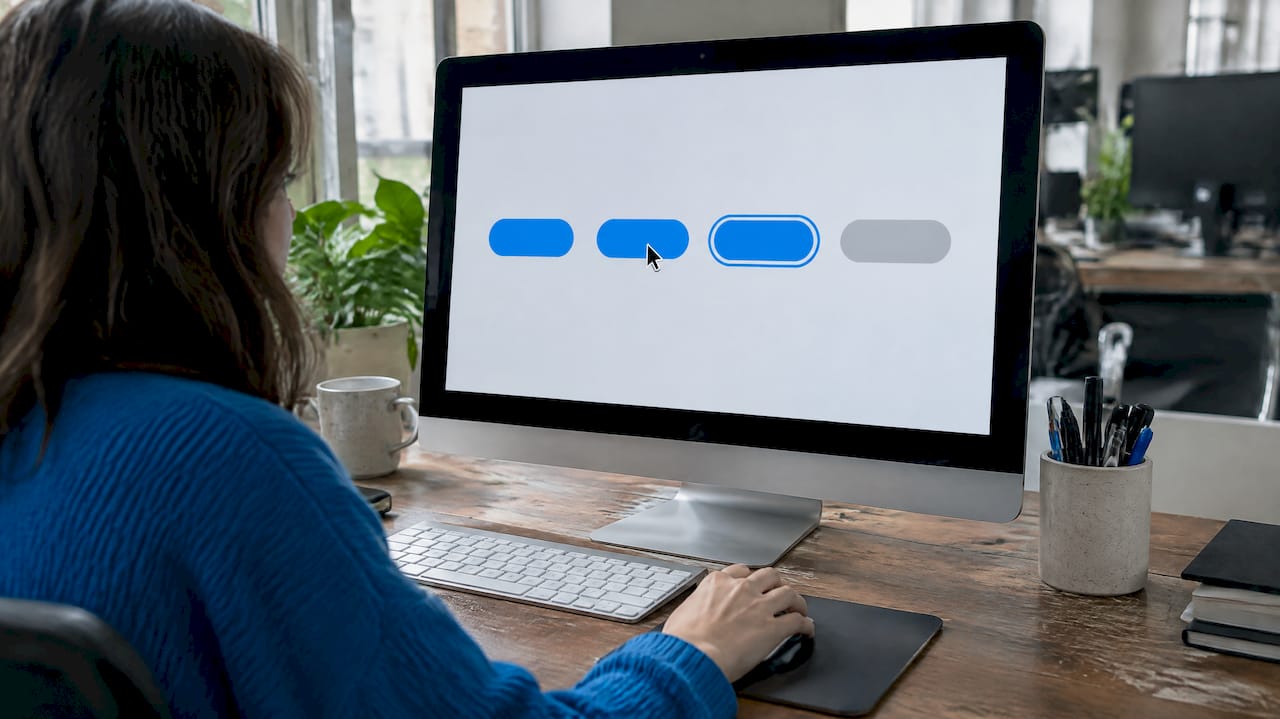
Every interactive button needs to communicate its current status, or people will click twice, hesitate, or give up. NN/g’s research on button states lays out six states worth designing for:
- Enabled: the default, ready-to-click appearance.
- Hover: a subtle shift in color or shadow that confirms the cursor is on target.
- Focus: a visible outline for keyboard navigation, distinct from hover.
- Pressed: a brief visual change confirming the click registered.
- Loading: a spinner or progress indicator for actions that take time.
- Disabled: a muted, clearly non-interactive look paired with
aria-disabled.
Timing matters as much as appearance. NN/g recommends pressed and focus feedback within 100 to 150 milliseconds, and a hover delay of 150 to 200 milliseconds to avoid flickering on accidental mouse passes. For any action that takes longer than a moment to process, show a loading indicator rather than leaving the button static, which prevents repeated clicks on the same request.
Use real <button> elements instead of styled <div> tags so screen readers announce the correct role automatically, and pair disabled states with aria-disabled="true" so assistive technology reports the status correctly.
Writing CTA labels that actually convert
Copy carries more weight than most teams assume. Lead every label with a verb or verb phrase, and name the specific outcome rather than a generic action.
- Lead with a verb: “Start,” “Download,” “Get,” “Book” rather than “Submit” or “Click here.”
- Be specific: “Download the pricing guide” beats “Learn more” because it sets a real expectation.
- Follow the 4Ss: NN/g’s guidance on link labels frames strong labels as specific, sincere, substantial, and succinct.
Match the verb to the commitment level: “Start free trial” for a low-risk signup, “Book a demo” for a sales conversation, “Buy now” for a direct purchase. Vague labels like “Submit” or “Next” force people to guess what happens after the click.
Pro Tip: Add one line of subtext under a CTA when the action carries risk or cost, such as “No credit card required” under a trial signup.
For actions with real consequences, such as canceling a subscription or deleting an account, write confirmation copy that restates exactly what will happen, rather than a generic “Are you sure?”
Placement and layout across devices and channels
Where a CTA sits matters almost as much as how it looks. Put the primary action where attention naturally lands, and protect it from competing calls to action.
- Hero and above the fold: place the primary CTA where a visitor sees it without scrolling, ideally within the first screen’s worth of content.
- Sticky CTAs: pin the primary button to the screen on long pages so it stays reachable as someone scrolls.
- Checkout: keep the final action, such as “Place order,” in a fixed, prominent position, and keep guest checkout visible rather than buried behind an account prompt.
- Mobile: size tap targets for thumbs, keep the primary button visible without extra scrolling, and never hide it behind a collapsed menu.
- One primary per screen: avoid placing two equally weighted CTAs side by side. Use spacing and visual grouping to make rank obvious.
Email and in-article placements follow the same logic: one clear action per message, positioned where the reader’s eye naturally stops after the content that builds the case for clicking. A guide on CTA placement in lead capture covers similar ground for landing pages specifically.
Accessibility checklist every CTA should pass
Accessibility is not a separate pass after design, it is part of the design. WCAG 2.2 sets concrete, testable targets for CTAs:
- Text contrast: label text needs a contrast ratio of at least 4.5:1 against its background.
- Component boundary contrast: the button’s edge or fill against the surrounding page needs at least 3:1 so people can tell it is there.
- Target size: WCAG’s baseline is 24×24 pixels, but aim for 44×44 pixels or add spacing around smaller targets to prevent mistaps.
- Semantic markup: use native
<button>or<a>elements, applyaria-disabledcorrectly, and keep visible focus indicators for keyboard users.
WCAG 2.2 sets a 3:1 minimum contrast ratio for interface component boundaries like button edges, separate from the 4.5:1 rule for text, a distinction that trips up a lot of brand-led designs with low-contrast outline buttons.
Reading order matters too: a screen reader should encounter the CTA in a logical sequence relative to the content that explains it, not isolated from its context. For a deeper walk-through of implementation steps, see the guide on ADA website compliance, and the practical steps outlined in Bitrupt’s ADA compliance guide cover similar testing steps for contrast and markup.
Ready-to-use CTA templates by channel
Borrow these starting points and adjust the noun to match your offer.
- Hero or product page: “Start your free trial” (sets expectation, low commitment) or “Get your quote” (service-based, implies a response).
- Email, single-button send: “Claim your spot” for a webinar, “See what’s new” for a product update, “Download the guide” for gated content.
- Checkout, final step: “Place order” or “Pay and place order” rather than “Submit” or “Continue,” since the label should match the actual consequence of the click.
Three usage notes worth keeping in mind:
- Match the verb to the commitment: “Buy now” for a direct sale, “Add to cart” for a step before the sale.
- Add one line of supporting microcopy under high-stakes buttons, such as delivery time or a return policy note near “Place order.”
- Keep email CTAs to one primary button per message, since multiple competing links split attention and depress click-through rate.
Testing CTA changes without fooling yourself
Pick one KPI to lead the test and let it map to the funnel stage you are working on: click-through rate for visibility changes, conversion rate for copy or placement changes, revenue per visitor when you want to confirm the change affects the bottom line, not just clicks.
- Isolate one variable per test, changing only copy, only color and contrast, or only placement, so you know which change produced the result.
- Run to a planned sample size rather than checking results daily and stopping early, since early peeks inflate false positives.
- Interpret effect size before rolling out, confirming the lift holds across segments and devices before applying it site-wide.
Pro Tip: Write down your hypothesis and minimum detectable effect before launching a test, not after you see the first results.
A reliable setup isolates one variable, tracks conversion rate and revenue per visitor together, and resists the urge to call a winner before the test reaches its planned sample size.
How All City Graphix approaches a CTA rollout
A discovery pass comes first: review analytics for drop-off points, map funnel bottlenecks, run a quick accessibility audit, and note any brand color constraints that might limit contrast options.
From there, design and delivery follow a consistent sequence:
- Mockups: build primary, secondary, and tertiary button states in context, not in isolation.
- Accessible markup: hand off HTML and CSS using semantic elements and correct ARIA attributes from the start.
- QA focus: test every button state, focus order, and screen reader announcement before launch.
Once a design ships, a short pilot test measures the real-world lift before a full rollout. Readers who want this process run end to end can start with the services overview to see how the audit-to-launch sequence fits a specific project.
Balancing brand aesthetics with conversion-first design
Brand guidelines and conversion goals clash most often over color. A soft pastel palette might look right in a style guide and fail the 3:1 boundary contrast test the moment it becomes a button.
The practical fix is rarely a full rebrand: add one accent color reserved for CTAs, increase button size to compensate for lower contrast, or pair an outline state with a filled state so focus and hover feel intentional rather than accidental. Set these choices as guardrails once, during a brand style guide process, so every future page follows the same rule instead of relitigating contrast on each launch.
— Alex
Get CTA design and testing support from an experienced design agency
Designing a CTA system that holds up across brand guidelines, accessibility rules, and real user behavior takes more than a single button swap. Experienced agencies build that system as part of their web design, UX/UI design, and brand strategy work, pairing discovery sessions with custom execution so the result fits your audience instead of a generic template.
The engagement path is simple: an audit of your current CTAs and funnel, a pilot redesign focused on the highest-leverage screens, a short test period, and iteration based on what the data shows. If your brand palette is fighting your contrast ratios or your checkout button is getting lost among secondary links, that is exactly the kind of problem this process is built to solve. Visit the services page to see the full range of design and development work, or explore web design for implementation details.
Sources
- WCAG 2.2 (W3C)
- UI copy: UX guidelines for command names and keyboard shortcuts — NN/g
- Button design: Best practices for optimal UI buttons — Baymard Institute
FAQ
What is a call to action in design?
A call to action is a UI element, usually a button, link, or banner, that prompts someone to take a specific next step, such as signing up or completing a purchase. Good CTA design pairs a visually dominant element with a verb-led label that states the outcome plainly.
What is a call to action example?
Common examples include “Start your free trial,” “Add to cart,” and “Book a demo,” each naming the exact action and what follows it. Checkout flows often use “Place order” or “Pay and place order” for the final, most consequential button on the page.
What is CTA in SEO?
In SEO contexts, a CTA is the element that converts search traffic into a measurable action, like a form submission or purchase, after a visitor lands on a page. Its design and placement affect conversion rate and revenue per visitor, which search marketers track alongside rankings and click-through rate.
What should be included in a call to action?
A strong CTA includes a verb-led, specific label, visual dominance through size and contrast, and, when the action carries risk or cost, a short line of supporting microcopy underneath. It also needs to meet accessibility basics: sufficient color contrast, an adequate target size, and semantic markup that works with screen readers.