

A great annual report pairs a tight narrative with clear visual hierarchy and accessible data visuals. Prioritize three things: a cover and executive summary that state your year in plain language, a grid system that guides the eye without clutter, and charts with one-line takeaways anyone can read in seconds. Everything else builds on that foundation.
TL;DR:
- Use a 12 column grid, consistent margins, one dominant visual per page, and body text set at 10 to 11 points.
- Collect audited financials, approved leadership quotes, and program photography before layout; include leadership, results, financial statements, governance, and supporting notes.
- Use trend lines, category bars, and stacked bars or donuts for composition; give each chart a plain language takeaway and a text alternative.
- Tag PDFs for logical reading order, add descriptive alt text, meet the 4.5:1 body text contrast ratio, and pair color cues with labels or patterns.
- Choose print for board meetings and donor events, PDFs for broad distribution, or interactive HTML when readers need to explore data online.
Table of Contents
- Design Essentials: Layout, Typography, and Visual Hierarchy
- Content and Structure: The Pages Every Annual Report Should Include
- Visualizing Data: Charts, Callouts, and Microcopy That Make Numbers Meaningful
- Templates, Formats, and Distribution: Print, PDF, and Interactive Options
- Accessibility and Standards: Making Your Report Usable for Everyone
- Production Checklist and Timeline: From Brief to Final Assets
- How All City Graphix Approaches Annual Report Design
- Ready to Build Your Annual Report With Professional Support
- FAQ
- Sources
Design Essentials: Layout, Typography, and Visual Hierarchy
A simple grid, built on 12 columns with generous margins, handles most annual report spreads without forcing every page into the same template. We typically plan four spread types: a cover that states the year’s theme in one phrase, a chapter opener with a full-bleed image and short header, a data spread built around one or two charts, and a narrative spread for leadership letters or case studies.
Typography needs a clear scale. A workable starting point: H1 at 36 to 42 points, H2 at 22 to 26 points, body copy at 10 to 11 points, and captions at 8 to 9 points, with line spacing around 1.4 times the body size. Photography should reflect the people and work behind the numbers rather than generic stock imagery, and brand colors should appear consistently in headers, pull quotes, and chart accents rather than scattered randomly across pages.
- Keep margins consistent across every spread so the eye never has to recalibrate.
- Limit each page to one dominant visual element plus supporting text.
- Reserve your brightest brand color for the single most important number on each spread.
Pro Tip: Print a spread in grayscale before finalizing it. If the hierarchy still reads clearly without color, your layout is doing its job.
Content and Structure: The Pages Every Annual Report Should Include
Most reports need the same core sections, just scaled to fit the organization’s size. Adobe’s guidance on annual report design outlines content to include and layout approaches that apply whether you’re producing four pages or forty.
- Cover and table of contents, setting tone and orientation.
- Letter from leadership, framing the year in a few paragraphs.
- Executive summary, highlighting the two or three results that matter most.
- Key metrics and highlights, often a single data spread.
- Program or business stories, giving numbers human context.
- Financial statements, formatted for clarity over density.
- Governance and leadership information.
- Appendix or notes, for supporting detail that doesn’t need prime placement.
A small report might run a few pages, a mid-size organization a moderate number of pages, and a large institution dozens. Reserve your best visual real estate for stories and highlights, and let dense financial tables sit later in the document where readers expect reference material. Before layout begins, collect final figures, approved leadership quotes, program photography, and audited financials so design doesn’t stall waiting on content.
Visualizing Data: Charts, Callouts, and Microcopy That Make Numbers Meaningful
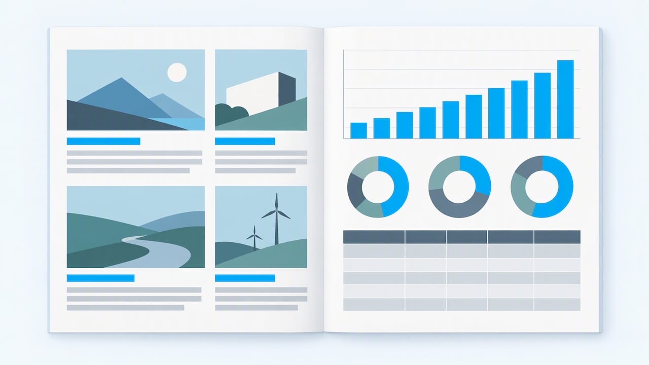
Chart choice should follow the question you’re answering. Use a line chart for trends over time, a bar chart for comparisons across categories, and a stacked bar or donut for composition, like budget allocation. Each chart needs a one-line takeaway above it, written in plain language such as “Program spending grew for the third straight year,” so a reader skimming the page still gets the point.
- Label axes directly on the chart rather than relying on a separate legend.
- Use no more than two or three colors per chart, reserving the brightest for the data point you want noticed.
- Avoid gridlines, drop shadows, and 3D effects that add visual noise without adding meaning.
- Pair every chart with a short text summary or data table for readers using screen readers.
Low-cost accessibility fixes tied to contrast and semantic structure can meaningfully increase how many people can actually read your report, according to WCAG 2.2. A chart that looks sharp on screen but fails contrast standards loses readers before they reach the insight.
Real-world examples back this up. Nonprofit reports like The Trevor Project’s FY2023 annual report pair narrative case studies with clearly labeled financial pages, showing how story and data can share a spread without competing for attention.
Templates, Formats, and Distribution: Print, PDF, and Interactive Options
Choose format based on audience behavior. Print works well for board meetings and donor events where a physical object signals permanence. Static PDF is the most common distribution format and works for most audiences when built with accessibility in mind. Lightweight HTML or interactive formats suit organizations whose readers explore data online, similar to how the World Bank’s annual report combines a web-first presentation with downloadable detail.
- For print, set bleed to at least 0.125 inches and convert all colors to CMYK before sending files to a printer.
- For PDF, flatten transparency and embed fonts to avoid rendering issues across devices.
- Start any template from a master style sheet covering headers, body text, and callouts, then customize the cover and chapter openers first since those set the tone for everything else.
- Name files with a consistent convention, such as “OrgName_AnnualReport_2026_v3,” so stakeholders always know which version they’re reviewing.
Award-winning projects, like the Mailchimp annual report recognized by D&AD, show how bold visual storytelling and data-driven infographics can work across both print and digital formats.
Accessibility and Standards: Making Your Report Usable for Everyone
Accessibility belongs in the design workflow, not as an afterthought added before export. Tagged PDFs with a logical reading order let screen readers move through content the way a sighted reader would, and every chart or image needs descriptive alt text rather than a generic label like “chart 1.”
- Maintain at least a 4.5:1 contrast ratio for body text, per accessible PDF guidance from Texas Tech University.
- Never rely on color alone to convey meaning. Pair color coding with labels, patterns, or text.
- Test the final PDF with a screen reader like NVDA or VoiceOver before distribution to confirm the reading order holds up.
Pro Tip: Document accessibility requirements in your design brief up front, specifying tagging, alt text, and contrast targets, so the handoff to production doesn’t require rework.
Production Checklist and Timeline: From Brief to Final Assets
A production schedule spanning several weeks gives most organizations enough runway to collect content, design, and proof without rushing the final weeks.
- Discovery and content planning, roughly 1 to 2 weeks.
- Content collection, including financials and leadership quotes, 2 to 3 weeks.
- Layout and design drafts, 2 to 3 weeks.
- Stakeholder review and revisions, 1 to 2 weeks.
- Accessibility tagging and export prep, 1 week.
- Final proofing and print or digital distribution, 1 week.
Approval rounds involving multiple stakeholders cause the most common delays, so lock decision makers in early and set a single point of sign-off per section. Use a shared review tool to track comments by page rather than email threads, and keep a version log so nobody proofs an outdated draft.
How All City Graphix Approaches Annual Report Design
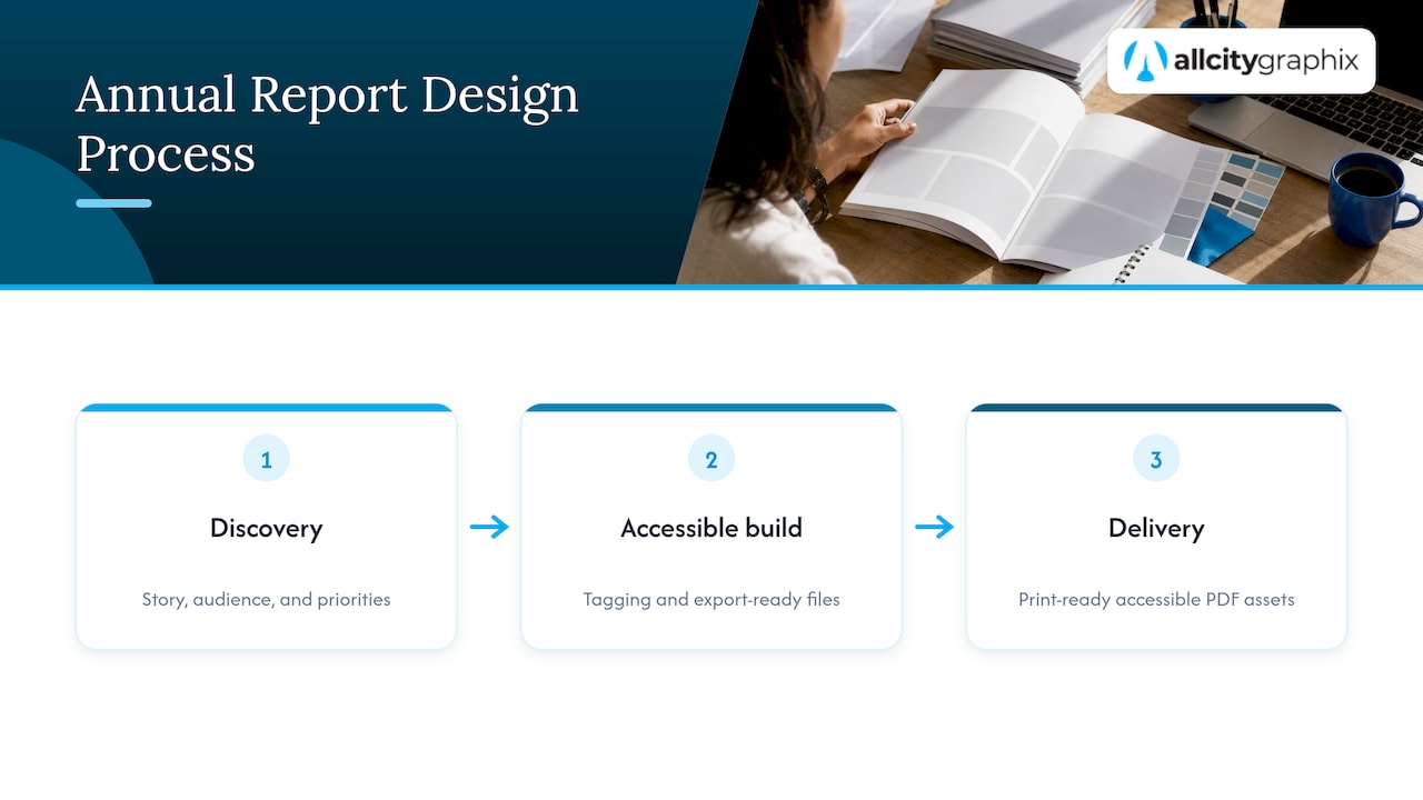
We start with discovery, understanding the organization’s story, audience, and priorities before a single layout exists. From there, our process builds in accessibility tagging and export-ready files from the beginning rather than retrofitting them at the end, so clients receive print-ready and accessible PDF assets without a separate pass. Clients typically see improved brand alignment and stronger reader engagement with their data spreads. Related work, including our pitch deck design projects, shows the same narrative-first thinking applied to a different format.
Ready to Build Your Annual Report With Professional Support
If you want a report that reads clearly, holds up in print and digital, and still looks like your brand, we handle that from discovery through final files. Our graphic design service covers layout, typography, and print-ready exports, while our broader services page lists how brand identity and web builds support a report that extends into an interactive online version.
A typical engagement starts with a discovery conversation about your content, timeline, and distribution plans, followed by a custom layout proposal and a defined review schedule. For teams running internal design reviews before sign-off, a tool like Pinhub’s visual feedback templates can help organize comments by page during your own revision rounds. Reach out through our services page to start a conversation about your next annual report.
FAQ
What is the best design for an annual report?
The strongest designs pair a clear visual hierarchy with a tight narrative and accessible data visuals, letting readers find key results in seconds. A consistent grid, a limited color palette tied to your brand, and one-line chart takeaways consistently outperform dense, text-heavy layouts.
How do you design an annual report?
Start with content collection, gathering financials, leadership quotes, and program stories before any layout work begins. From there, build a master style sheet covering typography and spacing, design core spreads like the cover and data pages, then move into accessibility tagging and export, following guidance like Adobe’s annual report overview.
What is the format of an annual report?
Most organizations choose between print, static PDF, or an interactive HTML format, often producing more than one. SEC Form 10-K guidance outlines the structural expectations public companies follow for financial disclosures, which many private and nonprofit reports adapt loosely for their own sectioning.
What are the four parts of an annual report?
While formats vary, most annual reports include a leadership letter, an executive summary with highlights, financial statements, and governance or leadership information. Larger reports often add program stories and an appendix, but these four sections form the core that readers expect to find.
— Alex
Sources
- Designing an annual report for your business. — Adobe
- Web Content Accessibility Guidelines (WCAG) 2.2
- SEC Form 10‑K (reporting guidance)
- The Trevor Project — Annual report FY2023