
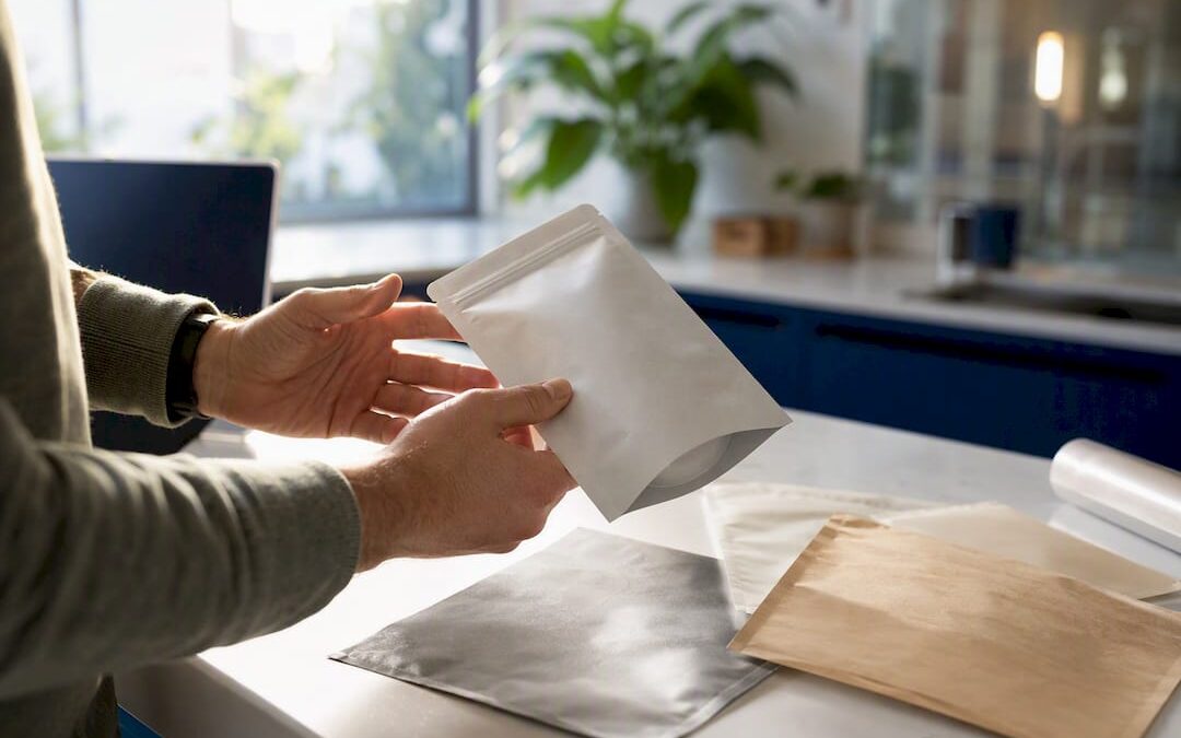
Food packaging design has one job with three parts: protect the product, tell the buyer what it is and why it matters, and win the half-second decision made in a store aisle or a phone thumbnail. Before a single graphic gets drawn, lock two things down: your brand story and your product’s hard constraints (format, shelf-life, budget). Every credible package also has to clear FDA labeling requirements, get proofed against physical prepress standards, and go through a real agency process, not a Canva template.
- Define your brand story in one sentence before opening a design file.
- List product constraints: format, shelf-life target, and production budget.
- Confirm FDA label requirements apply to your ingredient and claims list.
Key Takeaways
Food packaging design succeeds when material choice, dieline accuracy, and legal compliance are locked before creative exploration begins.
| Point | Details |
|---|---|
| Lock constraints first | Define brand story, format, shelf-life, and budget before opening a design file. |
| Match material to threat | Choose barrier film based on oxygen or moisture risk, not visual preference. |
| Use the real dieline | Request the manufacturer’s dieline early to avoid costly reprints. |
| Proof physically, not just digitally | Test color under three lighting types and run drop and seal tests before mass production. |
| Consider an experienced agency | Allcitygraphixny pairs brand strategy with production-ready prepress and dieline discipline. |
Table of Contents
- Food Packaging Design Ideas That Actually Sell
- What Makes Food Packaging Design Work on Shelf and Online?
- How Do You Choose the Right Packaging Material?
- The Step-by-Step Process From Brief to Print-Ready
- Which Tools and Templates Speed Up the Process?
- What Should You Check Before Mass Production?
- How Does a Packaging-Capable Agency Run This Project?
- What the Research Actually Supports
- Ready to Move From Sketch to Shelf?
- Sources
- FAQ
Food Packaging Design Ideas That Actually Sell
Five formats cover most of what a food or beverage brand needs, and each solves a different shelf problem.
- Stand-up pouch. The front panel is your billboard. Snacks, powders, and pet treats lean on this format because the flat face gives a big canvas for the primary claim and a bold graphic mark.
- Flat-bottom pouch. This is the workhorse for coffee, granola, and anything in the 8 oz to 5 lb range. It stands upright on a shelf like a rigid box but costs less to produce, which gives you premium shelf presence without a premium price tag.
- Rigid box or sleeve. Reach for this when you’re selling gift sets, chocolate assortments, or multi-piece bundles. The unboxing moment matters as much as the shelf moment here.
- Bottle or jar. Sauces, oils, and beverages live or die on glass or PET shape. A distinctive silhouette can carry brand recognition even with the label removed.
- Windowed sleeve or kraft laminate. These formats sell texture and honesty. A window shows the product; a kraft laminate signals a simpler, less processed feel, and both work well for bakery packaging design where freshness is the story.
Pick the format that matches how the product behaves in transit and on shelf.
What Makes Food Packaging Design Work on Shelf and Online?
Good design follows a hierarchy: product name and primary benefit lead, supporting claims follow, everything else gets cut. A shopper scans a shelf in under two seconds, and a package that makes them work to find the flavor or the benefit loses that scan.
Color does two jobs at once. It anchors the brand across a whole line, and it differentiates flavors or variants within that line, so a blueberry SKU reads instantly different from a plain one even at a glance. Typography needs a floor: legal text (net weight, ingredients, allergens) has minimum size rules, and cramming them smaller to make room for a logo is the fastest way to fail a compliance check. FDA label formatting exists for exactly this reason, and it applies before creative preferences do.
Photography versus illustration is a category call. Photography sells realism for prepared foods and produce; illustration sells whimsy or craft for snacks and beverages, and it also tends to hold up better as a tiny e-commerce thumbnail. Superside’s review of CPG packaging design examples shows that brands unifying color, type, and iconography into one system see measurable sales lift because the pack performs the same job whether it’s on a shelf or a 200-pixel thumbnail.
- Lead with product name and the single strongest benefit.
- Reserve at least one color as a brand anchor across every SKU.
- Never shrink legally required text below its minimum readable size.
- Edit ruthlessly: if three claims fight for attention, cut two.
Pro Tip: Print your label at actual size and tape it to a shelf next to five competitors. If your eye doesn’t land on it within two seconds, the hierarchy is wrong, not the artwork.
How Do You Choose the Right Packaging Material?
Material choice starts with the product’s biggest threat, not the prettiest film. Whole-bean coffee needs a high oxygen barrier and usually a degassing valve, or the bag swells and the beans go stale fast. Chips need protection from both moisture and light, since fat oxidation is what turns them rancid on a shelf. Bakery goods need breathability balanced against staleness, which is a very different barrier target than either of those. JMEI Packing’s guide to custom food packaging maps these product types against oxygen transmission rate (OTR) and moisture vapor transmission rate (MVTR) targets, and getting that spec wrong is one of the most common reasons brands end up reprinting an entire run.
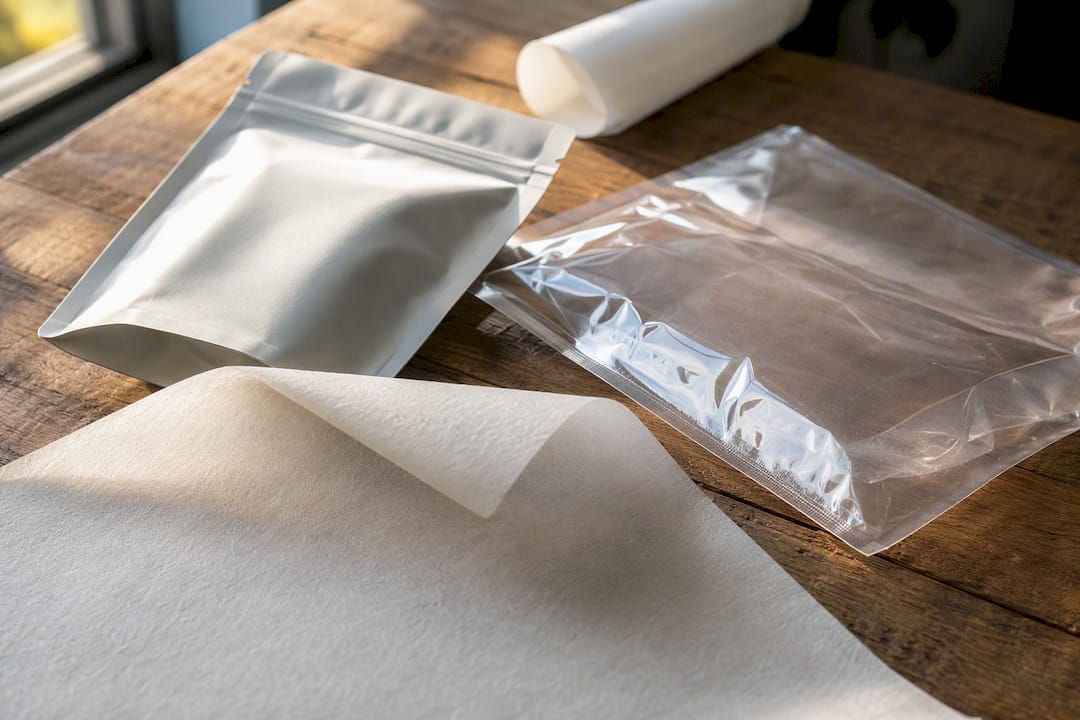
Format carries its own tradeoffs. Stand-up pouches fill fast and cost less per unit but cap out around 5 lb before stability suffers. Rigid boxes protect better and photograph beautifully but add real weight and shipping cost. Roll stock keeps unit costs lowest at high volume but locks you into one size early.
Sustainability is now a real purchase driver, not a nice-to-have footnote. Mono-material pouch structures and GRS-certified PCR (post-consumer recycled) films are the two most common paths toward genuinely sustainable packaging solutions, but recycling access varies by region, so verify local infrastructure before printing a recycling claim on the pack.
- Ask suppliers for the exact OTR/MVTR numbers, not just “high barrier.”
- Confirm seal integrity under your specific fill weight and temperature.
- Get written confirmation on recyclability claims before they go to print.
The Step-by-Step Process From Brief to Print-Ready
A packaging project runs cleanest when physics comes before creativity. Lock the product spec, budget, and launch date before opening a design file.
- Define specs and timeline. Nail down fill weight, shelf-life target, budget ceiling, and the date the product needs to be on shelf.
- Get the manufacturer’s dieline. Confirm actual fill volume with the packaging supplier before any artwork starts. A dieline built on guesswork is the single most common cause of a reprint.
- Concept and explore. Design inside the real dieline, not a placeholder rectangle, so hierarchy and legal text placement are accurate from the first draft.
- Prepress the file correctly. Convert the dieline and barcode to vector, specify exact Pantone colors, and follow standard bleed and safe-zone rules so nothing gets trimmed or misprinted.
- Proof digitally, then physically. A screen proof catches typos; a printed, true-size sample catches color shifts and structural problems a screen never will.
- Run production with a buffer. Confirm QC sign-off and build in a logistics buffer, since transit and customs delays are common even after a flawless print run.
According to JMEI Packing’s step-by-step breakdown, the full sequence from confirmed barrier and format through mass production typically runs four to eight weeks, plus transit time.
Which Tools and Templates Speed Up the Process?
Certain tool categories consistently save time and prevent compliance mistakes, and none of them require guesswork.
- Label and nutrition panel generators format the FDA nutrition facts panel to the agency’s exact spacing and type-size rules, which is far safer than hand-building one in a design file.
- Dieline and template libraries give you a starting structural file, but always request the actual manufacturer’s dieline before finalizing artwork. A generic template dieline rarely matches your specific supplier’s tooling.
- Mockup and 3D rendering tools let you preview how a design reads as a tiny e-commerce thumbnail before you commit to print, which matters given how much food shopping now happens on a phone screen.
- Prepress checks to insist on before sending any file to print: PDF/X format, fully embedded fonts, and images at 300 dpi minimum. Skipping any of these three is how blurry text or missing fonts end up on a finished product.
What Should You Check Before Mass Production?
Proofing is where reprints get prevented, not where they get discovered after the fact.
- Check color under three lighting conditions: retail LED, daylight, and warm indoor light, since a color that looks right under one often shifts under another.
- Run functional tests: drop tests, seal and zipper cycle tests, and a photography test to confirm the pack looks right under a camera, not just under your eye.
- Verify every compliance element: ingredient list, allergen statement, complete nutrition facts, and correctly formatted net quantity, since a missing allergen statement is a recall risk, not a cosmetic flaw.
- Require a minimum of two rounds of physical sample approval, from at least two stakeholders, before releasing the file to mass production.
That four-step sequence catches most of what causes production failures before they ever reach a customer.
| Point | Details |
|---|---|
| Color proof under three lights | Check retail LED, daylight, and warm indoor light before final sign-off. |
| Run functional tests | Test drops, seal cycles, and photography before committing to a full run. |
| Confirm compliance elements | Verify allergen statement, nutrition facts, and net quantity formatting. |
| Require two approval rounds | Get physical sample sign-off from at least two stakeholders before mass production. |
How Does a Packaging-Capable Agency Run This Project?
A structured packaging project moves through four stages: discovery, dieline-constrained design, physical prototyping, and launch-ready photography. Discovery locks the brand story and product constraints first, which is exactly the order that prevents the reprints so many brands hit when creativity runs ahead of dieline reality. Allcitygraphixny approaches packaging work this way, treating the manufacturer’s dieline as a fixed input rather than an afterthought, and pairing design with production-ready prepress so files arrive at the printer clean the first time.
CPG packaging succeeds when it balances standout shelf presence with a design system that scales across SKUs and produces measurable results, not just a single striking hero image. Agency-led packaging projects commonly run $5,000 to $30,000 or more depending on scope, which reflects the real work of dieline coordination, prepress, and sample rounds, not just the visual layer.
- Discovery meeting to define brand anchors, constraints, and launch date.
- Dieline-constrained concepting so early designs match real production geometry.
- Physical prototyping and sample review before committing to a full print run.
- Launch photography planned around both shelf and thumbnail use cases.
What the Research Actually Supports
The conventional advice on food packaging design spends most of its energy on the front panel: color, font, imagery. That advice isn’t wrong, it’s just answering the wrong question first. The brands that reprint entire runs almost never fail on aesthetics. They fail because someone chose a pouch material before confirming the oxygen barrier their product needed, or approved artwork on a placeholder dieline instead of the manufacturer’s real one.
What’s overrated is the idea that a striking hero shot wins the shelf. A striking hero shot on the wrong barrier film wins nothing, because the product goes stale before it sells. What’s underrated is the boring middle of the process: dieline confirmation, Pantone specification, physical sample testing under real lighting. Nobody posts that part on a mood board, but it’s the part that decides whether your launch date holds or slips by six weeks.
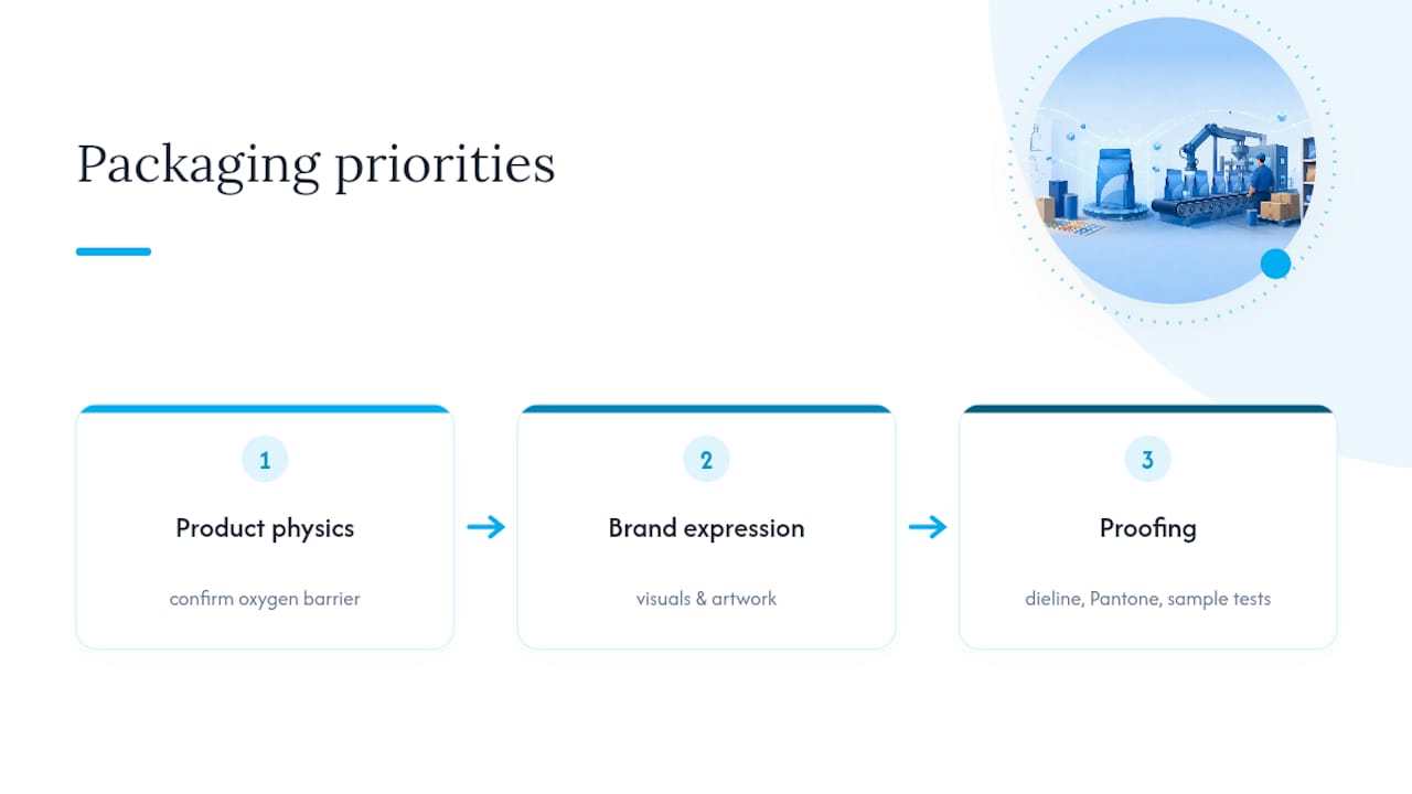
If you’re starting a packaging project, prioritize product physics first, brand expression second, and treat proofing as a design step, not a formality tacked on before printing. That order is the difference between a package that looks good in a pitch deck and one that survives contact with a warehouse, a delivery truck, and a customer’s kitchen counter.
— Alex
Ready to Move From Sketch to Shelf?
Plenty of freelancers and print shops can hand you a pretty label file, but few pair that with the dieline discipline, prepress accuracy, and compliance checking that keeps a food product out of a reprint cycle. Allcitygraphixny runs packaging work through the same discovery-to-production process outlined above: brand strategy first, manufacturer dieline second, physical sample proofing before anything hits a full print run.
That combination matters most for small food and beverage brands that can’t absorb the cost of a failed production run or a missed launch date. If your product needs a package that holds up on a retail shelf, in a Google thumbnail, and inside a shipping box, start with a discovery conversation. Explore Allcitygraphixny’s services or visit the agency’s main site to get a project scoped against your specific format, timeline, and budget.
Sources
- How to design custom packaging for your food brand: A step-by-step guide (JMEI Packing)
- CPG packaging design: The complete guide (Lien Design)
FAQ
What Is the Best Packaging Design for Food?
There’s no single best format. The right choice depends on the product’s shelf-life risk and format: stand-up pouches suit snacks and powders, flat-bottom pouches suit coffee and granola, and rigid boxes suit gift assortments.
What Are the Four C’s of Packaging Design?
Definitions vary across sources, but a common version centers on Clarity, Consistency, Communication, and Convenience: the pack should be easy to read, consistent with the brand across SKUs, clear about what’s inside, and convenient to open, close, and store.
What Are the Seven Basic Steps to Packaging Design?
A reliable sequence runs: define specs and budget, confirm the manufacturer’s dieline, concept within that dieline, complete prepress with vector art and Pantone colors, proof digitally, test physical samples, then move to production with a logistics buffer.
What Are the Packaging Design Trends for 2026?
Sustainable materials like mono-material pouches and PCR films continue gaining ground as buyer expectations shift, alongside packaging systems built to perform equally well on a retail shelf and as a small e-commerce thumbnail.
Should I Design Packaging Myself or Hire an Agency?
DIY tools work for early testing, but a packaging-capable agency like Allcitygraphixny reduces reprint risk by managing dieline accuracy, FDA compliance, and physical sample proofing as part of one connected process.