

Choose colors that match your brand personality, and prioritize saturation and brightness before hue. That single decision, made in the right order, determines whether your palette works: define your personality first, set intensity and lightness ranges, then pick a primary, secondary, and accent color, backed by neutrals for text and backgrounds. Test the result for contrast and real-world legibility before you call it final.
TL;DR:
- Choosing saturation and brightness before hue ensures a cohesive and differentiated palette aligned with the brand’s personality traits.
- Color effects on consumer perception are highly context-dependent, emphasizing the importance of matching saturation and brightness to brand intent rather than relying on fixed hues.
- Most effective palettes use two to four base colors with neutrals, structured under the 60-30-10 rule to maintain visual hierarchy and consistency across channels.
- Precise documentation of color values and clearly defined usage rules prevent shade drift and ensure color consistency in web, print, and digital applications.
- Accessibility standards require contrast ratios of at least 4.5:1 for text and background pairings, and color-blind testing is essential to ensure content remains legible for all users.
Table of Contents
- Step-by-step framework for picking brand colors
- What the research actually says about color and what matters
- Palette structure: how many colors, roles, and the 60-30-10 rule
- Applying colors across channels: web, print, photography, video, product
- Accessibility and contrast: WCAG, contrast ratios, and color-blind checks
- Testing and validating your palette with A/B tests and user feedback
- Creating a practical brand color spec and living style guide
- How All City Graphix applies this process with clients
- Getting hands-on help finalizing your palette
- Primary resources and tools to validate choices
- Sources
- FAQ
Step-by-step framework for picking brand colors
A workable color system follows a sequence, not a mood board. Skipping steps is why so many small business palettes look scattered across a website, a package, and a social feed.
- Define brand personality first. Use traits from the Aaker framework (sincerity, excitement, competence, sophistication, ruggedness) to describe how you want to be perceived, then let color follow that description rather than a generic favorite.
- Decide on category conventions. Look at what colors dominate your competitive category, then choose to either fit in for immediate recognition or deliberately break the pattern to stand out.
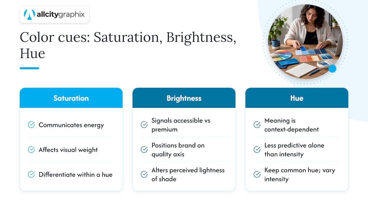
- Lock saturation and brightness before hue. Decide how intense and how light or dark your palette should feel first: a muted, low-saturation range reads calm and premium, while high saturation reads energetic and youthful.
- Choose one primary color, then one secondary and one accent, landing on two to four base colors total.
- Build accessible neutrals. Select text and background pairs that hold up under contrast testing, not just ones that look fine on a designer’s monitor.
- Document everything. Record hex, RGB, and CMYK values, tints and shades, and clear usage rules for each color.
Small teams often skip step three and jump straight to hue, which is why two competitors both wearing blue can look completely different once saturation and lightness are accounted for.
- Personality traits should map to specific color decisions, not just a general feeling.
- Category review prevents an accidental clash with a well-known competitor’s exact palette.
- Documentation is what keeps a freelancer, a print shop, and an intern all using the same shade of blue.
Pro Tip: Pick your saturation and brightness range before you touch a hue wheel: it narrows thousands of options down to a handful that already feel consistent.
What the research actually says about color and what matters
Pop psychology tables claiming “blue means trust” or “red means urgency” oversimplify a body of research that is far more conditional. A peer-reviewed review in Color Psychology: Effects of Perceiving Color on Psychological Functioning in Humans concludes that color effects on cognition and behavior depend heavily on context: the same hue can produce different reactions depending on the product category, the cultural setting, and even the saturation and brightness of the specific shade used.
Color effects on psychological functioning are context-dependent, and researchers caution against assuming a universal meaning for any single hue.
That finding reorders the whole decision process. Instead of asking “what does green mean,” a stronger question is “how saturated and how bright should this color be to fit what we’re selling.” Saturation tends to communicate energy and visual weight, while brightness signals where a brand sits between accessible and premium.
Evidence-based guidance recommends choosing colors that fit the brand’s intended personality, since consistency between color and brand personality predicts consumer preference more reliably than the hue chosen on its own. A muted, low-saturation teal and a bright, high-saturation teal both sit in the “trustworthy blue-green” family, but they signal very different brands: one reads clinical and calm, the other reads modern and approachable. That’s why the framework in the previous section puts saturation and brightness ahead of hue selection: you can keep a hue that’s common in your category and still differentiate meaningfully through intensity and lightness alone.
Palette structure: how many colors, roles, and the 60-30-10 rule
Most workable brand palettes run two to four base colors plus a set of neutrals, a range flexible enough to allow personality while staying simple enough to apply consistently. Shopify’s practical framework for building a palette confirms this pattern: brand palettes typically include several core colors and up to ten secondary or tertiary shades for broader use across marketing materials.
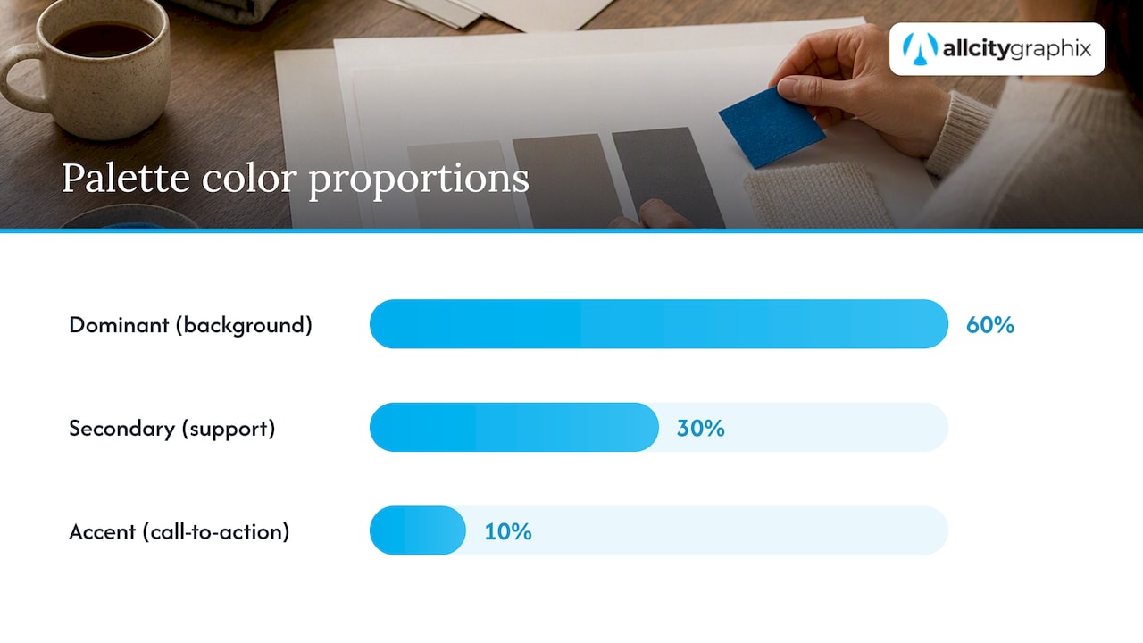
The 60-30-10 rule gives those colors a job. Sixty percent of a layout, page, or space carries your dominant neutral or primary color, usually as a background. Thirty percent goes to a secondary color, often used in supporting graphics, section dividers, or secondary buttons. The remaining ten percent is reserved for an accent color placed on the elements you most want noticed, like a call-to-action button or a highlighted price.
- Backgrounds and large surfaces get the 60% color, almost always a neutral or muted primary.
- Supporting UI elements, icons, and secondary text get the 30% color.
- Buttons, links, and anything meant to grab attention get the 10% accent.
Once the ratios are set, define tints and shades for each base color so you have lighter and darker variants ready for hover states, disabled buttons, and print backgrounds, all while preserving the contrast ratios your text needs to stay legible. Hex drift, where a “brand blue” quietly shifts across a website, a business card, and a social banner because nobody recorded the exact code, is one of the most common and easiest mistakes to prevent.
Pro Tip: Write your exact hex codes into a shared document the day you finalize them: it takes five minutes and prevents months of inconsistent shades.
Applying colors across channels: web, print, photography, video, product
A color that looks right on a screen can shift the moment it’s printed, photographed, or filmed, because digital and physical media use different color models entirely.
- Understand RGB versus CMYK. Screens build color with red, green, and blue light, while print uses cyan, magenta, yellow, and black ink, so a vibrant RGB color often needs a separate CMYK proof to avoid printing duller or shifted than expected.
- Check photography conditions. Props, backgrounds, and lighting all interact with brand colors, so confirm white balance on camera and review sample shots before a full shoot to catch color casts early.
- Grade video within safe ranges. Colors that read fine as a static graphic can appear oversaturated or clipped once compressed into video, so check brand colors against your platform’s broadcast-safe or web-safe color range before finalizing edits.
- Account for material finishes. A matte package finish absorbs light and mutes a color, while a glossy finish intensifies it, so request a physical proof before a full production run.
- Hand developers exact values, not screenshots. Provide hex codes and a defined range of tints and shades for responsive interfaces, so buttons, hover states, and error messages stay on-brand at every screen size.
Skipping the proofing step is the single most common reason a brand’s “signature color” looks different on the storefront sign than it does on the website.
Accessibility and contrast: WCAG, contrast ratios, and color-blind checks
Accessible color choices aren’t optional polish, they determine whether people can actually read your content. The Web Content Accessibility Guidelines (WCAG) 2.2 require a contrast ratio of at least 4.5:1 for normal text and 3:1 for large text, with logotypes specifically exempt from these contrast requirements. That exemption matters for small businesses: your logo can use brand colors freely, but your body copy and buttons cannot.
- Run every text and background pairing through a contrast checker like the WebAIM contrast checker before launch.
- Test palettes against common color vision deficiencies using a simulator, since red-green combinations are a frequent failure point.
- Add a secondary indicator, like an icon or underline, anywhere color alone communicates meaning, such as form errors or status badges.
- Fix low-contrast text by darkening the text color or lightening the background rather than changing the hue entirely.
A brand palette that fails these checks isn’t just an accessibility gap, it’s a usability failure that costs conversions from a meaningful share of visitors.
Testing and validating your palette with A/B tests and user feedback
A finished-looking palette still needs real-world validation before you commit budget to full rollout.
- Start with high-traffic pages. Run an A/B test on your homepage hero section or a single call-to-action button color, tracking click-through rate or conversion rate as the primary metric.
- Keep tests proportional to your traffic. Small businesses with limited visitors should run tests for at least two to four weeks rather than declaring a winner after a few days of noisy data.
- Weigh brand fit against marginal gains. If one color variant nudges a click rate slightly higher but clashes with the personality you defined in step one, the brand-fit choice usually wins over a small short-term lift.
- Add qualitative feedback. A short survey or five-minute conversations with a handful of real customers often surfaces reactions that a click-through number alone won’t explain.
Small teams can run quick tests on landing pages and CTAs without a dedicated research budget, which makes this step realistic even for a one-person operation.
Creating a practical brand color spec and living style guide
Once a palette is validated, it needs to be written down in a form that a designer, a developer, and a print vendor can all use without guessing.
- Record hex, RGB, and CMYK values for every color, plus a Pantone reference if you print regularly; see Thread Color Conversion Explained for practical tips on maintaining color consistency across textile and print production.
- List every tint and shade with its own code, not just “lighter version of primary.”
- Define approved use cases for each color and explicitly note forbidden combinations, like using the accent color as a background.
- Specify file types and color profiles when handing assets to printers or developers, since a missing profile is a common cause of shifted print colors.
- Set a simple approval and versioning process so updates to the palette get distributed to every partner, not just the design team.
| Spec item | What to include | Why it matters |
|---|---|---|
| Hex/RGB/CMYK | Exact codes for every base color and neutral | Prevents shade drift across web, print, and video |
| Tints and shades | Named variants with their own codes | Gives designers ready-made options for hover states and backgrounds |
| Usage rules | Approved and forbidden combinations | Keeps accent colors reserved for their intended purpose |
| File handoff | Correct color profile and file type per vendor | Avoids color shifts between screen and printed materials |
A launch checklist that confirms proofing across the website, packaging, and any printed collateral catches mismatches before customers ever see them. Our guide to building a living brand style guide covers this documentation process in more depth.
How All City Graphix applies this process with clients
A design agency might run this exact sequence with clients: define personality traits early in discovery, lock saturation and brightness before touching a hue wheel, then build and document the palette so it holds up across a website, packaging, and a printed banner. That discovery-led process, paired with direct collaboration between our team and the client’s leadership, is what keeps a palette consistent months after launch rather than drifting shade by shade. If you’re building your own palette, test it the way we do: check contrast, gather real feedback, and revisit the spec before it goes to print.
— Alex
Getting hands-on help finalizing your palette
Working through personality traits, saturation ranges, accessibility checks, and cross-channel proofing takes real time, and for a business launching on a deadline, that time is often the scarcest resource. Some agencies build brand strategy, full color specs, print and digital proofs, and developer-ready handoffs as part of their branding and identity work, so the palette that comes out of discovery is the same one that shows up correctly on a site, packaging, and signage.
Hiring outside help pays off most when you’re launching at scale, can’t afford a visible color mismatch on day one, or simply don’t have the internal hours to run proofing across five different channels.
- We handle brand strategy and palette development from the discovery meeting through final documentation.
- Our team produces print-ready and web-ready proofs so colors hold up across every material.
- We provide developer handoffs so your responsive site uses the exact approved codes, not an approximation.
If that sounds like where you are, visit our services page to talk through your project.
Primary resources and tools to validate choices
For deeper reading and quick checks, the WCAG 2.2 guidelines cover contrast requirements in full, the Annual Reviews piece on color psychology covers the underlying research, and USPTO’s examining guidance explains what’s required to trademark a color. Use the WebAIM contrast checker for fast pairing tests.
Sources
- Color Psychology: Effects of Perceiving Color on Psychological Functioning in Humans | Annual Reviews
- Color Science in Marketing: The Truth (2026) | Deep Marketing
- How To Choose Brand Colors + Real-World Examples (2025) – Shopify
- USPTO examining materials and decisions on color-only marks
FAQ
How do I choose the right colors for my brand?
Start by defining your brand’s personality traits, then set the saturation and brightness range that fits that personality before selecting a specific hue. From there, pick one primary color, add a secondary and an accent, and test the result for contrast and audience response before finalizing it.
What is the color rule for branding?
There’s no single universal rule, since research shows color effects depend on context rather than fixed meanings for each hue. The most consistent guidance is to match color choices to your brand’s intended personality and keep the palette limited to two to four base colors plus neutrals.
What is the 60/30/10 rule for colors?
It gives a palette a clear hierarchy instead of applying every color evenly.
How many brand colors should be chosen?
Most workable palettes use two to four base colors alongside a set of neutrals for text and backgrounds. Shopify’s guidance notes that typical brand systems include at least three core colors, with additional secondary and tertiary shades added for flexibility across materials.
Do brand colors need to meet accessibility standards?
Yes, text and background color pairings should meet WCAG contrast requirements of at least 4.5:1 for normal text and 3:1 for large text, though logotypes are exempt from this rule. Running pairings through a contrast checker before launch catches failures early.