

Pick a typeface family that maps to three to five brand traits, keep your logo wordmark separate from your everyday reading fonts, confirm the license and accessibility basics, then test the pairing on real mockups with a handful of people outside your team. Skipping the testing step is the most common reason brand fonts get replaced within a year. Two things are not optional: accessible text spacing and a license that actually covers how you plan to use the font.
TL;DR:
- Choosing a typeface family with a comprehensive weight range, styles, and language support ensures consistent brand application across multiple touchpoints.
- Pairing fonts with clear contrast, distinct structures, and matching x-heights improves readability and reinforces your brand hierarchy.
- Testing mockups with actual users on their preferred devices helps identify potential legibility issues and misinterpretation of your typography choices.
- Brand typography must meet accessibility guidelines, including proper spacing, high contrast, and scalable units to accommodate diverse audiences.
- Licensing considerations, especially for commercial fonts and web usage, are crucial to avoid expensive legal problems after launching your brand materials.
Table of Contents
- Define your brand traits and map them to type characteristics
- Choose a typeface family, not a single font file
- How to pair fonts and build a typographic hierarchy
- Accessibility and legibility guidelines for brand typography
- Test and validate your font choices with realistic samples
- Where to source fonts and how licensing actually works
- How All City Graphix approaches font selection for clients
- When should you DIY your font choices versus hire a designer?
- Finishing a living brand typography system with All City Graphix
- FAQ
- Sources
Define your brand traits and map them to type characteristics
Before you open a font library, write down three to five adjectives that describe how your brand should feel, and attach a behavior to each one. “Approachable” might mean friendly photography and plain language. “Precise” might mean tight grids and formal copy. Vague traits like “modern” or “trustworthy” are too broad to guide a font decision on their own.
Once you have your traits, match them to type characteristics. A 2023 review that synthesized perceptions of 229 qualities across 635 typefaces and 34 studies found that typeface impressions are measurable but depend heavily on context, so these mappings are starting points, not guarantees.
- Heritage or authority: traditional serif typefaces with moderate contrast
- Modern or efficient: geometric sans serifs with clean, uniform strokes
- Warm or approachable: humanist sans serifs with rounder letterforms
- Playful or distinctive: display fonts, used sparingly and never for body text
Build a small moodboard with logos, packaging, and websites that already express your traits well. Pulling five or six visual references before you shortlist fonts keeps you from choosing something just because it is trending.
Choose a typeface family, not a single font file
A single font file gets you through a logo mockup. A typeface family gets you through years of brand materials: invoices, packaging, app interfaces, social graphics, and everything in between. Practitioner guidance from experienced type directors backs this up, noting that choosing a family over a single file gives a brand the weights, styles, and glyph coverage it needs as it grows.
Before committing, check the family against a short list:
- Weight range: does it include light, regular, bold, and ideally a few steps between?
- Italics and styles: are true italics available, or only a slanted regular?
- Language and glyph support: does it cover the characters your markets need?
- File formats: is it available in OTF for print and WOFF2 for the web?
- Variable font option: one file that adjusts weight and width without multiple downloads?
Pro Tip: Commission a custom wordmark only when your logo needs a shape no existing typeface offers. For everything else, a well-chosen system or library family saves money and still reads distinctly.
How to pair fonts and build a typographic hierarchy
Good pairings create contrast on purpose instead of by accident. Pick fonts that differ clearly in structure, such as a serif headline with a sans body, rather than two sans serifs that look like near-duplicates. Match x-heights so the pairing feels intentional rather than mismatched, and reserve any display or accent font for short bursts like pull quotes or buttons.
- Pick a headline font with enough personality to set tone at large sizes.
- Pick a body font optimized for small sizes and long reading, usually a plainer sans or serif.
- Add one accent font at most, used only for labels, tags, or callouts.
- Set your scale: headlines around 32 to 48 pixels, body text around 16 to 18 pixels, captions around 12 to 14 pixels.
- Test it in context: build a simple header, a paragraph of body copy, and a button, then check whether the hierarchy reads at a glance.
If you have to study the mockup to figure out what to read first, the hierarchy needs more contrast, not more fonts.
Accessibility and legibility guidelines for brand typography
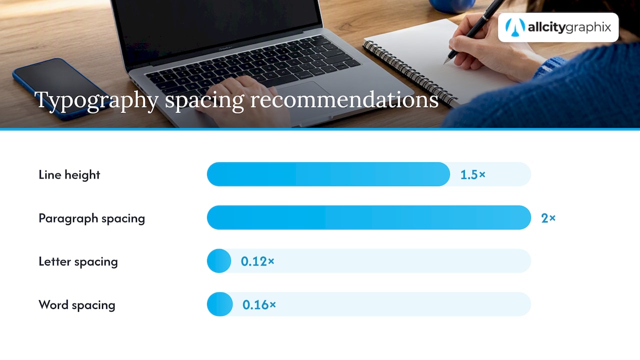
Fonts that look great in a mockup can still fail readers who need more spacing or higher contrast. The W3C’s guidance on text spacing recommends line height of at least 1.5 times the font size, paragraph spacing of at least twice the font size, letter spacing of at least 0.12 times the font size, and word spacing of at least 0.16 times the font size.
A 2025 systematic review of 42 empirical studies on typeface legibility found no significant legibility advantage for serif fonts over sans serif fonts, which means the serif-versus-sans debate matters less than spacing, size, and contrast in practice.
- Use relative units like
emorreminstead of fixed pixels so text resizes with user settings. - Keep contrast high between text and background, especially for body copy.
- Scale type for mobile rather than shrinking your desktop sizes to fit.
- Consider a variable font, which lets you fine-tune weight and width without loading extra files, supporting more flexible, accessible layouts.
Test and validate your font choices with realistic samples
A font that looks right in isolation can fail once it meets real content. Build mockups that mirror actual use: a small-scale logo lockup, the full wordmark, a website header, a product label if you sell physical goods, and a social media post.
- Assemble five to ten representative people, ideally a mix of existing customers and people unfamiliar with your brand.
- Give them simple tasks, like reading a sample paragraph aloud or picking out a headline from a cluttered layout.
- Ask perception questions, such as what three words come to mind when they see the logo.
- Record exact observations, not summaries, so you can spot patterns across responses.
- Discard a candidate if people consistently misread it, if it signals the wrong personality, or if it is missing glyphs your content needs.
A 2025 systematic review recommends context-specific testing with the actual audience rather than relying on generic legibility rules, which is exactly what this kind of small-sample test gives you.
Pro Tip: Run the test on the device your audience actually uses. A font that reads fine on a laptop can behave very differently on a phone screen.
Where to source fonts and how licensing actually works
Licensing mistakes are expensive to fix after launch, so check this before you fall in love with a typeface. Google Fonts developer documentation explains that families and styles are requested through stylesheet URLs, and it also warns that loading too many families or styles can slow down your site.
- Open Font License (OFL) fonts, including most of the Google Fonts library, are free to use commercially, but check for Reserved Font Names, which restrict how you can rename or redistribute modified versions, as explained in Google’s own licensing guide.
- Commercial fonts usually require a license tied to usage type: desktop, web embedding, or app embedding each may need separate terms.
- Custom typefaces make sense when budget allows and your brand needs letterforms no existing family offers.
- Always confirm web licensing covers the number of page views or domains you expect, since some foundries price by traffic tier.
How All City Graphix approaches font selection for clients
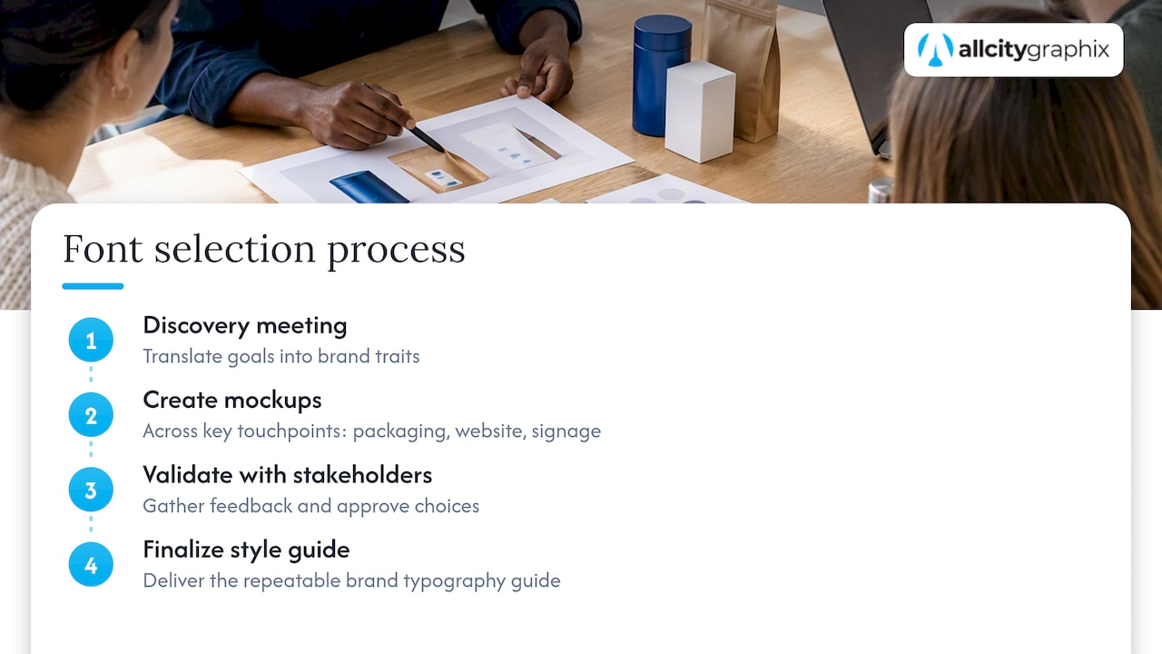
Our process at All City Graphix starts with a discovery meeting where we translate a client’s goals into concrete brand traits before any typeface gets considered. From there, we build mockups across the touchpoints that matter most to that business, whether that is packaging, a website, or event signage, and validate choices with stakeholders before finalizing a style guide. We have refined this discovery-led approach into a repeatable process rather than a one-off creative exercise.
When should you DIY your font choices versus hire a designer?
DIY works well for a simple scope: a single logo, a basic website, and tight budget. Hiring makes more sense once you are managing packaging, multiple product lines, or legal constraints across many touchpoints. If you do hire, ask for file formats, full weight ranges, licensing notes, and a usage guide as standard deliverables before accepting a proposal.
— Alex
Finishing a living brand typography system with All City Graphix
If the trait-mapping, pairing, and testing steps above feel like more than you want to manage alongside running a business, that is exactly the gap our process is built to close. We combine brand strategy, logo design, and web design into one discovery-led engagement, so your font choices get built into a full identity system.
A typical engagement starts with a discovery meeting to define your brand traits, moves through mockups across your key touchpoints, includes a round of stakeholder or audience validation, and ends with a handoff of your files, weights, and usage guidelines to the client. Rather than leaving you to document everything yourself, we package the outcome into a brand style guide you and your team can reference for years. If you are ready to move from shortlisting fonts to a finished system, visit our services page to start a conversation about your project.
FAQ
What are the best fonts for branding a small business?
There is no single best font for every brand, since a 2023 review found typeface impressions depend heavily on context rather than following universal rules. The better approach is matching a typeface family to your specific brand traits and testing it with your actual audience.
How many fonts should a brand use?
Most brand systems work well with two fonts: one for headlines and one for body text, plus an optional third accent font used sparingly for labels or callouts. Using more than three fonts usually weakens hierarchy and makes materials feel inconsistent across touchpoints.
Are serif fonts more legible than sans serif fonts?
No. A 2025 systematic review of 42 empirical studies concluded that serifs show no significant legibility advantage over sans serif fonts, and recommends testing with your actual audience and content instead of relying on that assumption.
Can I use Google Fonts for my brand’s logo and website?
Yes. Google Fonts families are released under the Open Font License, which generally allows commercial use, though Google’s licensing guide notes that some fonts carry Reserved Font Name restrictions on renaming or redistribution. Check the specific family’s license file before using it in a logo you plan to trademark.
What accessibility settings matter most for brand typography?
The W3C recommends line height of at least 1.5 times the font size, paragraph spacing of at least twice the font size, letter spacing of at least 0.12 times the font size, and word spacing of at least 0.16 times the font size, according to its text spacing guidance. Building these values into your CSS from the start keeps your brand typography usable for people relying on assistive technology.
Sources
Choosing brand fonts goes faster with a clear sequence instead of endless browsing. Here is the order that keeps the process moving without skipping the checks that matter.
- The Perception of Qualities in Typeface | Visible Language
- Understanding Success Criterion 1.4.12: Text Spacing | WAI | W3C
- Get started with the Google Fonts API | Google for Developers
For research and inspiration, sites like Fonts in Use and Typewolf show real-world applications of typefaces, while the Google Fonts library remains a practical starting point for free, well-supported families. Professional type foundries are worth exploring once your brand needs something more distinctive than a library font.
Your mini deliverable at the end of this process should be a one-page brand-typography spec: the family name, weights used, font sizes for headline and body text, line-height and spacing values, and a note on the license type. Handing this to a designer or developer up front avoids guesswork later, and a brand style guide is a natural place to formalize it alongside your color palette and logo rules. For teams documenting typography choices across departments, external examples like NEXTmsp’s brand guidelines show how this kind of spec gets shared and maintained.