

The single rule that governs good email newsletter design is this: build for mobile first, keep everything in one column, and give the reader exactly one clear action to take. Set your content width to roughly 600 to 700 pixels, keep body text comfortably readable at 16 pixels or larger, and stop there. The templates and checklists below turn that rule into something you can build today.
TL;DR:
- Keeping email content container between 600-700 pixels ensures consistent rendering across all major email clients and mobile devices.
- Use a single-column layout with clear hierarchy, large headings, and sufficient line spacing to enhance scanability and user experience.
- Place the main call to action as the only button, at least 44×44 pixels, and use live text instead of images for essential copy and links.
- Ensure all images have descriptive alt text, keep total email size under 102 KB, and test with preview tools on multiple platforms to prevent clipping and broken layouts.
- Follow accessibility standards by maintaining adequate contrast, using semantic HTML structure, and preparing dark mode-compatible assets to maximize reach and compliance.
Table of Contents
- What Should an Email Newsletter Design Checklist Cover?
- How Do You Build Visual Hierarchy Into a Newsletter?
- Why Does Single-Column Layout Win for Email?
- How Should You Handle Images and CTAs in a Newsletter?
- What Belongs on an Accessibility and Dark Mode Checklist?
- What’s the Right Way to Test a Newsletter Before Sending?
- What Are Good Starter Templates for a Newsletter?
- [Newsletter projects typically start with a discovery meeting to identify the audience and the newsletter’s purpose, whether relationship building, curation, or sales, or to assist with issues like payroll outsourcing for small business compliance. A template is built first instead of designing each issue from scratch, enabling faster production and cleaner QA. After launch, monitoring performance helps determine if ongoing support is needed to keep issues consistent as the subscriber list grows.](#newsletter-projects-typically-start-with-a-discovery-meeting-to-identify-the-audience-and-the-newsletters-purpose-whether-relationship-building-curation-or-sales-or-to-assist-with-issues-like-payroll-outsourcing-for-small-businesshttpsinfinitybenefitsgrpcompayroll-outsourcing-for-small-business-compliance-a-template-is-built-first-instead-of-designing-each-issue-from-scratch-enabling-faster-production-and-cleaner-qa-after-launch-monitoring-performance-helps-determine-if-ongoing-support-is-needed-to-keep-issues-consistent-as-the-subscriber-list-grows)
- Get Help Designing a Newsletter That Actually Converts
- Sources
- FAQ
What Should an Email Newsletter Design Checklist Cover?
Run through this before you hit send. It catches most of the mistakes that tank engagement or land you in a spam folder.
- Width: keep the content container between 600–700px so it renders cleanly across Outlook, Gmail, and mobile clients.
- Body font: 16px minimum. Anything smaller forces a pinch-to-zoom, and most readers won’t bother.
- CTA size: buttons at least 44×44 pixels, since that’s the accepted minimum for a comfortable thumb tap.
- Alt text: every image gets a description, no exceptions.
- File size: keep the whole email lean; more on the exact numbers below.
Once the checklist is handled, pick a structure. Three archetypes cover most business use cases, and each solves a different reader job. The Letter format is a single essay from one voice, built for relationship and trust. The Digest curates links and short summaries, built for people who want a scan, not a read. The Storefront leads with products and a shopping CTA, built for conversion. Pick the one that matches why people subscribed, then build a template around it instead of starting from a blank canvas every issue.
How Do You Build Visual Hierarchy Into a Newsletter?
Hierarchy means the reader’s eye lands on the right thing first without you having to explain anything. Put your lead story or offer at the top, in the largest type on the page, and keep the same section order issue after issue so returning readers know where to look.
Headings should be larger than body copy at 16 pixels or above, in a size range that clearly establishes hierarchy. That gap is what lets someone scan a newsletter in three seconds and still walk away knowing what it’s about. Line height matters just as much as size: set it between 1.4 and 1.6 for body text, since tighter spacing makes paragraphs feel dense and readers bail before finishing a sentence.
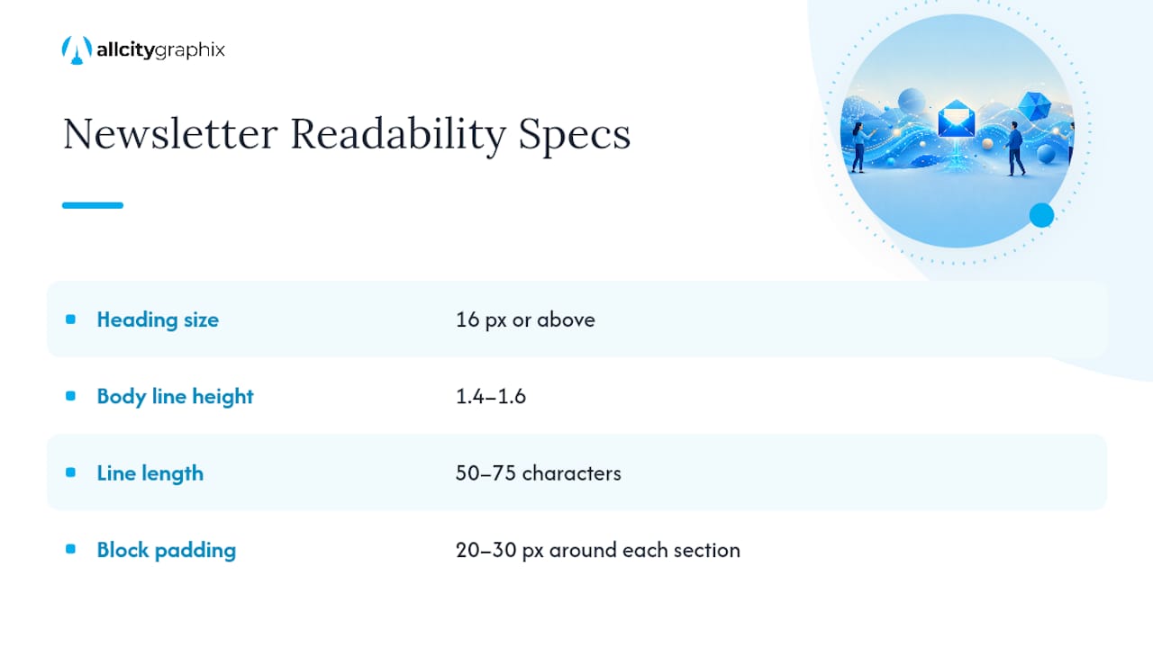
Line length affects the same thing. At a 600px container width, you naturally land on a comfortable line length, roughly 50 to 75 characters, without extra CSS work. Give sections breathing room with consistent padding, usually 20 to 30 pixels around each block, so the layout reads as a series of distinct chunks rather than one long scroll of text. Readers skim newsletters the way they skim a menu: headings first, then whatever heading caught their eye. Design for that behavior instead of fighting it.
Why Does Single-Column Layout Win for Email?
Single-column, roughly 600px wide, is the default for a reason: it’s the layout that survives contact with every major email client without breaking. Go above 720px and Outlook clips the message, hiding everything past that point behind a “view entire message” link that most people never click.
Multi-column layouts have their place, but only in small doses. A row of two or three product tiles inside a Storefront newsletter works fine, as long as it stacks cleanly into a single column on mobile screens. What doesn’t work is running multi-column body copy. Fractured paragraphs across two columns force the reader’s eye to jump in ways that feel disorienting on a phone screen, and a single stacked column reflows reliably no matter the device.
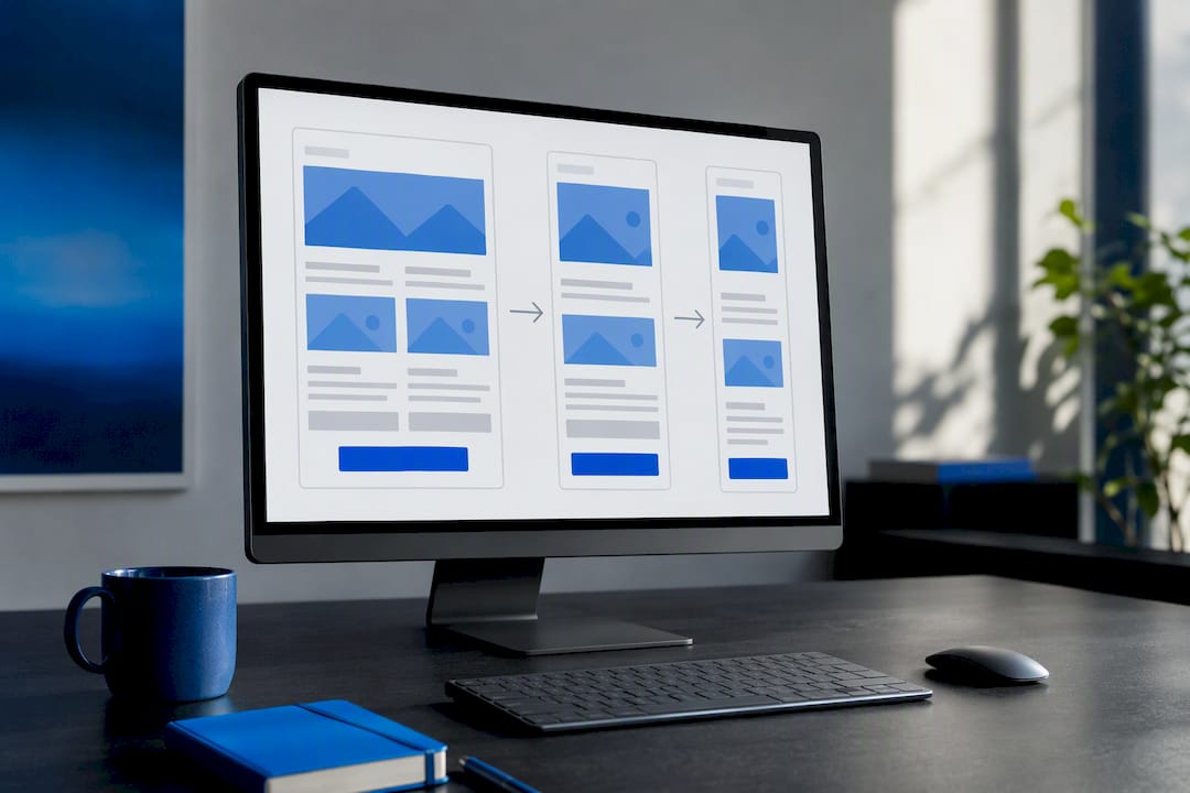
On the technical side, build with table-based containers and inline CSS rather than relying on modern layout properties like flexbox or grid. Email clients, especially Outlook’s desktop rendering engine, still use Microsoft Word’s rendering behavior under the hood, and that engine ignores most contemporary CSS. Structure your tables so the stacking order makes sense top to bottom, since that’s the order a mobile client will actually render regardless of how the desktop version looks.
How Should You Handle Images and CTAs in a Newsletter?
Never put essential copy or your call to action inside an image. Image blocking is common enough across email clients that a newsletter relying on image text can arrive looking mostly blank, with the reader having no idea what you were trying to say.
Every image needs descriptive alt text, both for accessibility and as a fallback when images don’t load. For hero images, prepare artwork at double the display size, around 1,200px wide, then render it down to 600px. That gives you sharpness on retina screens without bloating file size.
- Keep individual images under 100 KB where possible.
- Target a total email size under 102 KB of HTML for the fastest load and to avoid Gmail’s clipping point, which cuts off messages beyond roughly 102 KB and hides the remainder behind a “view entire message” link.
- Write CTA button copy as a short action verb: “Shop Now,” “Read More,” “Get Started.”
- Size every button at least 44×44 pixels, and leave real space between adjacent tap targets so mobile thumbs don’t misfire.
One CTA per email, stated plainly in live text, beats three competing buttons every time.
What Belongs on an Accessibility and Dark Mode Checklist?
Run this list before every send, not just for the redesign launch:
- Meet WCAG AA contrast of 4.5:1 for body text against its background.
- Use real heading tags in your HTML structure so screen readers can navigate the message logically.
- Write link text that describes the destination (“See the full report”) instead of “click here.”
- Add
role="presentation"to layout tables so screen readers skip over structural markup that carries no content. - Include alt text on every image and offer a plain-text version of the email as a fallback.
Dark mode adds its own wrinkle. Some clients invert colors automatically, which can wreck a logo that was designed on a white background or turn a subtle brand color into something illegible. Testing and preparing image swaps for dark themes prevents that, and adding a thin outline or stroke to logo files keeps them visible no matter which background they land on.
Pro Tip: Dark mode can genuinely hurt accessibility if you don’t test for it. A color combination that passes contrast checks in light mode can fail once a client auto-inverts your palette, so check both states before you approve final artwork.
What’s the Right Way to Test a Newsletter Before Sending?
QA isn’t a final step you tack on before hitting send. It starts at template design, because catching a rendering flaw in your base template saves you from repeating it in every future issue.
- Review the design against your checklist: width, font sizes, contrast, CTA sizing.
- Build the code and check it renders correctly in a raw HTML preview before adding content.
- Run pre-send previews across major clients (Outlook, Gmail, Apple Mail, and key mobile apps) using a testing tool like Litmus to catch rendering breaks, clipped content, and broken links.
- Run a spam test and an accessibility scan on the final build.
- After sending, watch for rendering complaints or unusual drops in open and click rates that might signal a client-specific problem.
Skipping step three is the most common shortcut, and it’s the one that produces the ugliest surprises.
What Are Good Starter Templates for a Newsletter?
Each archetype needs only a handful of blocks to function. Build the content map once, then reuse it every issue.
- Letter: header with logo, one lead essay block, a single CTA, footer with unsubscribe link and physical address.
- Digest: header, three to five curated link blocks with short summaries, one CTA per top item, footer.
- Storefront: header, one hero product or offer, a small grid of secondary products, one dominant CTA, footer.
Name retina image assets clearly (hero@2x.png) so anyone touching the template later knows which file is which. Always generate a plain-text alternative alongside the HTML version, since some clients and spam filters still favor it. Reusing the same structural template issue after issue is what actually builds subscriber habit and makes QA faster every single time, because you’re checking known blocks instead of a new layout from scratch.
Newsletter projects typically start with a discovery meeting to identify the audience and the newsletter’s purpose, whether relationship building, curation, or sales, or to assist with issues like payroll outsourcing for small business compliance. A template is built first instead of designing each issue from scratch, enabling faster production and cleaner QA. After launch, monitoring performance helps determine if ongoing support is needed to keep issues consistent as the subscriber list grows.
— Alex
Get Help Designing a Newsletter That Actually Converts
All City Graphix is the alternative to guessing your way through a template builder: instead of trial-and-error with drag-and-drop tools, you get a newsletter system built around your brand from the start, with the structure and QA process already worked out. Our team handles graphic design for the template itself, ties it into your broader digital strategy, and can extend the same thinking to your website content strategy so your newsletter and site are saying the same thing.
If your list has outgrown a generic template, or you’ve never had one built properly in the first place, the next step is simple: reach out through our services page and book a discovery conversation. We’ll talk through what your newsletter needs to do, and whether a one-time template build or an ongoing retainer makes more sense for your production pace.
Sources
Every commercial email needs a physical postal address and a working opt-out link to meet CAN-SPAM requirements. For deeper reference, Litmus covers accessible email code, dark mode handling, and client testing workflows, while Email on Acid explains image blocking in more detail.
- The ultimate guide to dark mode for email marketers
- Image blocking (Email on Acid glossary)
- Top 10 Email Marketing Trends in 2026
FAQ
How Do You Design a Good Email Newsletter?
Start with a single-column layout at 600–700px wide, use body text at 16px or larger, and give the reader one clear call to action. Pick a repeatable structure, whether that’s a Letter, Digest, or Storefront format, and keep it consistent issue after issue so rendering and QA stay predictable.
Are Newsletters Still Relevant in 2026?
Yes. Mobile-first design and preference-based subscriber options are active trends, which points to newsletters that adapt to how and what individual readers actually want to receive, according to email marketing trend research.
How Do You Create an Email That Looks Like a Newsletter?
Use a masthead-style header with your logo and issue date, break content into clearly labeled sections instead of one continuous block, and keep a consistent template from issue to issue. That repetition, paired with a single dominant CTA, is what visually signals “newsletter” rather than “one-off promotional email.”
What Are the Basic Rules for Laying Out a Newsletter?
Keep it single-column at roughly 600px wide, use readable type at 16px body with larger headings, and never bury essential copy or your CTA inside an image. Add descriptive alt text to every image, meet WCAG AA contrast standards, and test rendering across major clients before sending. A business building this out for the first time can also get a template built by a design team rather than starting from a blank builder.