

Use a landing page when you need one focused, measurable conversion for a campaign: a lead magnet, a product launch, a paid ad click-through. Use a website when you need an ongoing hub for discovery, multiple user journeys, and long-term search visibility. Most growing businesses eventually need both, with campaign landing pages living alongside a broader site.
TL;DR:
- Sending paid clicks to a homepage weakens message match and attribution; if no dedicated page is ready, remove navigation and add a matching hero.
- On landing pages, use one call to action, a headline that leads with the benefit, only essential form fields, and social proof beside the button.
- Baymard reports focused checkout changes raise conversions about 35% on average for large e commerce sites, a benchmark rather than a landing page guarantee.
- A full product catalog, ongoing SEO, or considered purchase needs service pages, case studies, reviews, and navigation that a single campaign page cannot provide.
Table of Contents
- Website, Homepage, and Landing Page: What Each One Actually Is
- The Trade-Offs That Actually Decide Your Build
- When a Landing Page Wins, and When a Website Does
- Why Your Homepage Can’t Double as a Campaign Landing Page
- Landing Page Tactics That Actually Lift Conversions
- Building a Website That Supports Discovery and Conversion
- A Quick Checklist to Decide This Week
- Why This Advice Comes From Practice, Not Theory
- Get a Landing Page or Website Built Right the First Time
- FAQ
- Sources
Website, Homepage, and Landing Page: What Each One Actually Is
The terms get used loosely, so it helps to separate them before deciding which one solves your problem.
A website is a multi-page hub built to serve many visitors with many different intents: someone researching your services, a returning customer checking hours, a journalist looking for a press contact. It includes navigation, several content sections, and often a blog, product catalog, or service pages that get indexed and found over time.
The homepage is the front door of that website. Its job, according to Nielsen Norman Group’s homepage usability guidelines, is to orient a visitor fast: what this business does, why it matters to them, and where to click next.
A landing page is different by design. It is built for one campaign and one outcome, often with no main navigation at all, so a visitor who arrives from an ad or email has nowhere to go except toward the offer.
Typical elements line up like this:
- Website: main navigation, homepage, service or product pages, blog, footer with contact and legal links.
- Homepage: hero section, brief value statement, links into deeper site sections, trust signals like logos or testimonials.
- Landing page: single headline tied to the offer, one call to action, a short form, social proof near the button, and a dedicated thank-you page after conversion.
The Trade-Offs That Actually Decide Your Build
Once you know what each option is, the real decision comes down to five practical differences.
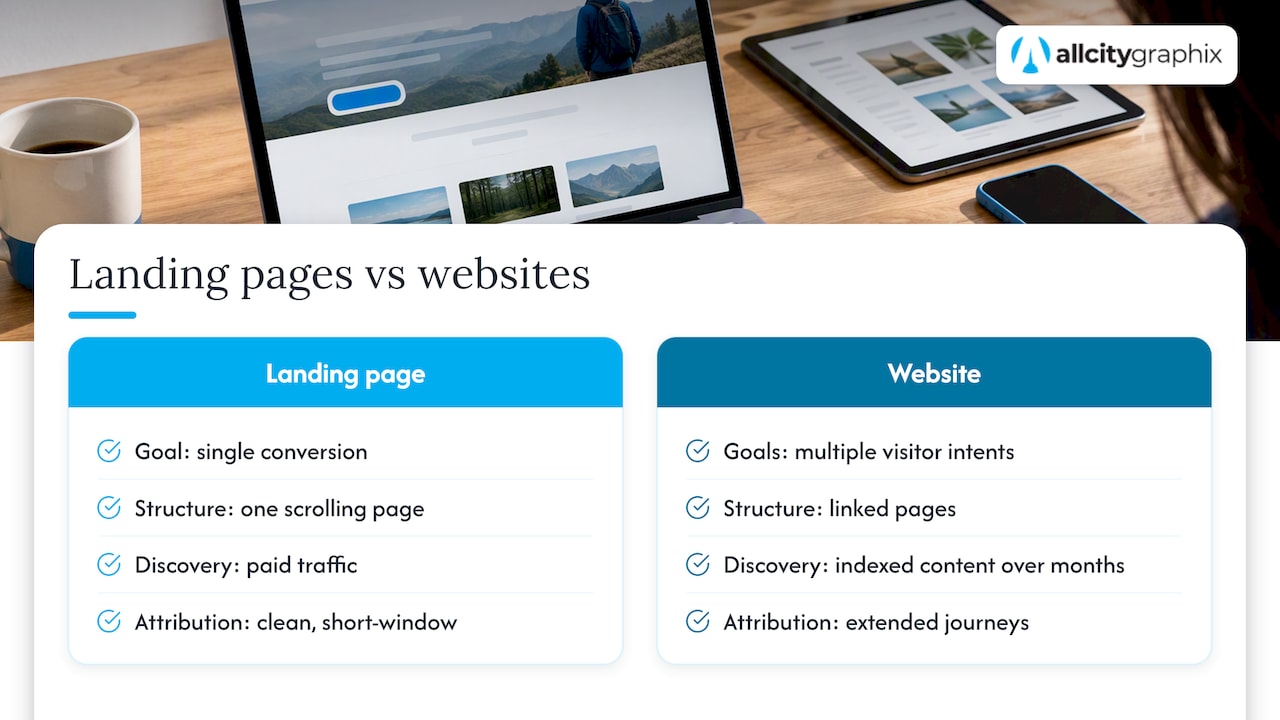
Goal orientation. A landing page is built around a single conversion: download, signup, purchase. A website carries multiple goals at once, letting one visitor read your blog while another checks pricing and a third books a call.
Structure. Landing pages are typically one scrolling page with no distracting links. Websites span many pages connected by internal navigation, which supports research-heavy buying decisions but also gives visitors more ways to leave before converting.
Discoverability. Landing pages are usually found through paid traffic (search ads, social ads, email), not organic search, since they lack the depth and internal linking that search engines reward. Websites build discoverability over months through indexed pages, backlinks, and content that answers search queries directly.
Measurement and attribution. Landing pages are built for clean attribution: one offer, one UTM-tagged source, one conversion event, and a short attribution window that ties directly back to ad spend. Website conversions are messier to attribute since a visitor might read blog posts over an extended period before filling out a contact form.
Performance and maintenance. A landing page’s limited scope makes it faster to load and easier to optimize since there is less to test. A full website carries more ongoing maintenance, from broken links to outdated service pages to plugin updates, but it also compounds in value as content accumulates.
Baymard Institute’s checkout research shows how much performance details affect conversion: focused design changes to checkout flows alone can raise conversion by about 35% on average for large e-commerce sites, which is a useful benchmark for how much friction in a single flow (whether checkout or a landing page form) can cost you, according to Baymard’s checkout usability research.
That single data point explains why landing pages exist as a category at all: when one flow carries all the weight of a campaign, every field, click, and second of load time matters more than it would on a page buried deep within a website.
When a Landing Page Wins, and When a Website Does
Matching the tool to the job stops a lot of wasted budget. Here is how to think about it by scenario.
- Paid ad campaigns need a landing page. A visitor who clicks a Google or Meta ad expects a page that mirrors the ad’s promise exactly, with no detour through a navigation menu.
- Product launches benefit from a dedicated landing page, especially when you want to measure demand before building out full product pages on your site.
- Gated content (ebooks, templates, webinars) works best behind a landing page with a short form, since the entire point is capturing one piece of contact information in exchange for one asset.
- Event registration is a landing page use case almost by default: one date, one action, one confirmation.
- Full product catalogs need a website. A landing page is not suited to a large product catalog with filtering, search, and category pages.
- Ongoing content strategy and SEO require a website, since search engines need many indexed, interlinked pages to understand your topical authority.
- Service listings for local or professional businesses belong on a website, where visitors can compare offerings, read about your process, and find contact details without re-entering from a new ad each time.
- Trust building for considered purchases (legal services, home renovation, B2B software) happens over a website visit, not a single-page pitch, because buyers want to see case studies, team bios, and reviews before committing.
The two also combine well: a campaign landing page can live as a standalone URL while still linking back to your main site for visitors who want more context, or a major product launch might justify a temporary microsite that later folds into the permanent site structure. As a rule of thumb, short timelines and ad-driven traffic point toward a landing page first; longer sales cycles and organic or referral traffic point toward investing in the site itself.
Why Your Homepage Can’t Double as a Campaign Landing Page
A common mistake is sending paid traffic straight to the homepage instead of a dedicated landing page. It rarely works as well.
Your homepage exists to orient many different visitors at once, which NN/g’s cognitive load guidance warns against turning into a dumping ground that tries to serve every audience with every message. That same breadth that makes a homepage useful for general visitors dilutes it for campaign traffic:
- The call to action competes with a full navigation menu, so visitors wander instead of converting.
- Messaging is written for a general audience, not the specific offer that brought someone in from an ad.
- There is no way to track whether a homepage visit resulted from your campaign versus organic search or a bookmark.
If building a dedicated landing page isn’t feasible right away, a few lighter fixes help: swap in a temporary hero section that matches the campaign message, add a campaign-specific banner above the fold, or stand up a simplified one-section landing page that borrows your site’s branding without its full navigation.
Pro Tip: If you only have time for one fix before a campaign launches, remove the main navigation from whatever page you send ad traffic to. Fewer exits usually means more conversions.
Landing Page Tactics That Actually Lift Conversions
Once you’ve committed to building a landing page, a handful of tactics consistently move the needle.
Start with a single, visible call to action and a benefit-first headline that states the outcome, not the feature. A visitor should understand what they get quickly after landing.
Keep forms short. Ask only for the fields you need right now, and consider progressive profiling (collecting more detail on a second interaction) instead of front-loading every question. Baymard’s checkout research found that focused, specific design and microcopy changes to forms are often what drives the roughly 35% conversion improvement mentioned above, according to checkout usability benchmarking, the same principle that applies to landing page forms even outside of checkout flows.
Other practices worth building into every page:
- Place social proof (logos, testimonials, review counts) close to the CTA, not buried at the bottom.
- Design for mobile first and test page speed, since a slow load on mobile costs conversions before a visitor even sees your offer, as explained in this guide to Mobile First Facebook Ads Landing Pages for DTC That Pass Pixel & CAPI.
- Run A/B tests on headline, CTA copy, and form length rather than guessing which version performs better.
- Instrument every page with UTMs and conversion pixels so you can attribute results back to the specific campaign.
- Build a dedicated thank-you page with a clear second step, whether that’s a calendar link, a download, or a related offer.
Our step-by-step landing page design guide walks through building each of these elements in sequence, and our CTA design templates cover specific wording and placement patterns that tend to outperform generic buttons like “Submit.”
Pro Tip: Test your form length before you test your headline. A shorter form may produce a bigger swing in conversion than a copy change.
Building a Website That Supports Discovery and Conversion
A website earns its keep differently than a landing page does: through structure that helps people find what they need and content that keeps bringing new visitors in over time.
Your homepage should answer three questions fast, per NN/g’s homepage guidelines: what this business is, why a visitor should care, and where to go next. If a first-time visitor can’t answer all three within a few seconds, the homepage needs revision before anything else.
Beyond the homepage, dedicated service or product pages tied to your core offerings do double duty: they give paid campaigns a relevant landing destination when appropriate, and they build the topical depth that search engines reward with organic rankings.
A few structural habits keep a website working for conversions instead of against them:
- Design navigation and footer links to support exploration without pulling visitors away from a page’s primary action.
- Group related content into pillars (by service, by audience, or by industry) so visitors and search engines can see how pages connect.
- Keep a regular content and analytics cadence, reviewing which pages earn traffic and which need updates, rather than publishing once and walking away.
Our practical website content strategy guide goes deeper on planning that content cadence, and our homepage design best practices post covers hero sections and CTA placement in more detail.
A Quick Checklist to Decide This Week
If you’re still unsure which to build first, this short exercise usually settles it.
- Define your primary goal. One conversion event (a signup, a sale) points toward a landing page; multiple goals across different visitor types point toward a website.
- List your traffic sources. Paid ads and email campaigns favor a landing page; organic search, referrals, and word of mouth favor a website.
- Estimate your timeline and budget. A landing page can launch in days; a full website build takes longer and costs more to maintain.
- Assess your content needs. A single offer with a short pitch fits a landing page; a catalog, service menu, or ongoing blog needs a website.
- Plan your measurement approach. If you need one clean conversion number per campaign, build a landing page; if you need to track behavior across many pages and visits, build a website analytics plan instead.
Score your answers simply: if most of your answers point toward one option, that’s your starting build.
- Mostly landing page signals: launch a focused page first, tied to one campaign, and expand later if the offer proves out.
- Mostly website signals: invest in site structure and content before running paid traffic to it.
- Split evenly: build both, starting with a landing page for your next campaign while planning the website in parallel.
Whichever outcome you land on, the immediate next step is the same: write down the one action you want a visitor to take, then build backward from that action rather than starting with design.
Why This Advice Comes From Practice, Not Theory
This guidance reflects hands-on branding, web design, and digital marketing work. Readers looking for more detail on specific fixes can review our conversion-focused web design sprint guide for quick wins, or our landing page design walkthrough for a full build process. If you’ve tried the checklist above and still aren’t confident in the structure, scope, or copy, that’s usually the point where bringing in an agency pays for itself.
— Alex
Get a Landing Page or Website Built Right the First Time
We build landing pages and full websites, starting with a discovery conversation about your goals, traffic sources, and timeline rather than a one-size-fits-all template. Our web design work pairs with brand strategy so the page you launch actually sounds and looks like your business, not a generic template with your logo dropped in.
If you want a second opinion on whether your next project should be a landing page, a website, or both, visit our web design services page to start a conversation or request a portfolio review.
FAQ
Do I need a website if I have a landing page?
A landing page can work on its own for a short-term campaign, but most businesses still need a website for ongoing discovery, trust building, and organic search visibility. If you only have a landing page, visitors who want more information before converting have nowhere else to go.
Can a landing page be a website?
A landing page is typically one page of a broader site, not a replacement for it, though a very small business can start with a single landing page as its only web presence. Over time, most businesses expand into a full website as they add services, content, or products.
Are landing pages still relevant?
Yes, landing pages remain one of the most reliable tools for paid campaigns and product launches because they isolate a single offer and a single conversion action. Platform guidance like Kajabi’s comparison of landing pages and websites confirms this distinction still holds: landing pages serve single-purpose campaigns while websites serve broader, ongoing visitor needs.
How do I create a landing page?
Start with one clear goal, write a benefit-first headline, and build a short form that asks only for essential information. From there, add social proof near your call to action, test the page on mobile, and instrument it with UTMs so you can measure exactly how the campaign performs, as outlined in our landing page design guide.
Sources
- Reasons for Cart Abandonment – Why 70% of Do So – Baymard
- 113 Design Guidelines for Homepage Usability (Jakob Nielsen) – NN/G