
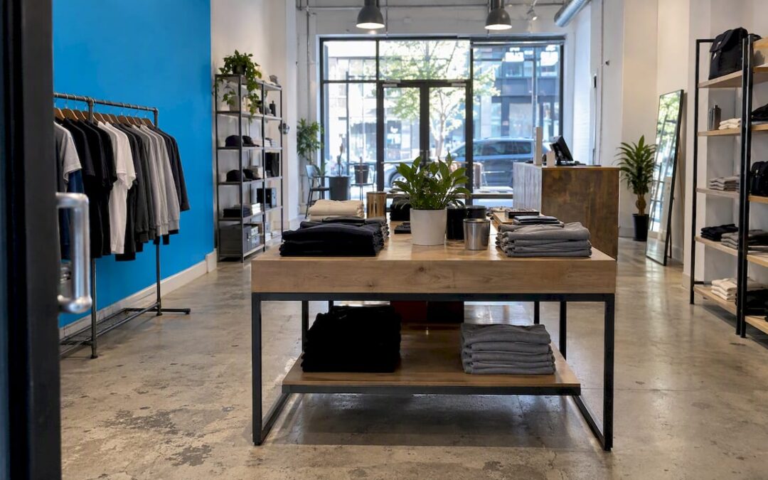
A good pop-up shop design does three things in a space you may only hold for days or weeks. It stops people on the sidewalk, it makes your brand understandable in a few seconds, and it moves visitors through the space toward a purchase, a signup or a conversation. Everything below, from the floor plan to the lighting to the signage, is a way of serving those three jobs on a tight budget and a short clock.
TL;DR
- Decide what the pop-up is for (sales, awareness, testing a market, clearing inventory) before you pick a single fixture. Every design choice should serve that goal.
- Plan the floor for peak traffic, not the average hour. Keep entrances, checkout and your best display free of pinch points.
- Give each sightline one hero display, layer your lighting, and let branded exterior signage do the work of drawing people in.
- Build accessibility into the plan from day one: accessible route, reachable counters and an accessible checkout.
- Spend on what customers see first (facade, hero display, lighting) and keep everything else modular, reusable and light.
Table of Contents
- Start with the goal, not the decor
- Translate your brand into a physical space
- Choose a layout that guides people
- Build displays with one clear hero
- Light and color do more than you think
- Design the facade and signage first
- Make it accessible and safe from the start
- Budget the design, not just the rent
- Measure and adjust while it is open
- Our perspective
- Bring in a design partner
- FAQ
- Sources
Start with the goal, not the decor
The most common pop-up mistake is designing a pretty room with no job to do. Research on pop-up retail from Toronto Metropolitan University’s open textbook notes that design priorities depend on the pop-up’s purpose, whether that is marketing, entering a new market or selling through inventory. Those goals pull the design in different directions.
| Goal | What the design should prioritize | What to cut |
|---|---|---|
| Sell inventory | Easy browsing, clear pricing, fast checkout, enough stock visible | Experiential extras that slow people down |
| Build awareness | A photogenic hero moment, strong signage, shareable details | Wide product range, heavy shelving |
| Test a market | Spots to collect feedback and emails, flexible displays you can rearrange | Expensive custom builds |
| Launch a product | A focal display, demo area, storytelling graphics | Anything that competes with the launch product |
The pop-up consultant Melissa Gonzalez has said that she asks clients how they define success, and the answer may be email capture, social posts, or real conversations with existing and new customers. Write that answer down in one sentence. Then test every design decision against it. If a fixture, a graphic or a lighting rig does not support that sentence, it is decoration.
A brand-awareness pop-up behaves differently from a store. One agency describes it as effectively an ad where the space is the message and the visitor is both audience and content amplifier. If that is your goal, design for the photo: what will a visitor want to post, and where will they stand to take it?
Translate your brand into a physical space
A pop-up is the only time many customers will meet your brand with all five senses. That makes it a chance to show what your identity looks like when it leaves the screen. The approach recommended by pop-up specialists is to research the brand, its community and their needs, then use storytelling, colors, materials and custom elements to reflect the brand’s character and goals.
In practice, that means working through a short list before anyone orders lumber or vinyl:
- Pull your brand system into three-dimensional terms. Your primary color becomes a wall or a counter. Your typeface becomes the sign and the price cards. Your logo becomes one confident mark at eye level, not ten small ones.
- Pick one story. A pop-up that tries to say everything says nothing. Choose the single idea a visitor should leave with.
- Choose materials that match the price point. Raw plywood reads as craft and independent. Lacquered surfaces read as premium. Neither is better; they are different promises.
- Repeat, do not decorate. Three or four consistent elements (color, material, a graphic motif, a lighting temperature) look intentional. Twelve look like a garage sale.
If your brand identity is not settled yet, a pop-up is the wrong place to figure it out. A weak or inconsistent logo and color system gets magnified on a storefront. Getting logo design and a wider brand development process done first means every sign, shelf talker and shopping bag in the pop-up starts from the same foundation.
Choose a layout that guides people
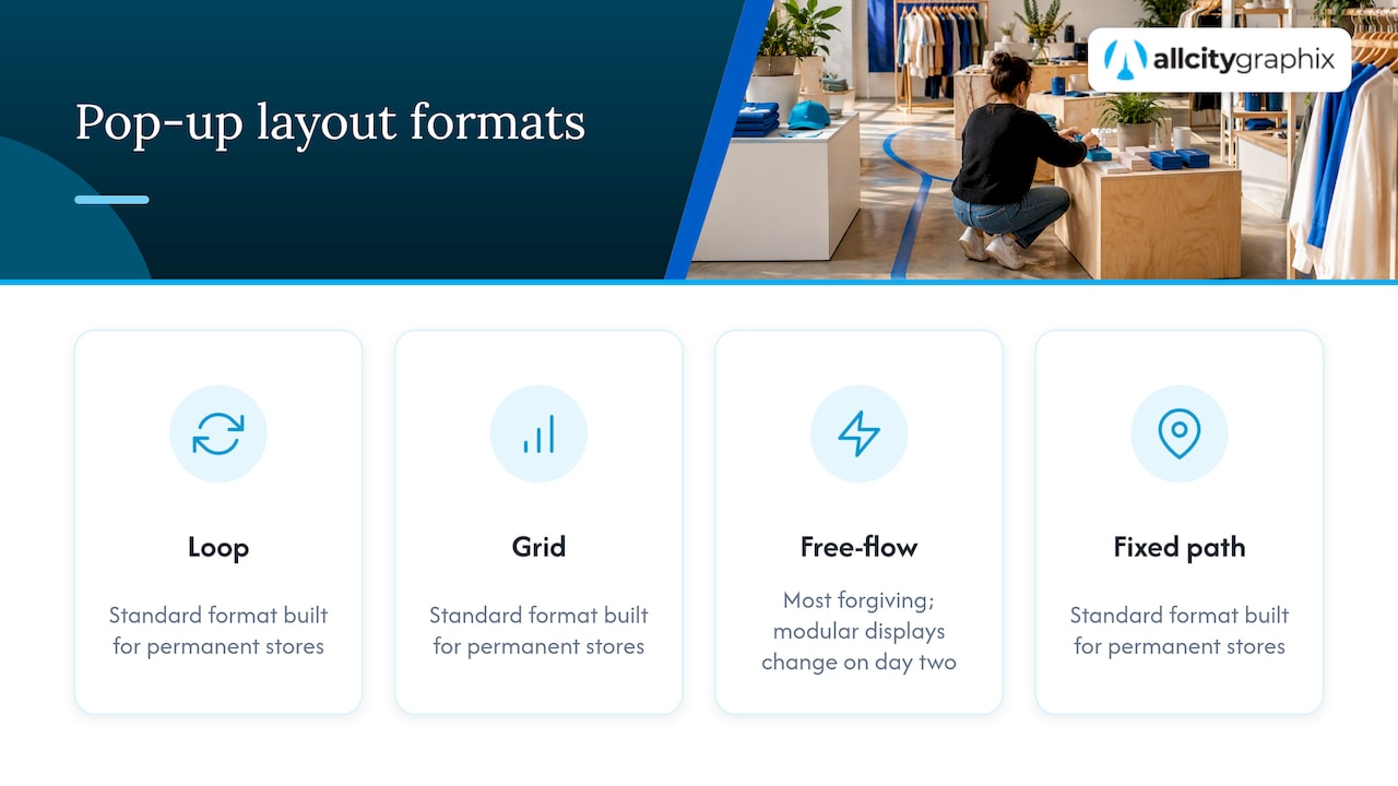
Layout is where small spaces win or lose. Retail layouts are usually described as loop, grid, free-flow or fixed path, and the standard formats are built for permanent stores. For a pop-up, a free-flowing path with modular displays is usually the most forgiving, because you can change it on day two when you see how people actually move.
Plan for the busiest hour
Pop-up planners advise designing for peak traffic, not average traffic. Walk through your floor plan as if twenty people were inside at once. Look for pinch points near the entrance, the checkout and your most interesting display, and make sure staff can move without squeezing past customers. A crowded corner feels exciting for a minute and then becomes a reason to leave.
Use the entrance as a decompression zone
People need a beat after they walk in. Leave the first few feet open, with nothing to buy and nothing to read, so visitors can orient themselves. Then place the hero display where the eye lands once they have stopped. Many retail designers also note that shoppers tend to drift to one side on entry, so it is worth watching your own first hours and moving the hero display to wherever people actually go.
Small spaces: go vertical and slim
For compact pop-ups, the advice is to prioritize vertical shelving, slim-profile fixtures, multi-functional displays and a clear central path. A few practical versions:
- A display table that doubles as storage underneath, covered with a branded cloth.
- Wall-mounted rails and shelves in place of freestanding racks, which frees floor area for people.
- A checkout counter that is also a product display, so nothing sits idle.
- Stock kept in sealed boxes behind the counter and replenished in small batches, so the floor never looks cluttered.
Sketch it to scale
Before load-in, draw the space to scale on paper or a free floor-plan tool, with door swings, outlets and windows marked. Cut out your fixtures at the same scale and move them around. It takes an hour and prevents the classic failure: a beautiful display that arrives on the day and does not fit through the door.
Build displays with one clear hero
The cleanest pop-ups have a visible hierarchy. Visual merchandising guidance recommends a single hero focal point in the strongest sightline, rather than several displays competing for attention. Everything else supports it.
A workable hierarchy looks like this:
- The hero: your signature product, a large graphic, or an installation. It is visible from the entrance, and often from the sidewalk.
- The core range: the products you want to sell most, at reachable height, grouped by use or color rather than by category jargon.
- The impulse zone: small, low-priced items near checkout.
- The information layer: short signs that state what the product is, why it matters and what it costs.
Two rules keep this honest. First, price every item visibly, since visitors in a temporary space are less willing to ask. Second, edit ruthlessly. A pop-up with forty items beautifully shown outsells one with two hundred crowded together. You can always keep reserves out of sight.
Light and color do more than you think
Because pop-ups are small and short-lived, designers have more freedom to experiment. A university study on pop-up lighting makes the case that cues of color and light can shape the customer’s sense of the experience and potentially influence sales. The same research notes that correct illuminance can help entice people to enter, promote merchandise and communicate brand identity.
Layer your lighting
A practical setup uses accent lighting for products and task lighting for counters, so texture and quality show without the room feeling noisy. In plain terms:
- Ambient light sets the mood and should be even and warm enough that skin and products look good.
- Accent light goes on the hero display and key products. This is the cheapest way to make a modest fixture look expensive.
- Task light over the counter lets staff and customers read labels and handle payment.
If you are building a more theatrical space, event lighting professionals point out that modern wireless LED fixtures give flexibility and customization that make scenic builds more dynamic and easier to deploy in temporary spaces. Battery or wireless fixtures also remove the need to run cables across a floor you do not own.
Keep color disciplined
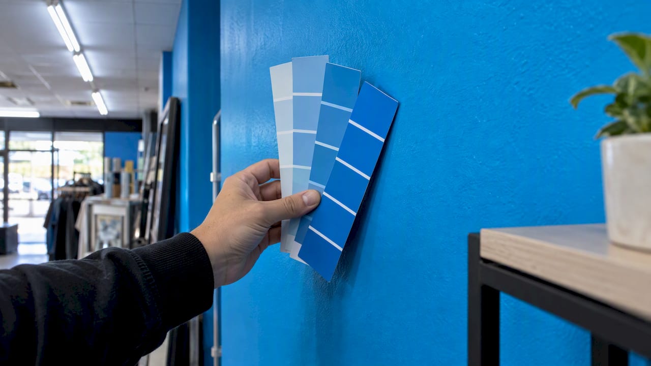
Use your brand’s primary color as the dominant tone and one accent for emphasis. Neutral backdrops let products stand out, while a single saturated wall creates the photo moment. Test colors under the actual lighting in the space: a paint chip under fluorescent tubes can look very different from what you chose in a showroom.
Design the facade and signage first
The pop-up begins on the sidewalk. The Toronto Metropolitan research recommends branded exterior signage and windows to draw customers in, alongside planned product displays, graphics and traffic flow that communicate the brand and avoid congestion. This is the answer to anyone asking how a pop-up booth or storefront can attract attention while staying easy to understand.
A good facade passes the three-second test. A passerby should be able to tell, without stopping, what you sell, who you are and why to step in. That usually takes:
- One large, legible name or logo, set in high contrast.
- A single short line describing the offer, with no more than six or seven words.
- A window display that previews the hero, lit well enough to read in daylight and after dark.
- A sandwich board or floor graphic only where local rules allow it.
Inside, environmental graphics (wall murals, floor decals, hanging banners, shelf talkers) carry the brand story. Thinking of signs and displays as a system rather than separate purchases is a theme in project branding strategy work, and it applies equally to a temporary store: one visual language, repeated at every scale from the façade to the price tag.
If you will also be at conferences or markets, the same principles carry over to a booth. Our guide to trade show booth design for small teams covers how to scope that work, and the visual rules for event signage apply to any space where people walk past quickly.
Make it accessible and safe from the start
Accessibility is a design constraint, not an afterthought, and it is cheaper to plan than to fix on opening day. Temporary spaces are not automatically exempt: the original 1991 federal standards already covered temporary buildings or facilities that were extensively used or essential for public use. Whether the ADA applies to your specific pop-up depends on the setup and the landlord, so confirm it with the venue and a qualified professional.
What the ADA’s small-business guidance says in practice:
- Shelves and sales counters need to be on an accessible route with enough clear space for customers using mobility devices.
- For selling floors under 5,000 square feet, at least one check-out aisle must be accessible to people with mobility disabilities, which covers nearly every pop-up.
Design choices that follow naturally: keep main aisles wide and free of cables, mats and display feet; put the hero display where it can be seen and reached from the accessible route; and include a lowered or clear section on the checkout counter.
Beyond accessibility, check the local rules before you build. Verify zoning, health, fire safety and signage permit requirements before signing a lease, because missing one can delay or block an opening. If your pop-up is outdoors, city guidance can be specific. One California city’s pop-up guide, for example, asks for a minimum 48-inch clear path for accessibility and sets fire safety rules for heaters. Your own city’s rules will differ, so call the local building or business office first, and your landlord or event organizer will usually know the building’s fire and insurance requirements.
Budget the design, not just the rent
Nobody can quote a universal price for pop-up design, because it swings with city, square footage and ambition. One 2026 small-business breakdown puts practical low-end estimates at roughly $500 for rent, $200 for displays and fixtures, and $50 for permits and insurance. Treat that as a floor for a very small, scrappy setup, not a typical budget for a storefront in a major city.
A sensible way to allocate design spend:
- Facade and signage (largest share). This is what converts a passerby into a visitor.
- The hero display and lighting. The highest visual return per dollar.
- Modular fixtures. Buy or build pieces that fold, stack or travel, so you can reuse them at the next event.
- Graphics. Design them once in your brand system so they can be reprinted at different sizes.
- A buffer. Hold back some budget for fixes on day two, since you will learn what does not work.
Spend less on what the customer will not notice: back-of-house storage, perfect finishes on surfaces nobody touches, and anything you cannot reuse.
Measure and adjust while it is open
A pop-up is a live experiment. Pop-up specialists describe it as a chance to test and learn, collecting real-time customer feedback before committing to a permanent store. One retail-analytics case study describes a pop-up that used 3D sensor data to adjust opening hours, merchandising and product positioning. You do not need sensors to do the same thing with a notebook.
- Note where visitors slow down, where they turn around and where they pick things up but put them back.
- Track sales by hour and by product, and compare them with foot traffic.
- Ask five customers a day what they expected the shop to be.
- Move one thing every day and see what changes.
The point is to come out with a design you can repeat, scale or retire, backed by evidence rather than a feeling.
Our perspective
We have been designing brands, websites and printed and physical collateral for small and growing businesses for more than 15 years, and the pop-ups that work share a trait: the design was decided by the strategy, not the other way around. A discovery conversation about who the customer is, what they should do and how you will know it worked saves more money than any fixture sale.
We also see that temporary spaces expose brand weaknesses fast. A logo that looked fine on a website can disappear on a ten-foot wall, and a color palette that felt calm on screen can look muddy under shop lighting. That is why we like to build the identity system first and then stretch it across the physical touchpoints: signage, packaging, shopping bags, menus, floor graphics and the online page people visit after they leave.
Our advice is simple. Pick one goal, one hero and one story, and make them impossible to miss. Everything else is optional.
— Alex
Bring in a design partner
If you are planning a pop-up and want the brand, graphics and physical design to work as one, our team can help with event design, graphic design and the wider branding work behind it. We start with a discovery meeting about your goals, then build custom solutions and stay on for support after launch. You can see everything we offer on our services page, or get in touch to talk through your project.
FAQ
How do you design a small pop-up shop?
Go vertical, keep fixtures slim and leave a clear central path. Use multi-functional pieces such as tables with storage, wall-mounted shelves and a counter that doubles as a display. Keep one hero display in the strongest sightline and edit the product range to what fits comfortably.
How much does it cost to set up a pop-up shop?
It depends heavily on the city, size and finish. One 2026 small-business estimate puts the low end at around $500 for rent, $200 for displays and fixtures and $50 for permits and insurance, but a storefront in a major city will cost much more. Get quotes for rent, fixtures, signage and insurance together so you see the full figure.
Do I need a license or permit for a pop-up shop?
Usually yes, and the requirements vary by city and venue. Check zoning, health, fire safety and signage rules before you sign a lease, since missing one can delay or block your opening. Your local business or building office and your landlord can tell you what applies.
Does a pop-up shop have to be ADA accessible?
The ADA applies to many places open to the public, and federal small-business guidance calls for shelves and counters on an accessible route and an accessible checkout aisle in selling floors under 5,000 square feet. How it applies to a particular temporary setup depends on the space, so confirm with your landlord and a qualified accessibility professional.
Sources
- Chapter 8: Design, Layout and Display, Pop-up Retail (Toronto Metropolitan University)
- What ‘Pop-Up Architect’ Melissa Gonzalez Has Learned (WWD)
- Brand Awareness Pop-Up Shops (Parasol Projects)
- The steps to a successful pop-up store (Nestore)
- Pop Up Store Layout: Floor Plans and Flow Strategies (The Storefront)
- Pop Up Store Design Guide (The Storefront)
- Pop-up shop design (Cubic)
- Color and light in pop-up store design (University of Florida Journal of Undergraduate Research)
- Lighting Ideas From a ‘Rainbow High’ Pop-Up (BizBash)
- ADA Standards for Accessible Design, 1991 (ADA.gov)
- ADA Update: A Primer for Small Business (ADA.gov)
- The Real Budget Behind Opening a Business (Small Business Magazine)
- Pop-Up Guide for Outdoor Dining and Retail Display
- How Much Does a Pop-Up Shop Actually Cost?
- Customer case study: Respire (Technis)
- Project branding strategy