

A high-converting service page has one job: move a stranger toward a qualified inquiry. It does that by answering four questions before the visitor scrolls past the first screen: who you serve, what you deliver, why they should believe you, and what to click next. Everything else on the page exists to support those four things, not distract from them.
TL;DR:
- Effective service pages use a clear layout order that matches how buyers decide, starting with understanding, then trust, evaluation, and finally action.
- Including social proof, pricing context, and FAQ details within 600 to 1,400 words improves lead quality by answering key visitor questions upfront.
- The headline should specify the service, audience, and outcome, while benefit-led bullets highlight tangible results rather than features.
- Design should prioritize trust signals near CTAs, mobile responsiveness, fast loading, and accessible tap targets to maximize conversions across devices.
- When selling multiple services, create dedicated pages for each to target specific buyer journeys, rather than combining them into one broad service page.
Table of Contents
- What Belongs on Every Service Page
- The Layout Order That Matches How People Decide
- Copy, Proof, and Microcopy That Actually Convert
- Mobile, Speed, and Accessibility Checklist
- Where to Find Real Service Page Examples
- How All City Graphix Approaches Service-Page Projects
- Get Your Service Page Built Right the First Time
- Sources
- FAQ
What Belongs on Every Service Page
Every strong service page shares the same working parts, even when the design looks different from site to site. Squarespace’s breakdown of service page structure treats the page as a client-generating tool, not a brochure, and that framing changes how you build each section.
Start with the hero. The formula is service, plus audience, plus outcome, in one headline, with a subhead that adds the detail the headline had no room for. “Brand identity design for growing restaurants” tells a visitor more in five words than “Our Services” ever will.
Right below that, put your trust strip: testimonials, client logos, a review score, or a project count. Placing proof next to the primary CTA outperforms burying it in a separate section lower on the page, because visitors decide whether to keep reading within seconds.
Then break down the service itself with benefit-led bullets, not feature lists:
- Lead with the outcome (“Launch in six weeks,” not “Six-week timeline”)
- Separate “what’s included” from “what’s not” so scope questions never reach your inbox
- Show starting prices or ranges when your offer is standardized; skip pricing entirely when every project is scoped individually and say so plainly
- Repeat one consistent CTA button text throughout, not three different phrases competing for attention
- Add microcopy under the button (“No obligation, 20-minute call”) to lower the stakes of clicking
- Close with an FAQ covering timelines, deliverables, refund terms, and how fast you respond to a new inquiry
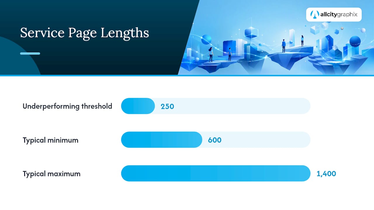
A page missing any one of these tends to generate more clarifying emails than actual leads. Pages under 250 words, Databox found, often underperform simply because they leave too many questions unanswered. Most strong service pages run 600 to 1,400 words, depending on how complex the offer is.
The Layout Order That Matches How People Decide
Section order is not a design preference. It follows how a buyer actually thinks: first they need to understand what you offer, then they need to trust you, then they evaluate fit, and only then are they ready to act. Zendesk’s buyer journey framework maps cleanly onto page structure, and it explains why so many redesigns fail: they add sections without asking which stage that section serves.
A sequence that consistently performs well runs like this:
- Hero with headline, subhead, and primary CTA
- Trust strip (logos, ratings, or a quick stat)
- Who this is for (qualifies the visitor, filters out poor fits)
- What’s included, with benefit-led detail
- Process or “what happens next”
- Deeper social proof, like a case study or longer testimonial
- Pricing context and FAQ
- Final CTA, worded identically to the top one
Branded Web Design’s audit of high-converting pages backs this same seven-part structure, and for good reason: each block answers the exact question a visitor was about to ask.
If you sell several distinct services, resist cramming them all onto one page. SiteGround’s guidance recommends a hub page linking out to dedicated pages per offering, since each one can then target a single buyer journey and a single set of search terms. A logo design page and a web development page have different buyers asking different questions, so don’t force them to share a headline. Repeat your CTA after the trust strip and again after the case study, but use a button for the main path and reserve an embedded form only for the final push.
Copy, Proof, and Microcopy That Actually Convert
Good headline formulas are short on purpose: “[Service] for [audience] who want [outcome].” That structure forces you to name a real audience instead of writing to everyone, which usually means writing to no one.
Benefit bullets should answer “what’s in it for me,” not describe your process. “Get a site that loads in under two seconds” beats “We optimize performance” every time, because it names the payoff instead of the method.
- Use a compact case study card, 80 to 120 words: situation, action, tangible result, stated in one line each
- Keep that card visually near the CTA, not in a separate testimonials page
- Add microcopy that removes friction: response time (“We reply within one business day”), and a privacy line near any form
- Never introduce a second CTA phrase; consistency beats novelty here
A short data-use line near your contact form reduces hesitation at the exact moment a visitor is about to hand over their information.
Pro Tip: Write your case study card before you write anything else on the page. Once you know the real result you’re proving, the headline and bullets almost write themselves.
Mobile, Speed, and Accessibility Checklist
Most service page traffic arrives on a phone, and a page that reads well on a laptop can fail completely on a five-inch screen.
- Design the hero mobile-first, with a sticky CTA button sized for a thumb, not a mouse cursor
- Keep forms short: name, email, and one qualifying question, nothing more, with a one-step booking link as an alternative to a long form
- Compress images, lazy-load anything below the fold, and keep server response fast enough to hold your Largest Contentful Paint low
- Use real semantic headings, descriptive alt text, and tap targets large enough for a finger, not a cursor
- Test keyboard navigation, since a visitor using a screen reader still needs to reach your CTA
Where to Find Real Service Page Examples
Design galleries and template marketplaces are a fine starting point, but they’re inspiration, not a finished product. Browse a source like Dribbble’s service page tag or a template catalog such as Webflow’s professional services collection and look specifically for the elements that matter: a real trust strip, visible pricing context, and a consistent CTA, not just pretty typography.
Before you adapt anything, audit it the way you’d audit your own page: does the example show authentic proof, or is that testimonial block just placeholder text? Dribbble itself notes that inspiration still needs adaptation before it’s conversion-ready.
- Swap every line of filler copy for your actual service language
- Replace stock photography with real project work, pulled from your own web design portfolio
- Confirm the hero states audience and outcome, not just a vague tagline
- Match the CTA wording across every instance on the page
How All City Graphix Approaches Service-Page Projects
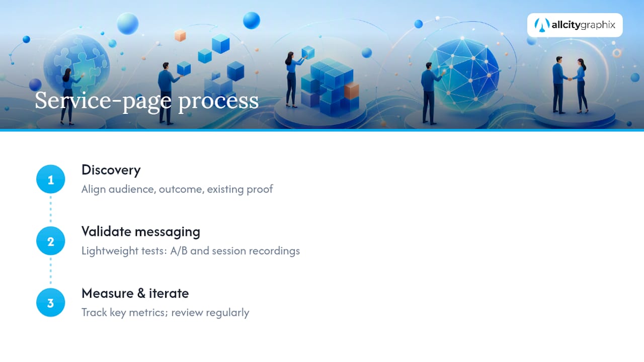
Every project starts with discovery: aligning on the target audience, the outcome we’re selling, and what proof we already have on hand. Before launch, we validate messaging with lightweight tests, sometimes a quick A/B pass, sometimes session recordings, to see where visitors hesitate. After launch, success gets measured in leads, qualified inquiries, and conversion rate, reviewed on a regular cadence rather than left alone.
Get Your Service Page Built Right the First Time
All City Graphix is the alternative to guessing your way through a redesign: a discovery-led process that starts with your actual audience and outcomes, not a generic template pulled off a marketplace.
That process covers the full stack a converting service page needs: web design, UX structure, copywriting, and case study collection, all built around the layout order that moves visitors from recognition to action. If your current page reads like a brochure instead of a sales tool, that’s usually a messaging problem before it’s a design problem, and it’s exactly what a discovery session is built to catch. For teams juggling proof collection and testimonials, a resource like Cult Media’s guide to social proof content pairs well with the trust-strip work we do on every build.
Ready to see what a conversion-focused page looks like for your business? Visit the All City Graphix services page to review the full offering and start a conversation.
Sources
- Service Page Design: Complete Guide and Examples — Squarespace
- Service Page Web Templates / How to Design a Services Page — SiteGround Academy
- Buyer journey — Zendesk
- Service Page designs — Dribbble
FAQ
What Should a Service Page Include?
A service page needs a clear headline naming the service and audience, a trust strip with proof, a benefit-led breakdown of what’s included, a visible process, pricing context, and one consistent CTA repeated at least twice. Squarespace’s guide treats these as the minimum for turning a page into a working sales tool rather than a static description.
What Are the Three Main Components of Service Design?
Service design generally breaks down into the audience you’re serving, the offering itself, and the proof that convinces someone to act. On a service page, those three components translate directly into the hero, the service breakdown, and the trust strip.
What Are the Four P’s of Service Design?
Definitions vary across disciplines, but in a marketing context the four elements most page designers focus on are people (who you serve), promise (the outcome), proof (trust signals), and prompt (the CTA). Treat these as the practical version of the four P’s for a service page, rather than a strict academic framework.
What Are Some Good Website Designs for Services?
Strong examples generally share a hub page linking to focused single-service pages, a visible trust strip near the top, and a repeated CTA at every major proof point. All City Graphix builds pages around this same structure, and browsing design galleries like Dribbble can show you the visual variety possible within it.
How Long Should a Service Page Be?
Most high-performing service pages run 600 to 1,400 words, depending on how much explanation the offer needs. Pages shorter than 250 words tend to underperform because they leave scope, pricing, or timeline questions unanswered.