

Use RGB for anything that lives on a screen: your website, social posts, email, presentations. Use CMYK for anything printed with ink on paper, board or packaging, unless your printer tells you otherwise. That one exception matters more than most guides admit, and we cover it below, along with where Pantone spot colors fit and how to keep your brand color from changing between your laptop and your brochure.
TL;DR
- RGB mixes light and suits screens. CMYK mixes ink and suits print. They cannot show exactly the same colors.
- Bright, saturated colors (neon greens, electric blues, vivid oranges) often look duller once printed, because RGB reaches colors that CMYK ink cannot.
- Some modern print shops prefer sRGB files and convert to CMYK themselves. Ask for the printer’s file spec before you convert anything.
- For a logo or brand color that must match everywhere, specify a Pantone spot color and keep a CMYK build for everyday print.
- Pick your colors with print in mind from the start, and test a physical proof before a big run.
Table of Contents
- What RGB and CMYK actually are
- Why colors look different in print
- When to use RGB
- When to use CMYK
- The exception: printers that want RGB
- Side-by-side comparison
- Pantone vs CMYK: spot color or process color
- How to set up a file correctly
- Common mistakes
- Our perspective
- Getting colors right across your brand
- FAQ
- Sources
What RGB and CMYK actually are
A color model is a numerical system for describing color. RGB and CMYK are the two you will meet in every design tool, and UCLA’s design media arts guide calls them the two main models a designer needs to know.
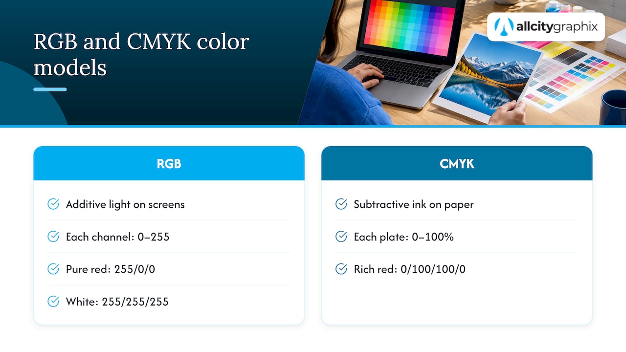
RGB stands for red, green and blue. It is an additive model: a screen starts dark and adds light. According to HP, RGB is used for light-emitting displays such as monitors and phones, and each channel runs from 0 to 255. Pure red is 255, 0, 0. White is 255, 255, 255.
CMYK stands for cyan, magenta, yellow and key (black). It is a subtractive model: paper starts white, and each ink absorbs some of the light that would otherwise bounce back to your eye. The same HP guide notes that CMYK values are percentages, 0% to 100% for each ink plate. A rich red might be 0% cyan, 100% magenta, 100% yellow, 0% black.
The practical consequence is simple. A screen can shine light at you. Paper can only reflect the light in the room. That is why the same artwork never looks identical in both places.
Why colors look different in print
The core issue is gamut, the range of colors a system can produce. Professionals point out that RGB has a wider gamut than CMYK, as the UCLA guide explains. Neon, vibrant and highly saturated colors on screen often fall out of gamut, meaning ink cannot reproduce them, and they print muted or softer.
You see this most often with:
- Bright electric blues and violets that turn into a flatter navy or purple.
- Fluorescent greens and oranges that lose their glow.
- Gradients that looked luminous on screen and look chalky on a flyer.
Two other things shift color on top of gamut: the paper (coated, uncoated, kraft all change how ink looks) and your monitor. An uncalibrated screen can be too bright or too warm, so even a perfect print will look “wrong” next to it.
A quick example
Say a coffee shop picks a vivid teal for its logo, built in RGB as a screen color. On the website it glows. On the first run of takeout cups and menus it looks darker and grayer. Nothing went wrong with the printer. The teal was simply outside what four process inks can lay down. Had the owner chosen a slightly less saturated teal at the start, the screen and the cup would have been much closer.

That is why our own advice on picking 2 to 4 brand colors by saturation and lightness starts with print in mind, not as an afterthought.
When to use RGB
Choose RGB for anything viewed on a display:
- Websites, web apps and online stores
- Social media graphics and ads
- Email headers and newsletters
- Slide decks and video
- App icons and digital signage
In these cases, converting to CMYK would only dull your colors for no gain. Keep working files in RGB, and for web delivery use the sRGB profile, the standard that browsers and most devices assume.
When to use CMYK
Choose CMYK when the final output is ink on a physical surface:
- Brochures, flyers, postcards and catalogs
- Business cards and stationery
- Posters and banners
- Packaging and product labels
- Magazines and print ads
In each case, designing in CMYK from the beginning shows you what you will actually get. If you are building a business card, our printer-tested business card specs and checklist cover size, resolution and file setup. For packaging, product label design that avoids reprints goes through the mistakes that cost small businesses money.
The exception: printers that want RGB
Here is the nuance most “RGB vs CMYK for print” articles skip. Many modern professional print systems are optimized to receive standardized sRGB files and handle the CMYK conversion internally. Printful’s help center recommends uploading final print files in the sRGB IEC61966-2.1 profile, and explains that converting to CMYK too early can discard color information, giving less accurate prints than if the system had converted the file itself.
This is common with digital presses, large-format printers and print-on-demand services. Traditional offset printing, with plates and press operators, more often expects CMYK or spot colors.
So the honest rule is:
- Ask the printer for its file specification before you export.
- If it asks for CMYK, convert using the profile it names.
- If it asks for sRGB, send sRGB with the profile embedded and do not convert.
- If nobody can tell you, ask for a proof.
This is also the point to talk to your printer about color management early. HP’s guidance says brand consistency is best achieved by working with a printer from the start on a color workflow, which may include specific color profiles, a monitor calibrated to match print output and, in some cases, extended-gamut CMYK with orange, green and violet inks. A printer-led workflow for matching design colors to the final printed piece is also where color grading techniques from photography become useful, especially for image-heavy brochures.
Side-by-side comparison
| RGB | CMYK | |
|---|---|---|
| How it mixes | Adds light | Subtracts light with ink |
| Colors | Red, green, blue | Cyan, magenta, yellow, black |
| Values | 0 to 255 per channel | 0% to 100% per ink |
| Best for | Screens | Ink on paper and packaging |
| Gamut | Wider | Narrower |
| Risk | Bright colors can print dull | Looks flatter on screen |
| Typical files | Web graphics, social, video | Print-ready PDFs for offset |
Pantone vs CMYK: spot color or process color
CMYK is a process: the press lays down tiny dots of four inks that blend to your eye. A Pantone color is a spot color: one pre-mixed ink, the same formula every time. The RMIT colour theory text describes process printing as laying down tiny dots, and notes that not every color can be produced that way.
How they trade off:
- Consistency. Fujifilm’s guide says Pantone is preferred for corporate identities and logos because pre-mixed ink gives a consistent brand color across printers and materials. CMYK can vary slightly between jobs and machines.
- Cost. The same source finds CMYK more cost-effective for general marketing print with detailed, multi-color images.
- Reach. Some Pantone colors, notably fluorescents and metallics, cannot be reproduced with process inks at all. If your brand needs one, you specify a spot color, and RMIT notes that this means an additional, more expensive print run.
A sensible approach for small businesses
You rarely have to choose one forever. A good brand kit includes:
- An RGB or hex value for the web
- A CMYK build for everyday print
- A Pantone reference for the moments when exact match matters, such as signage, packaging or a printed logo on merchandise
If you only ever print a few items on digital presses, CMYK or sRGB per your printer is fine. If you run packaging at volume, or a color is the heart of your identity, price a spot color early. Our guide on logo file formats explains which versions of your logo to keep for each use.
How to set up a file correctly
- Decide the output first. Screen, digital press, offset press or packaging? The answer sets the color mode.
- Get the printer’s specs. Ask for color mode, profile, bleed, resolution and file type.
- Start in the right mode. Designing in print colors from the beginning avoids a nasty surprise at conversion.
- Soft-proof. In Photoshop or similar tools, preview how colors will print. Adobe notes that soft-proofing is only as reliable as your monitor calibration, the output device profile and the room lighting, so choose the specific profile of the printer and paper rather than a generic preset.
- Add bleed and check the basics. Our 0.125 in print bleed and 5-item preflight walks through it.
- Order a physical proof for anything important. A screen preview is not paper.
Before you send marketing artwork to a commercial printer, confirm the color mode and conversion plan. Asking those questions up front, as this guide on production rules for signage shows for QR-coded event materials, prevents failed prints.
How to check which mode your file is in
In Photoshop, look at the title bar or open Image > Mode. In Illustrator and InDesign, check the document color mode in file setup. In Figma, designs are screen-based, so print files typically need exporting with a proper print workflow. If a file looks suspiciously vivid, it is probably RGB.
Common mistakes
- Converting a bright RGB design at the last minute. The shift is biggest for saturated colors, and you discover it when it is too late to adjust.
- Trusting your monitor. Without calibration, your screen is a guess.
- Assuming CMYK is always right. Check the printer’s spec first.
- Using black text built from four inks. Small type should use a single black ink to avoid blurry edges from misregistration.
- Skipping a proof because the deadline is close. A reprint costs far more than a proof.
- Expecting metallics or fluorescents from CMYK. They need spot inks.
Our perspective
Most color problems we see come from decisions made too early, not from the printer. A founder picks a gorgeous screen color on day one, builds a site, then discovers the packaging looks nothing like it. By then the brand is live in several places and the fix is expensive.
So we start branding work with the full life of the color in mind: where it appears, on what material, in what quantities. That discovery step, which sits at the heart of how we work, lets us choose a palette that holds up on a phone, a storefront sign and a shipping box, and document the RGB, CMYK and Pantone values in one place. If a brand really depends on a vivid hue, we say so up front and talk through the spot-ink trade-off with you rather than hiding it.
Our practical advice: treat your printer as part of the team. A ten-minute call before you export saves a week and a reprint.
— Alex
Getting colors right across your brand
If you want your logo, website and printed materials to look like one brand, that is the kind of work we do. Our graphic design and branding services cover palettes, logo systems and print-ready files, and you can see everything we offer on our services page. Bring us your current files and we will tell you what will print well and what needs adjusting.
FAQ
Is it better to use CMYK or RGB?
Neither is better overall. RGB is the right choice for anything shown on a screen, and CMYK is the standard for ink on paper. Pick based on where the final piece will be seen, and check your printer’s requirements.
Why do we print in CMYK and not RGB?
Printers work with ink, which absorbs light, so they mix cyan, magenta, yellow and black rather than red, green and blue light. That said, some modern print systems accept sRGB files and convert to CMYK internally, so confirm with your printer before converting.
Which color format is best for printing?
Use whatever the printer specifies. For many offset jobs that means a CMYK PDF, and for some digital and print-on-demand services it means sRGB. For logos and brand colors that must match exactly, a Pantone spot color is the most consistent option.
Can I convert RGB to CMYK without losing color?
Not completely. Colors outside the CMYK gamut, especially bright, saturated ones, will shift when converted. Soft-proofing with the correct printer profile shows you the change before you print, and a physical proof confirms it.
Is Pantone better than CMYK?
Pantone is better for exact, repeatable brand color and for colors CMYK cannot make, such as metallics. CMYK is usually more economical for full-color images and general marketing print.
Sources
- Print Basics: RGB Versus CMYK, HP
- Should I use RGB or CMYK for Printful print files?
- Pantone vs CMYK, Fujifilm
- Process (CMYK) and Spot (Pantone) colour printing, RMIT
- Proofing colors in Photoshop, Adobe