

A strong homepage hero does one job: it tells a visitor what you do, who it’s for and what to do next, before they have scrolled. That takes a specific headline of about ten words or fewer, one line of support, a single call to action and a visual that proves you are real. It also has to load fast and respect people who don’t want motion.
This guide covers each of those parts, with rewrites you can adapt, the performance and accessibility rules that decide whether the hero works at all, and a checklist to run on your own site.
TL;DR
- Lead with a clear result or benefit in 10 words or fewer. Skip “Welcome to…” and clever slogans.
- Use one primary call to action, visually distinct, with one supporting line of copy.
- Choose authentic imagery (custom photography, real product shots) over generic stock.
- Treat the hero image as a performance problem: aim for a Largest Contentful Paint of 2.5 seconds or less.
- Avoid auto-rotating carousels and honor
prefers-reduced-motionso the hero works for everyone.
Table of Contents
- What a homepage hero has to do
- The four parts of a hero, in order of importance
- Layout patterns that hold up
- Speed: the hero image decides your load score
- Motion and accessibility
- Perspective: what we see when we audit hero sections
- A practical hero checklist
- Common mistakes, and what to do instead
- Need a hero that does its job?
- FAQ
- Sources
What a homepage hero has to do
The hero is the banner area at the top of your homepage, the first thing visitors see before they scroll. DreamHost describes the winning recipe as a clear headline, short supporting text, one call to action and a visual that shows what you offer. That is the whole brief.
Time is the constraint. The same DreamHost guide, citing Jakob Nielsen’s research, says visitors form an opinion in roughly 50 milliseconds and often leave within 10 to 20 seconds if the value isn’t clear. You will not win that window with a long explanation. You win it by making the page’s purpose obvious at a glance.
So judge any hero with three questions:
- Can a stranger say what you sell and who it’s for after two seconds?
- Is there one obvious next step?
- Does the visual make you more believable, or just fill space?
If the answer to any of them is no, fix that before you touch colors or fonts.
The four parts of a hero, in order of importance
1. The headline
The headline carries the value proposition. Guidance from DreamHost is to say it in ten words or fewer, using strong, result-oriented verbs, and to avoid vague welcome messaging that doesn’t explain what the product does for the visitor.
Three formulas work reliably for service businesses:
- Outcome for audience: “[Result] for [specific customer].”
- Problem removed: “[Painful thing], handled.”
- What we do, plainly: “[Service] for [market], built to [result].”
Here are illustrative rewrites. They are examples we wrote for this guide, not real client results.
| Weak hero headline | Stronger rewrite | Why it works |
|---|---|---|
| Welcome to Maple Street Dental | Gentle family dentistry in Park Slope, with same-week appointments | Names the service, place and a concrete benefit |
| Innovative solutions for a changing world | Payroll that runs itself for teams under 50 | Says what it is and who it’s for |
| We are passionate about design | Brand identities that make a small shop look established | Leads with the result the buyer wants |
| Your journey starts here | Book a free 20-minute kitchen remodel estimate | The headline and the action are the same thing |
Notice what changed. The weak versions could sit on any company’s site. The strong ones could only sit on one.
If you struggle to find the sentence, the problem is usually positioning, not copywriting. A workshop-style look at brand positioning examples can help you decide what you want to be known for before you write a word of hero copy.
2. The supporting line
The subheading earns its place by adding one thing the headline couldn’t: how, for whom, or proof. Keep it to one or two short sentences.
If your headline says “Brand identities that make a small shop look established,” the support line might say “Logo, color, type and templates, designed after a discovery conversation about your customers.” It answers “how” without turning into a paragraph.
3. The call to action
Use one primary action. DreamHost’s advice is that the CTA should be singular and visually distinct, and that a hero with several competing actions will usually underperform one with a clear path.
Practical rules:
- Write the button as a verb plus the outcome: “Get a free site review,” not “Submit” or “Learn more.”
- Make it the highest-contrast element on the screen.
- If you need a second action, make it a quiet text link, not a second button of equal weight.
- Match the ask to buyer readiness. A first-time visitor to a $15,000 service rarely wants “Buy now”; “See our work” or “Book a call” is a fairer first step.
4. The visual
The visual should build trust and personify the brand. Webflow’s guidance on hero images points service agencies and brands toward custom photography or authentic product demonstrations instead of generic stock, which tends to signal a lack of professional depth.
That matches what we see when we review sites. A smiling stock team in a glass office tells a visitor nothing. A real photo of your shop, your crew or your finished work tells them you exist.
Good hero visuals include:
- Your actual product in use, cropped so the subject is clear on a phone.
- Real team or founder portraits. A look at how a corporate photography project is handled shows what planned, professional portrait and brand imagery looks like in practice.
- A short product demonstration or screen recording, if it’s what you sell.
- A simple illustration or pattern from your brand system, if photography doesn’t fit.
One warning from the same Webflow guidance: the most common mistake is prioritizing imagery over clarity. Beautiful but abstract visuals lose to a plain page that states a clear result.
Layout patterns that hold up
You don’t need a novel layout. These four cover most small and mid-sized businesses.
Split hero. Text on the left, image on the right (stacked on mobile). Best when the headline needs room and the image is a product or person. It is the safest default.
Full-bleed image with overlay. A large photo with the headline over it. Works for hospitality, events and retail, but only if the text stays readable. Test contrast on a real phone outdoors, not just in your design file.
Product-led hero. A live interface, a product shot or a short demo does most of the explaining. Good for software and e-commerce.
Proof-led hero. The headline sits next to a rating, a customer count or a recognizable client logo strip. Keep social proof light and unobtrusive so it supports the CTA rather than competing with it.
Whatever you choose, check the hero at a 390-pixel-wide phone screen first. For most local businesses, mobile is where the hero is seen most, and a layout that only works on a wide monitor is the wrong layout.
Speed: the hero image decides your load score
A hero can be well written and still fail if it loads slowly. The hero image is usually the page’s largest element, which makes it the main factor in Largest Contentful Paint, or LCP. web.dev’s LCP guidance sets the good-experience target at 2.5 seconds or less, measured at the 75th percentile of page loads.
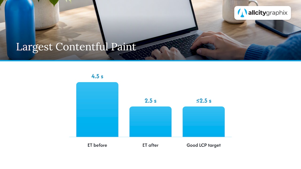
What does improvement look like in practice? A web.dev case study on The Economic Times reports LCP improving from 4.5 to 2.5 seconds, alongside an overall 43% better bounce rate. That is one publisher’s result, not a promise for your site, but it shows why the hero’s load time is worth the effort.
The fixes are mostly unglamorous:
- Preload the hero image and reserve its width and height in CSS so the layout doesn’t jump. web.dev covers these LCP techniques.
- Serve the right size. Sending desktop-sized images to mobile can use 2 to 4 times more data than needed, so use responsive image sizes.
- Don’t lazy-load the hero. It is the first thing the visitor needs.
- Defer scripts that aren’t needed to paint the first screen, such as chat widgets and some tracking tags.
- Consider a lighter treatment. A solid color or CSS gradient poster behind a video costs far less than a heavy photo.
If your WordPress or Shopify theme ships a 3 MB slider on the homepage, that is probably the single biggest win available. Our own deeper breakdown of hero, CTA and LCP decisions on the homepage goes through the build side.
Motion and accessibility
Motion in heroes is common: parallax, animated gradients, looping video, rotating slides. It is also where many heroes quietly exclude people.
The W3C’s explanation of WCAG 2.2 Success Criterion 2.3.3 says people can get sick from motion effects, and the aim is for users not to be harmed or distracted by them. The practical path is to support user preferences for motion and remove unnecessary effects. The W3C’s technique page on the CSS prefers-reduced-motion query shows how to let users switch animation off through their operating system setting.
In practice:
- Wrap parallax and large animations in a
prefers-reduced-motioncheck so they turn off for people who’ve asked for less motion. - Give any autoplaying video a visible pause control.
- Skip automatic carousels. They take control away from the user, hide most slides from most visitors, and each extra slide is another message competing with your CTA.
- Keep text contrast high over images and add alt text to any image that carries meaning.
This isn’t only a compliance matter. A calmer hero is usually a clearer hero.
Perspective: what we see when we audit hero sections
We’ve been designing brands and websites in New York for more than 15 years, and most weak heroes share the same root cause: nobody decided what the page was for.
The design is rarely the first problem. A founder says “we need a modern look,” and a hero gets built around a nice photo and a tagline the team likes. Then the homepage underperforms and everyone blames the color palette. When we open a project with a discovery meeting, we ask different questions. Who is this visitor? What did they search before landing here? What is the single thing we want them to do in the first minute?
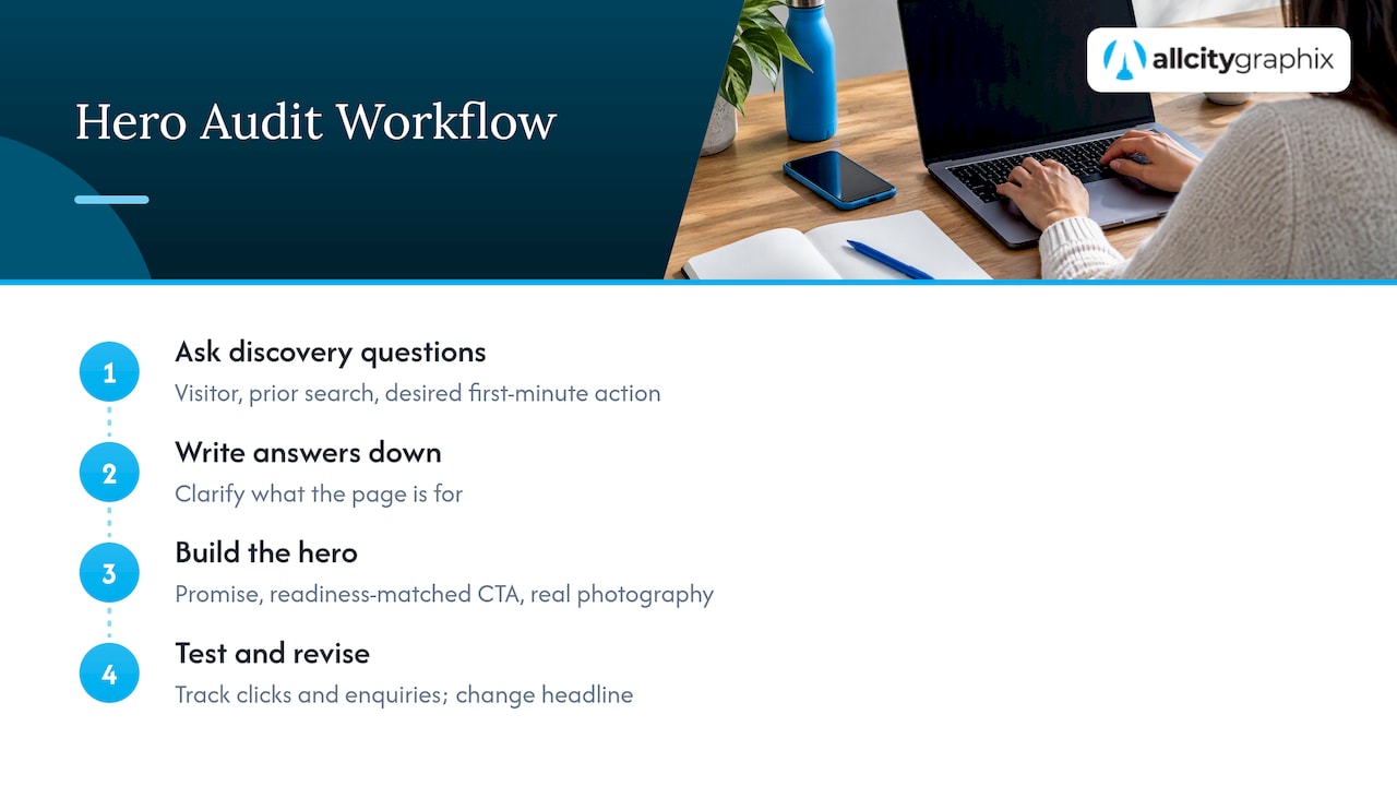
Once those answers are written down, the hero nearly writes itself. The headline states the promise. The CTA matches the visitor’s readiness. The visual comes from real photography of the business instead of a stock library, which is one reason we offer custom photography alongside design and development. And because the hero is where speed, accessibility and brand all meet, we like designers, developers and the person who owns the strategy in the same conversation, not passing files down a line.
One more habit we’d recommend: don’t treat launch as the finish. A hero is a hypothesis. Change the headline, watch what happens to clicks and enquiries, then change it again. The hero that earns its place is usually the third version, not the first.
— Alex
A practical hero checklist
Run your current homepage through this list on your phone, on a normal mobile connection, not on office Wi-Fi.
Message
- Does the headline say what you do and for whom, in about ten words or fewer?
- Could a competitor paste your headline onto their site unchanged? If so, rewrite it.
- Does the subheading add “how” or proof, rather than repeating the headline?
Action
- Is there one primary button with a verb and an outcome?
- Is it the most visible element?
- Does a secondary action, if any, look clearly quieter?
Visual
- Is the image real (your work, people, place or product)?
- Does it still make sense cropped for a narrow screen?
- Is the subject visible without the text covering it?
Performance
- Is the hero image preloaded, sized correctly and compressed?
- Does LCP land at 2.5 seconds or less in your field data?
- Does the layout stay still while it loads?
Accessibility
- Do animations switch off under
prefers-reduced-motion? - Is there any autoplaying carousel or video that can’t be paused?
- Is text contrast strong enough over the image?
Fix the message and action items first. They cost the least and move the most.
Common mistakes, and what to do instead
Leading with the company instead of the customer. “We are a full-service agency” is about you. “Get found by customers in your neighborhood” is about them. Start with what they get.
Cramming everything above the fold. The hero isn’t the whole homepage. Its job is to earn the scroll. Details, services, case studies and reviews belong below it.
Stacking CTAs. “Get a quote,” “Watch demo,” “Download guide” and “Subscribe” in one view means no one clicks any of them.
Using the hero for a slogan. Clever lines reward people who already know you. New visitors need clarity. Save the tagline for the footer.
Ignoring the pages after the hero. A hero promise has to be kept. If the headline says “Fast, affordable websites” and the next section is vague, trust drops. If your goal is a single conversion, our guide on building a landing page that converts shows how the hero connects to the sections that follow, and landing page vs. website helps you decide which one you need.
Need a hero that does its job?
If your homepage isn’t turning visitors into enquiries, the hero is the first place we’d look. All City Graphix is a New York agency that combines brand strategy, web design, photography and ongoing support, so the message, the visuals and the build come from one team. You can see everything we do on our services page, or start a conversation about your site and we’ll begin with a discovery meeting about your customers and goals.
FAQ
How tall should a homepage hero be?
There is no universal height. The hero should show the headline and the CTA without scrolling on a typical phone and laptop, and it should hint at the content below so people know to keep going. On mobile, that usually means a compact hero rather than a full-screen one.
Should I use video or a still image?
Use video only if it demonstrates something a photo can’t, and keep it short, muted by default and pausable. Video is heavier, so it puts your load speed at risk. A strong still image with a clear headline is often the better choice for a small business.
How many words should the headline have?
Aim for ten or fewer, according to DreamHost’s hero guidance. More important than the count is that it names the result for a specific audience. If you can swap in a competitor’s name and the line still works, it’s too generic.
Is stock photography ever acceptable in a hero?
It can work for abstract backgrounds or textures. For a service business, though, Webflow’s advice is to favor custom photography or authentic demonstrations, because generic stock can signal a lack of depth. If budget is tight, one good photo session of your real team and work goes a long way.
How do I know if my new hero is better?
Pick one measure before you change anything, such as clicks on the main CTA or form submissions, and compare a few weeks before and after. Change one element at a time, usually the headline first, so you can tell what made the difference.
Sources
- Hero Section: What It Is & How to Design One, DreamHost
- Website hero image guidance, Webflow
- Largest Contentful Paint (LCP), web.dev
- How The Economic Times passed Core Web Vitals thresholds, web.dev
- Serve responsive images, web.dev
- Understanding Success Criterion 2.3.3: Animation from Interactions, W3C
- Using the CSS prefers-reduced-motion query to prevent motion, W3C