

Print design is made for fixed, physical objects: a business card, a brochure, a package, a banner. Digital design is made for screens that change size, brightness and behavior: a website, an email, a social post, an app. The skills overlap, but the technical rules, the costs and the way each one earns a customer are different. This guide shows you where they split, what each costs you in practice, and how to decide which one your next project needs.
TL;DR
- Print is fixed and tactile (CMYK color, 300 DPI, set dimensions). Digital is flexible and measurable (RGB color, responsive layouts, editable any day).
- Neither wins outright. Direct mail is reported as the top-performing offline channel, while digital gives you cheap reach and fast testing.
- The most expensive mistakes are preventable: missing bleed and wrong color profiles in print, and treating a website like a finished brochure online.
- The strongest results come from connecting the two: one brand system, one set of assets, and a tracked landing page behind every printed piece.
Table of Contents
- What actually separates print from digital design
- How each one performs for a business
- Costs: where the money goes
- Which one does your project need?
- Perspective: why the split is mostly a planning problem
- Connecting print and digital
- Common mistakes to avoid
- Working with a team that does both
- FAQ
- Sources
What actually separates print from digital design
Both disciplines rest on the same visual principles: hierarchy, balance, contrast, white space, consistent type. What changes is the surface the work lives on. Adobe’s guide to designing for print versus screen frames it well: the underlying approach depends on whether the artwork sits on a physical printed surface or a digital screen.
Here is the short version side by side.
| Print design | Digital design | |
|---|---|---|
| Color model | CMYK (subtractive, ink on paper) | RGB (additive, light from a screen) |
| Resolution | 300 DPI at final physical size | Sized for screens, with sharp assets for high-density displays |
| Canvas | Fixed dimensions | Fluid; adapts to phones, tablets, desktops |
| Lifespan | Static once printed | Editable and updated continuously |
| Interaction | Touch, paper, finish, smell, weight | Click, scroll, video, animation, forms |
| Feedback | Slow and indirect (response codes, calls, coupons) | Fast and detailed (analytics, heatmaps, A/B tests) |
| Cost shape | Money up front per run | Build cost, then maintenance and traffic |
Color: ink is not light
Print uses a subtractive CMYK model, and screens use additive RGB, according to Adobe. The practical result: the vivid electric blue or neon green that glows on your monitor often has no exact match in ink and prints duller.
The gap is bigger than most owners expect. One printing guide notes that digital proofs viewed on RGB monitors can look 20 to 30 percent brighter than the finished piece. For brand-critical colors, it recommends requesting a hard-copy proof or spot-color (Pantone) matching, and it says spot matching can add 40 to 70 percent to job costs. That is a real line item, so decide early which colors are non-negotiable.
A tip we give clients: choose your brand palette with both mediums in mind from day one. Define the CMYK, RGB and, if needed, Pantone values together, so the logo on your truck and the logo on your homepage look like the same company.
Resolution and file prep
Print needs high-density images, typically 300 DPI at the final size, and files built for production. Screens are more forgiving of pixel density but punish heavy files: 39% of people stop engaging with a website when images won’t load or take too long, according to the HubSpot roundup of design statistics.
Print files also need bleed, the extra artwork that extends past the trim line so no white sliver appears when the sheet is cut. The printing guide above lists missing bleed, wrong color profiles and low-resolution images as the usual causes of production delays and reprints. Research cited there mentions 3mm to 5mm of bleed; in the US, most printers ask for 0.125 in, and we break down the five-item check in our guide to print bleed and preflight. If you are handing images to a printer or designer, it also helps to understand image delivery formats for print before the files leave your hands.
Layout: fixed page versus fluid canvas
A print layout is a single decision. You choose the size, place every element, and it stays that way. Panel math matters: a tri-fold brochure has to fold, fit an envelope and, if you mail it, meet postal rules. Our brochure size guide covers the panel math and USPS limits, and our business card size guide does the same for the smallest piece of print most companies order.
Digital layout is a set of decisions about how things rearrange. The same page has to work on a phone held in one hand and a wide desktop monitor, in different browsers, with different font settings. That is what responsive design is about, and we explain the mechanics in our practical guide to responsive web design.
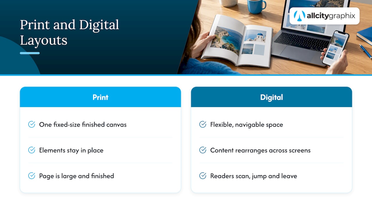
Usability research has long made the point that the two media read differently. Nielsen Norman Group’s comparison of print and web design notes that a printed page is a large, finished canvas, while a web page is a flexible, navigable space where readers scan, jump and leave.
Lifespan: finished object versus living system
This is the difference that changes budgets most. A printed piece is done when it ships. If the phone number is wrong, you reprint. A website is never done: content, offers, speed, search visibility and security all drift unless someone looks after them.
The same NN/G piece makes the key point: the costliest error is treating a site like a printed brochure that never changes. Businesses that launch a website and leave it for four years usually end up in a redesign they could have avoided. If that sounds familiar, our list of reasons to redesign your website is a quick self-check.
How each one performs for a business
Design is not decoration, it has to produce a response. The numbers below describe marketing channels more than design itself, but they show where each medium earns its place.
What the data says about print
According to the 2024 ANA Response Rate Report as summarized by PIWorld, direct mail is the top-performing offline channel for response, with house lists averaging between 5% and 9%. The same article reports median direct mail ROI of 112%, against 93% for paid search and 89% for online display ads. It also reports that combining print and digital can lift overall response by 20 to 30% on average.
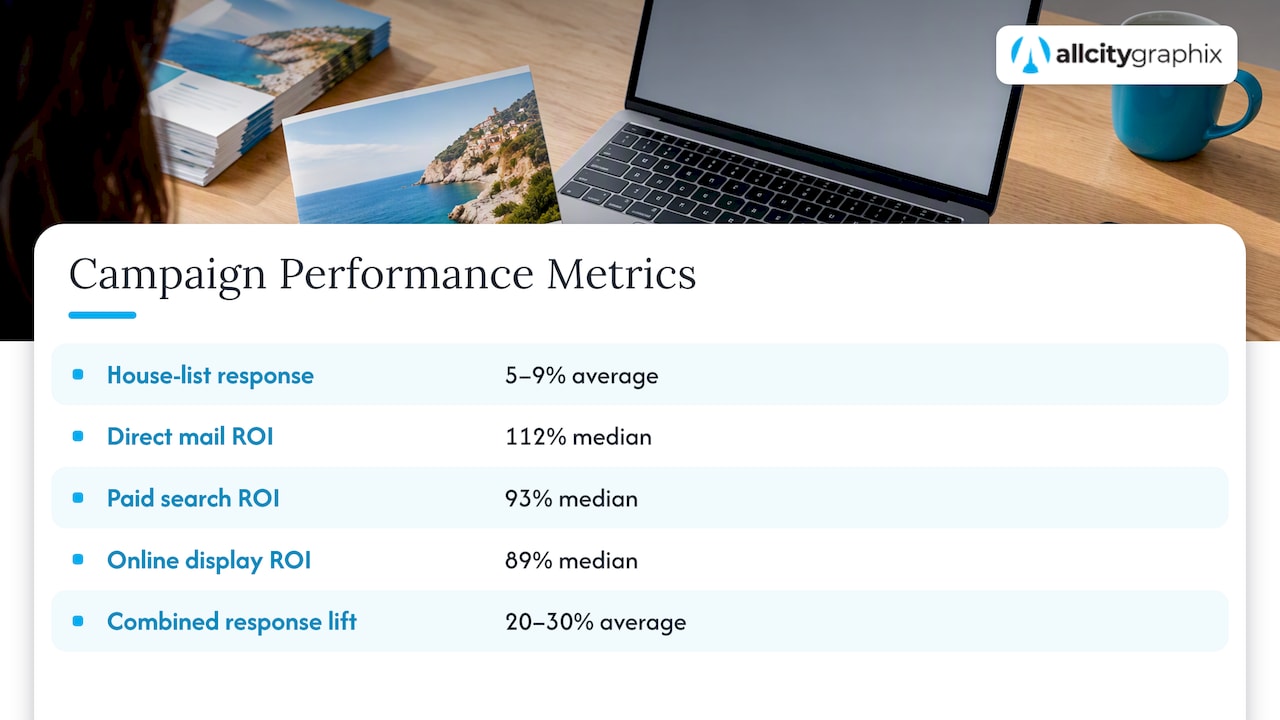
Treat those as industry-wide figures, not a promise for any single campaign. Your list quality, offer and creative will decide your own result. But they back up something we see often: a well-designed physical piece still cuts through a crowded inbox.
Print also does jobs a screen cannot: a menu a customer holds, packaging that sits on a shelf, signage that works at 30 feet, an event backdrop that photographs well. When the product itself is physical, or the setting is physical, print design is the brand.
What the data says about digital
Digital wins on reach, speed and measurement. You can launch a page today, see who visited tomorrow, and rewrite the headline on Friday. Design quality drives that performance too. The HubSpot statistics roundup cites Adobe research that, given 15 minutes to consume content, two-thirds of people would rather read something beautifully designed than something plain. Zippia’s small business website statistics report that 38% of customers disengage from a site with an unappealing layout.
In short: the first screen your visitor sees is your storefront. A weak layout does not just look bad, it quietly costs inquiries. We lay out practical fixes in our piece on conversion-focused web design.
Costs: where the money goes
Print cost is front-loaded and tied to quantity, paper, finish and shipping. Digital cost is spread out: design and development first, then hosting, updates and promotion.
A few points that surprise owners:
- Short runs are not automatically pricey. Adobe’s guide notes digital printing is not inherently more expensive than offset for smaller runs. Commercial printing industry material describes digital as better suited to short-to-medium runs of under 5,000 units, variable data and fast turnaround.
- Personalization adds prepress work. Variable-data printing, where each piece carries a different name or offer, needs database cleanup and templates, which can bring extra fees.
- Color matching and proofs cost extra. See the 40 to 70 percent figure above for spot-color matching.
- Digital has ongoing costs. A site needs maintenance, and traffic needs either content, SEO or paid ads. Our comparison of Google Ads versus SEO for small businesses shows how that budget decision plays out.
We do not publish fixed prices for our services, because scope drives everything: number of pages, products, print pieces, photography, ongoing support. We quote after a discovery conversation.
Which one does your project need?
Start with the job, not the medium. Ask these questions in order.
- Where will your customer be when they decide? On a phone searching for you, digital. Standing in a store, walking past a window, opening the mail or sitting at a trade show, print.
- Will the content change? Prices, hours, menus, inventory and offers that change monthly belong online. Content that must last (a logo on a sign, a package, a certificate) belongs in print.
- Do you need proof it worked? Digital gives granular data. Print needs a built-in tracking device: a unique URL, QR code, phone number or promo code.
- What does the physical experience say about you? Paper stock, finish and weight communicate quality before a word is read. If your category sells on trust or craft, that matters.
- Who has to find you? If strangers need to discover you, you need search visibility, which is a digital task. See our SEO guide for small businesses.
Quick examples
- A restaurant needs a menu that prints cleanly, a website with current hours and a Google presence. Our restaurant marketing ideas show how those pieces fit together.
- A product brand needs packaging and labels (print), a Shopify store (digital) and a single palette that holds across both.
- A professional services firm often leads with the website and a strong brand identity, then adds a few well-made printed leave-behinds for meetings.
- An event needs signage, programs and backdrops (print) plus a registration page and social content (digital). That is where event design draws on both skill sets.
Perspective: why the split is mostly a planning problem
We have worked on both sides for more than 15 years, and the pattern is consistent: the trouble rarely comes from picking the wrong medium. It comes from designing each piece as if it lived alone.
The logo that was drawn for a website header turns up too thin on an embroidered shirt. The brochure uses a green that the website never matched. The postcard asks people to “visit our site” and sends them to a homepage that has nothing to do with the offer. Each piece is fine by itself. Together they look like three different companies.
Our process starts with discovery, before anyone opens a design tool. We want to understand what the business sells, who buys it, where those buyers are, and what a good result looks like in numbers. Only then do we decide what gets printed and what gets built. A brand identity comes first: logo, palette, type and rules that work in CMYK and RGB, in a 2-inch space and on a billboard. Everything after that is easier and cheaper because the decisions are already made.
Our advice to owners with a limited budget: put your money first into the thing customers see most often, and make that piece excellent. For most service businesses that is the website. For most product businesses it is the package. Then add the other medium as a support, not a duplicate.
— Alex
Connecting print and digital
Integrated campaigns do more than run side by side. Tension’s direct mail timeline article describes the connective tissue: CASS-certified mailing lists to save on postage, dedicated landing pages for QR codes so you can track return, and a plan for managing digital assets so high-resolution files are ready for print-ready PDFs and responsive layouts at once.
In practice, that means:
- One landing page per printed piece. A postcard with a QR code should open a page that repeats the postcard’s headline and offer, not your general homepage. For paid campaigns the same principle applies; the role of landing pages for paid traffic is to match the promise that sent the visitor.
- A shared asset library. Keep master logo files (vector), print-ready PDFs, web-optimized images and a color sheet in one place, labeled clearly.
- Matching copy and visuals. Use the same voice, imagery and offer across both, so recognition builds.
- Tracking built in. Unique codes, URLs or phone numbers per piece, so you know what worked.
If you want the content side of that plan, our website content strategy guide shows how to decide what each page must say before design starts.
Common mistakes to avoid
- Approving print from a screen. Always ask for a proof for color-critical work.
- Designing in RGB and converting at the last minute. Colors shift. Check them early.
- Forgetting bleed, margins and safe zones. These are cheap to build in and expensive to fix after printing.
- Launching a site and walking away. Content and performance need attention. Maintenance is part of the project, not an add-on.
- Overloading a small canvas. A business card is not a brochure. Pick one action.
- Skipping the call to action. Both mediums need one clear next step.
Working with a team that does both
All City Graphix is a New York City creative agency covering branding, web design, graphic design, digital marketing and more. If you need a brand identity that holds up across business cards, packaging, signage and a WordPress or Shopify site, our graphic design and branding teams work from the same strategy. You deal directly with experienced leadership, and support continues after launch. Tell us what you are trying to achieve on our homepage contact options, and we will suggest what to print, what to build and what to leave out.
FAQ
Is print design or digital design better for a small business?
Neither is better in every case. Digital design usually earns the first investment because customers search online before they buy, and a website can be edited at any time. Print earns its place where the customer is physical: a storefront, a mailbox, an event. Most small businesses end up needing both, with one brand system behind them.
What is the difference between print design and web design?
Print design produces a fixed object with set dimensions, CMYK color and high-resolution images. Web design produces a flexible, interactive experience in RGB that must adapt to many screen sizes and be maintained over time. The visual principles are shared, but the technical constraints and the way success is measured differ.
Is digital printing expensive?
Not by default. Adobe notes that digital printing is not inherently more expensive than offset for smaller runs. Costs rise with customization, variable-data work, specialty finishes and color matching, so a simple short run is usually affordable while personalized or Pantone-matched jobs cost more.
Can the same design file be used for both print and digital?
Usually not as is. Print needs high-resolution, CMYK-ready artwork with bleed. Web needs compressed, RGB, responsive assets. The smart approach is to build from a master vector logo and a documented palette, then export separate versions for each medium.
Sources
- Revisiting Response Rates: Why Direct Mail’s ROI Keeps Rising (PIWorld)
- Designing for print versus screen: a full guide (Adobe)
- Differences Between Print Design and Web Design (Nielsen Norman Group)
- Online Printing Services & Comparisons: Expert Guide 2025
- 17 Website and UX Design Statistics (HubSpot)
- Small Business Website Statistics (Zippia)
- Commercial Printing Equipment: What It Actually Costs
- How Long Does a Direct Mail Campaign Take? (Tension)