

A visual identity system is the documented, governed collection of visual rules, tokens, and assets that makes your brand recognizably consistent across every touchpoint. It goes beyond a logo file, covering color, type, imagery, and motion with enough structure that teams, vendors, and software can apply it correctly. Done well, it follows WCAG 2.2 accessibility standards and increasingly lives in machine-readable formats rather than static PDFs.
TL;DR:
- Set positioning, values, and voice before designing assets; then pilot the rules in a real campaign and secure cross department approval before rollout.
- Require a contrast ratio of at least 4.5 to 1 for most text and images of text under WCAG 2.2 Level AA; logotypes are exempt.
- Store color and typography rules in named token files and connect them to design components and the CMS, so one approved change updates every template.
- Name an owner, version the manifest, and maintain an update process; structured token files and rules support automated checks that static PDFs cannot provide.
Table of Contents
- What is a visual identity system, really?
- Core components every visual identity system must include
- How to build a visual identity system step by step
- Documenting and governing: PDFs, tokens, and machine-readable systems
- Rollout and enablement: getting teams to actually use the system
- Accessibility and compliance: what the system needs to cover
- Practitioner notes: what works and common anti-patterns
- The future of identity systems: automation and governance
- How All City Graphix helps you build a system that actually holds up
- FAQ
- Sources
What is a visual identity system, really?
A logo is a mark. A brand identity is the strategy, personality, and promise behind that mark. A visual identity system is the operational layer that sits between them: the rules, assets, and governance that let dozens of people apply the brand correctly without asking a designer every time.
That distinction matters because most consistency failures do not come from a bad logo. They come from a missing rule. A sales deck uses the wrong blue. A social intern stretches the logo. A vendor prints a gradient that was never approved. A visual identity system closes those gaps by defining not just what the brand looks like, but where and how each element applies.
A mature system typically governs:
- Print collateral, packaging, and signage
- Websites, apps, and digital ads
- Social media templates and video or motion graphics
- Sales decks, email signatures, and internal documents
- Environmental and event branding
The newer idea in this space is treating the system as living rather than fixed. A static 40-page PDF gets outdated the moment a new channel appears. A living system has an owner, a version number, and a defined update process, closer to how software teams manage a codebase than how agencies traditionally handed off a style guide. That shift in mindset, from “document” to “governed product,” is the biggest change in how practitioners build identity systems today.
Core components every visual identity system must include
A complete system is more than a logo and a color swatch. Practitioners scaffolding brand work recommend building from evidence and strategy down to execution, so assets are the downstream result of decisions rather than the starting point, according to guidance in the brand-asset-library README. That evidence-first structure, moving from research and positioning to rules and only then to templates, prevents the fragmented governance that happens when design teams start with assets and work backward.
With that order in mind, here is what the component inventory should actually contain:
- Logo variants and lockups: primary mark, secondary mark, icon-only version, horizontal and stacked lockups, minimum size rules, clear space, and a list of forbidden distortions.
- Semantic color palette: primary, secondary, and accent colors assigned to roles (not just hex codes), plus documented contrast ratios for text and UI use.
- Typography scale: a defined set of headline, body, and caption sizes, with named web fonts and system font fallbacks for environments where custom fonts fail to load.
- Imagery and iconography guidance: photography style, illustration rules, icon grid and stroke weight, so visuals feel like one family across contributors.
- Motion, patterns, and templates: animation timing and easing rules, background patterns, and ready-to-use templates for common formats like social posts and slide decks.
One figure to anchor the color section: under WCAG 2.2 Level AA, most text and images of text need a contrast ratio of at least 4.5 to 1 against their background. That single rule, if written into the color component from day one, eliminates a large share of the accessibility rework that otherwise surfaces late in a project.
Typography deserves particular care because recognition research backs up strict consistency here. Work on brand-name identification found that font and letter case affect how quickly and accurately people recognize a name, which is a direct argument for locking down the typography scale rather than letting teams improvise, per the Memory & Cognition study on brand names. Logotypes carry a perceptual signature the same way a face does: change the type treatment and recognition slows down, even if the words are identical.
Imagery and iconography rules exist for the same reason color and type rules do: a photo style that shifts from warm and candid to cold and corporate between channels undercuts everything else the system does correctly. Icon and pattern guidance should specify grid size, stroke weight, and corner radius so that a contractor building a new feature icon matches the set without a design review.
How to build a visual identity system step by step
Building a system in the right order prevents the most common failure mode: jumping straight to logo files and color swatches before anyone has agreed on what the brand is supposed to communicate. Here is the sequence that holds up in practice.
- Audit and gather evidence. Collect every existing asset, brand mention, and piece of customer feedback. Map the informal chain of command for brand decisions today, meaning who currently approves a new deck, a new ad, or a new vendor asset, since that reveals where governance gaps already exist.
- Settle strategy before assets. Define positioning, core values, and voice in writing. Skipping this step is the single most common reason visual systems feel inconsistent even when the files are technically correct: without an agreed strategy, every designer defaults to personal taste.
- Design and tokenize. Build the palette and typography scale as structured files, not just a mood board. A
colors.tokens.jsonandtypography.tokens.jsonfile, assigning roles likebrand.primaryorheading.largeto specific values, lets the same rule drive a website, an app, and a print template from one source. - Document rules with real examples. Write the guidelines with explicit approved and forbidden examples side by side, not just abstract description. Compile a manifest listing every asset, its file location, and its intended use so nothing lives only in one person’s inbox.
- Pilot, test, and ratify. Run the system through a real campaign or website section before full rollout. Test contrast and legibility, get sign-off from stakeholders across departments, then launch with a clear version number.
Pro Tip: Build your token files before your style guide prose. It is far easier to write accurate documentation from a working token set than to retrofit tokens from a PDF written in isolation.
The biggest risk in this process is treating step three as optional busywork. Teams that skip tokenization end up with a beautiful guide that nobody can implement consistently in code, because the color values live in a design file that developers never open.
Documenting and governing: PDFs, tokens, and machine-readable systems
A traditional brand guideline PDF describes rules in prose and pictures. It works for a design team reading it cover to cover, but it breaks down the moment a rule needs to be checked automatically, applied across a CMS, or handed to an AI tool generating marketing copy. PDFs cannot be queried, versioned cleanly, or validated against a build pipeline.
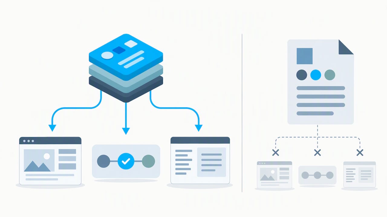
Design tokens solve the scale problem. A token is a named, structured value, like brand.primary mapped to a specific hex code and a minimum contrast ratio, stored in a file such as colors.tokens.json or typography.tokens.json. Any tool or platform that reads the token file applies the rule correctly, with no manual interpretation.
The newer layer on top of tokens is the Machine-Readable Brand System, an open specification that structures an entire identity system into a brand.manifest.json file alongside token directories and a rules/ folder, according to the MRBS specification on GitHub. That structure lets software validate whether a new asset follows the rules, rather than relying on a human to catch violations after the fact.
| Format | Human readable | Machine readable | Supports automated validation |
|---|---|---|---|
| Static PDF guide | Yes | No | No |
| Token files (JSON) | Limited | Yes | Yes |
| MRBS manifest and rules | Yes | Yes | Yes |
- MRBS manifests typically include semantic role fields, usage context, prohibited contexts, and minimum contrast ratio values.
- Token files separate color and type decisions from any single design tool, so updates propagate everywhere at once.
- A manifest also functions as a legal and asset inventory, recording what exists, where it lives, and who approved it.
Version control matters here too: treating the manifest like code, with change history and access permissions, keeps the question of “which version is live” from becoming a guessing game.
Rollout and enablement: getting teams to actually use the system
A finished system that nobody applies correctly is worse than no system, since it creates false confidence. Rollout needs the same planning as the design work itself.
Start by naming an owner, someone accountable for approving exceptions and updating the manifest when the brand evolves, with a defined workflow for who signs off on new templates before they ship. From there:
- Connect token files directly to your design system components and CMS, so a color or type change updates every template at once instead of requiring manual edits.
- Build a rollout kit: a short presentation explaining the why behind key changes, updated email signature templates, and specs for merchandise and signage vendors.
- Run periodic consistency audits, spot-checking recent assets against the rules, and track simple usage metrics like how often the approved templates get downloaded versus recreated from scratch.
- Share the finished guide as a living brand style guide that updates in place rather than a one-time PDF handoff.
Pro Tip: Give every new hire the token files and the manifest on day one, not just the PDF. Developers and designers who start from the structured files make fewer off-brand mistakes than those who start from prose alone.
For physical rollout like trade show signage or printed collateral, matching the documented palette on new materials deserves the same rigor as matching it on screen, since print and display vendors need exact specs to avoid drift between a digital rule and a physical result.
Accessibility and compliance: what the system needs to cover
Accessibility is not a separate checklist bolted onto a finished identity system. It belongs inside the color and typography rules from the first draft.
The baseline is WCAG 2.2 Level AA: a minimum contrast ratio of 4.5 to 1 for most text and images of text. Logotypes are specifically exempt from this requirement, but every other graphical UI component, from buttons to icons, still needs to meet it, a distinction clarified in the WCAG understanding documentation on contrast.
Practical steps to bake this in:
- Test every color pairing in the palette against the 4.5 to 1 threshold before it ships, not after a complaint arrives.
- For print, use a defined color-difference tolerance in PMS matching workflows so a printed brand color does not visibly drift from the digital original, following practical guidance like the PMS color matching workflow from Discount Swag.
- Write alt text guidance and visible focus states directly into templates, and build accessibility checks into code-level reviews using resources like inclusive design principles mapped to WCAG 2.2.
- Loop in legal or brand counsel when a rule touches regulated claims or ADA-related website compliance requirements.
Practitioner notes: what works and common anti-patterns
A workflow that holds up in real engagements starts with discovery: understanding audience, competitors, and goals before a single color is chosen. From there, rules come next, defining the system’s logic, and rollout follows, turning rules into templates teams can actually use. Our experience building brand identity systems at All City Graphix confirms that order consistently outperforms starting with mood boards.
The anti-patterns are predictable:
- Assets-first thinking, where a logo gets designed before anyone agrees on positioning, forcing constant rework later.
- PDF-only governance, where the only record of the rules is a document nobody updates after launch.
- Missing tokens, where color and type values live only inside design files, so every new platform reinvents the translation.
Teams that move to token-based and MRS-style documentation report fewer print reprints caused by mismatched colors and faster content production, since contributors pull from a structured source instead of guessing.
The future of identity systems: automation and governance
Rules-as-code is not a trend, it is the only practical way to keep a brand consistent once AI tools start generating assets at volume. A system that only humans can read will fall behind one that software can validate automatically.
The practical next step for most brand teams is modest: treat your documentation as a product with an owner and a review schedule, not a one-time deliverable. Start converting your palette and type rules into token files this quarter.
— Alex
How All City Graphix helps you build a system that actually holds up
We build visual identity systems the same way we approach every branding engagement: strategy first, execution second, support after launch. For teams ready to move past a logo file and a loose PDF, we offer brand strategy, brand identity, and brand collateral work that produces documented rules, not just pretty assets.
What that looks like in practice:
- A discovery process that captures positioning and voice before any visual work starts
- Token-ready color and typography decisions built for web, print, and app use
- A rollout package covering templates, signage specs, and ongoing maintenance support
The result clients should expect is fewer off-brand assets slipping through, a documented system their whole team can reference, and less time spent rebuilding the same deck or banner from scratch. If your current guidelines live in a PDF nobody opens, our logo design and identity team can help turn that into a living, governed system. Reach out through our services page to start a discovery conversation.
FAQ
What is an example of visual identity?
A visual identity example is the full set of documented visual rules a brand uses across touchpoints: a specific logo lockup, a semantic color palette, a defined typography scale, and imagery guidelines, all applied consistently from a website to printed packaging. It is broader than a single logo file because it includes the rules governing how that logo and its supporting elements are used.
What are the 7 types of logos?
Common logo type categories include wordmarks, lettermarks, pictorial marks, abstract marks, mascots, combination marks, and emblems. Definitions of these categories vary somewhat by source, but most identity systems document which type they use along with sizing, spacing, and forbidden-use rules for that specific mark.
What are the four main components of visual identity?
Most visual identity systems treat logo, color palette, typography, and imagery or iconography as the four foundational components. A complete system also documents motion, patterns, and templates, but those four form the baseline that every other guideline builds on.
What is the rule of thumb for consistent branding?
Definitions of specific numeric branding rules vary across sources and are not standardized by any single authority, so we would rather point you to the practice that matters: documenting and testing contrast ratios, like the 4.5 to 1 minimum under WCAG 2.2, and codifying color and type rules in token files so they apply the same way everywhere.
Sources
- Web Content Accessibility Guidelines (WCAG) 2.2
- brand-asset-library README
- Visual word identification beyond common words: The role of font and letter case in brand names (Memory & Cognition)