

Responsive web design is a single-codebase approach to building websites so they render correctly on any screen, using fluid grids, flexible images, and CSS media queries instead of separate sites for separate devices. If you fix nothing else on an aging site today, fix these three things:
- Add the viewport meta tag so mobile browsers stop rendering a shrunk desktop layout
- Switch fixed pixel widths to relative units like percentages and rem
- Set a mobile-first CSS baseline, then layer in complexity for bigger screens
Everything past this point is detail on how to do those three things well, plus the layout tools, testing habits, and workflow that separate a site that merely “looks fine on my phone” from one that holds up across hundreds of screen sizes you’ll never personally test.
Key Takeaways
Responsive web design works because fluid grids, flexible images, and content-driven media queries let one codebase adapt correctly to any screen, and mobile-first workflow keeps that codebase lean from the start.
| Point | Details |
|---|---|
| Three pillars come first | Fluid grids, flexible images, and media queries are non-negotiable; everything else builds on them. |
| Fix the viewport tag immediately | Missing viewport meta causes mobile browsers to render shrunk desktop layouts on old sites. |
| Choose breakpoints by content | Set breakpoints where your layout actually breaks, not at standard device widths. |
| Use Container Queries for components | They let reusable components respond to their container instead of the full viewport. |
| Test on real devices before launch | Lighthouse scores and lived device experience often diverge; check both. |
| Allcitygraphixny handles full conversions | The agency scopes responsive refactors versus hybrid adaptive work project by project for New York area businesses. |
Table of Contents
- What Are the Core Principles of Responsive Web Design?
- Which Layout Tools Work Best for Responsive Design?
- What’s the Right Workflow for Building a Responsive Site?
- How Do I Turn an Existing Site Responsive? A 6-Step Checklist
- What Agency Work Teaches You About Responsive Design
- How Do You Handle Responsive Videos and Embedded Content?
- Do Progressive Web Apps Still Need Responsive Design?
- Why Most Advice on Responsive Design Undersells the Workflow
- Get a Responsive Site Built by People Who Test on Real Devices
- Sources
- FAQ
What Are the Core Principles of Responsive Web Design?
Three mechanics do almost all the work: fluid grids, flexible images, and media queries. Get these right and most layout problems solve themselves before you touch a single breakpoint.
A fluid grid uses relative units, percentages, fr in CSS Grid, rem for spacing and type, instead of fixed pixel widths. A three-column layout built with grid-template-columns: 1fr 1fr 1fr reflows automatically as the viewport shrinks; one built with width: 300px three times over just breaks.
Flexible images matter because an image sized for a 1920px monitor is dead weight on a 375px phone. The baseline fix is img { max-width: [100%](https://www.smashingmagazine.com/2020/03/setting-height-width-images-important-again/); height: auto; }, which stops images from blowing out their containers. For real control over which file size loads where, srcset and sizes let the browser pick the right image for the device, and <picture> handles art direction, like cropping a hero photo differently on mobile versus desktop.
Media queries are where most people get sloppy. The instinct is to write breakpoints for “iPhone” or “iPad.” Don’t. Content-driven breakpoints, changing the layout wherever your actual content starts to look cramped or awkward, future-proof a design against screen sizes that don’t exist yet. Device-specific breakpoints age badly; content-based ones don’t.
- Build with relative units from the start, not as a retrofit.
- Cap image display size with
max-width: 100%before optimizing further. - Set breakpoints where your content, not a device catalog, tells you to.
Pro Tip: Resize your browser window slowly from full width down to 320px while watching one page. Wherever the text or layout looks wrong is your breakpoint. That’s a better method than copying a list of standard device widths.
Which Layout Tools Work Best for Responsive Design?
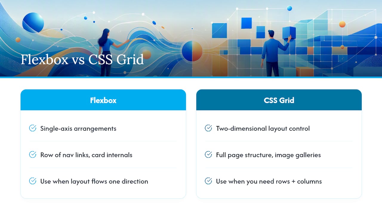
Flexbox and CSS Grid solve different problems, and using the wrong one is a common source of fragile layouts. Flexbox handles single-axis arrangements: a row of navigation links, a card’s internal content stacking, anything that flows in one direction. Grid handles two-dimensional layout: full page structure, image galleries, anything that needs explicit control over both rows and columns.
A fluid grid pattern worth memorizing:
.grid {
  display: grid;
  grid-template-columns: repeat(auto-fit, minmax(240px, 1fr));
  gap: 1rem;
}
That single line, combining auto-fit with minmax, builds a responsive card grid with zero media queries. Columns add or drop automatically as space allows.
Container Queries are the newer piece worth learning. A media query only knows the viewport size; a container query lets a component respond to the size of its own parent container, regardless of where that component sits on the page. That distinction matters for design systems: a card component dropped into a narrow sidebar and the same card dropped into a wide main column can each render their optimal layout, because each one checks its own container rather than the whole browser window.
Migrating reusable components to container queries cuts down on the fragile, overlapping global breakpoints that pile up in older stylesheets. It’s one of the few CSS additions in the past decade that actually reduces complexity instead of adding to it.
Practical applications: card grids use auto-fit/minmax, navigation menus switch from Flexbox rows to a stacked mobile pattern at a content breakpoint, and hero sections use Grid to reposition text over an image without duplicating markup.
What’s the Right Workflow for Building a Responsive Site?
Start mobile-first. Design and code the smallest screen first, then add complexity for larger viewports with min-width media queries. This isn’t just a stylistic preference: it forces you to prioritize actual content over decoration, since a 375px screen has no room for anything that isn’t earning its place. This is progressive enhancement in practice, and it tends to produce cleaner desktop layouts too, since you’re adding to a solid foundation instead of stripping down a bloated one.
- Build the mobile layout and content hierarchy first, with zero media queries.
- Widen the viewport until something looks cramped or awkward, then add a breakpoint there.
- Implement responsive images with
srcsetandsizes, serving modern formats like WebP or AVIF where file size actually matters for load time. - Inline critical CSS, defer non-essential JavaScript, and lazy-load offscreen images.
- Measure Cumulative Layout Shift and Largest Contentful Paint, not just “does it look okay.”
- Run an accessibility pass: font scaling, touch target size, keyboard focus order, and color contrast.
Pro Tip: A layout that passes every visual check can still fail Core Web Vitals. Set your image width and height attributes even when using srcset — the browser needs them to reserve space and avoid layout shift while the image loads.
Skip accessibility at your own risk here: a 44px touch target and visible focus states aren’t polish items, they’re the difference between a site that works for someone using a keyboard or a screen reader and one that quietly locks them out.
How Do I Turn an Existing Site Responsive? A 6-Step Checklist
Converting a fixed-width legacy site is a different job than building responsive from scratch, mostly because you’re untangling old assumptions instead of avoiding them in the first place.
- Add the viewport meta tag. Without
<meta name="viewport" content="width=device-width, initial-scale=1.0">, mobile browsers render the page at desktop width and zoom out, which is why old sites look tiny and unreadable on a phone. Set this before touching anything else. - Convert fixed widths to relative units. Replace pixel widths on containers with percentages or
fr, and refactor float-based layouts to Flexbox or Grid. - Implement responsive images. Add
srcsetandsizesto key images, and setloading="lazy"on anything below the fold. - Add content-driven breakpoints. Test on real devices, not just browser dev tools, since actual touchscreens surface issues emulators miss.
- Optimize performance. Convert images to modern formats, extract critical CSS, and lazy-load what isn’t immediately visible.
- Run an accessibility and spacing audit. Check touch target sizing, tab order, and contrast ratios before calling the project done.
Common pitfalls at each step: skipping step 1 and wondering why nothing else fixes the zoom issue, choosing breakpoints from a device chart instead of your own content, and declaring victory after a Lighthouse score without checking the site on an actual five-year-old Android phone. The scores and the lived experience aren’t always the same thing.
What Agency Work Teaches You About Responsive Design
Client projects rarely arrive as clean slates. A common pattern: a business has an existing site built years ago, wants it to “work on phones,” and assumes that means a quick CSS patch rather than a structural rethink of the markup underneath it. Sometimes it is a quick patch. More often the underlying HTML wasn’t built with any layout logic that survives translation to a fluid grid, and the honest answer is a partial redesign rather than a patch.
Scoping decisions come down to one question: is this a responsive refactor, or does the situation call for adaptive techniques layered on top, serving simplified components or smaller assets to specific device categories for a targeted performance win? Hybrid approaches show up more often in real projects than pure-responsive purists like to admit, particularly for image-heavy sites like restaurants or contractors where load time on a job-site 4G connection is the whole ballgame.
The projects that go sideways are almost never the ones where the CSS was hard. They’re the ones where nobody tested on a real device until launch week.
Our testing workflow, refined across dozens of construction and service industry builds:
- Stage the build before any client review, never test on production
- Run it through a physical device lab, not just emulators
- Pair Lighthouse audits with manual keyboard and screen-reader checks
- Flag layout shift and slow LCP before calling anything “done”
How Do You Handle Responsive Videos and Embedded Content?
Embedded content, YouTube iframes, Google Maps, third-party widgets, breaks responsive layouts more often than anything else on a page, mostly because that content arrives with its own fixed width and height attributes baked in.
This keeps the video scaling proportionally at every screen width instead of overflowing its column or leaving awkward whitespace.
Maps and social embeds deserve the same scrutiny. A Google Maps iframe dropped in at a fixed 600px width will force horizontal scroll on mobile if you don’t override it. Wrap it, cap its max-width, and test it at 320px before shipping.
One more thing worth flagging: lazy-load video embeds and heavy iframes the same way you lazy-load images. A page with three autoplaying embeds above the fold will tank both your Largest Contentful Paint and your visitor’s patience, especially on a mobile data connection where every megabyte counts against load time.
Do Progressive Web Apps Still Need Responsive Design?
Yes, and the two work together rather than replacing each other. A Progressive Web App, a website that can be installed to a home screen, run offline, and send push notifications, still renders in a browser engine underneath all that. If the layout beneath the app shell isn’t responsive, the PWA wrapper doesn’t fix it.
What changes is the design surface you’re building for. A PWA needs to look right not just across phone and desktop browser widths, but in a standalone installed window with no browser chrome, sometimes in split-screen multitasking view on a tablet, sometimes in an unusual aspect ratio dictated by a foldable device. The fluid grids, flexible images, and content-driven breakpoints already covered here are exactly what makes a PWA hold up across that wider range of contexts.
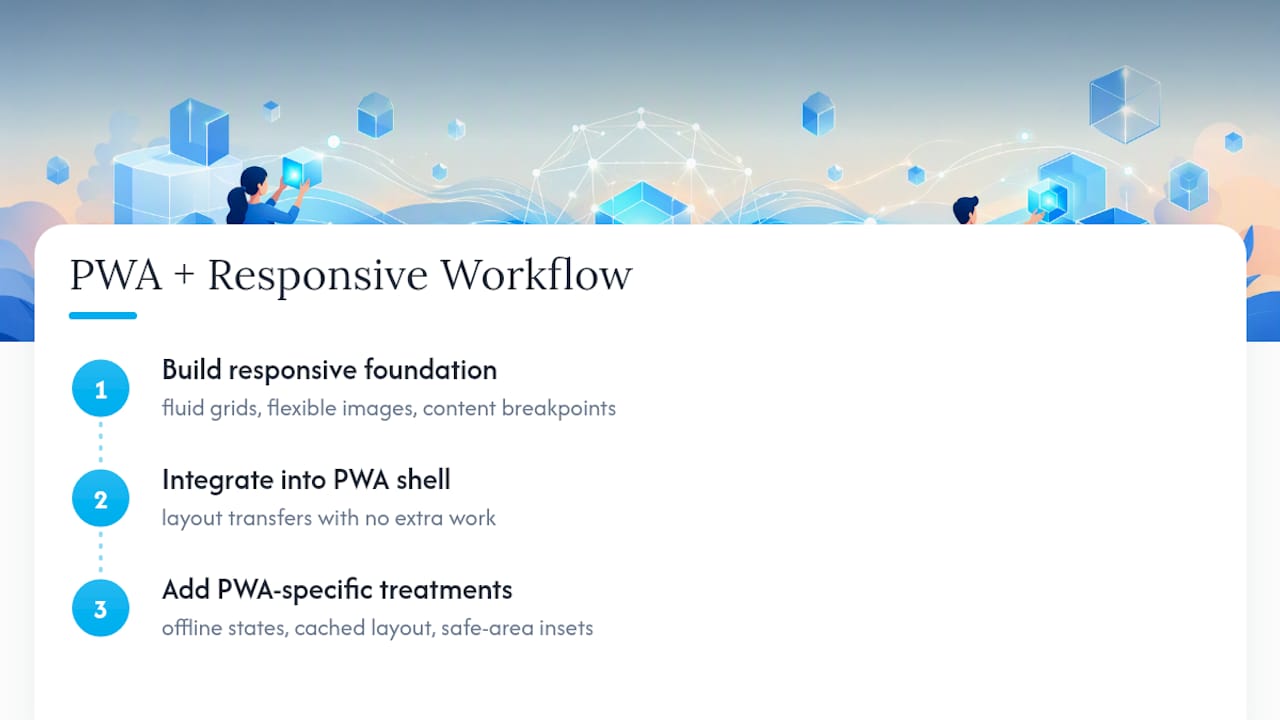
The practical overlap: a responsive layout built with Grid and Flexbox transfers directly into a PWA shell with no extra work. Where PWAs add genuinely new considerations is around offline states, cached content needs its own layout treatment when images or embeds fail to load, and around safe-area insets on devices with notches or rounded corners, which responsive CSS alone doesn’t account for without additional env() variables.
If you’re planning a PWA, build the responsive foundation first and treat the installability layer as an addition on top, not a separate design track running in parallel.
Why Most Advice on Responsive Design Undersells the Workflow
The conventional wisdom treats responsive design as a checklist of CSS properties: add some media queries, cap your images, call it done. That’s not wrong, exactly, but it skips the part that actually determines whether a site holds up: the order you do things in. Mobile-first isn’t a nice philosophical stance, it’s a forcing function that keeps you from designing a bloated desktop layout and then apologizing for it on small screens.
Where the standard advice really falls short is Container Queries. Most guides still mention them as an emerging feature to watch. They’re not emerging anymore, they’re a tool you should be reaching for on any component that gets reused across different layout contexts, a card in a sidebar and the same card in a grid.
If you take one thing from this guide, prioritize content-driven breakpoints over device-driven ones. Device catalogs change every year. Your content’s actual pressure points, where text wraps badly or a button gets cramped, don’t. Build against those, and your layout ages far better than one tuned to whatever phone was popular the year you shipped it.
Get a Responsive Site Built by People Who Test on Real Devices
Reading through six steps of breakpoints, container queries, and performance audits is one thing. Actually rebuilding a site that’s been fixed-width since 2015 is another, especially while running a business at the same time. Allcitygraphixny handles the full conversion: mobile-first rebuild, image optimization, cross-device testing on a real device lab, and an accessibility pass, so you’re not the one debugging layout shift on a Tuesday night.

That’s the practical difference for a small business owner reading this guide: you get the workflow above executed by a team that’s run it across construction, restaurant, and service-industry sites already, instead of piecing it together solo between other responsibilities. If your current site still zooms out on a phone or breaks at certain widths, start with a web design consultation to scope what a responsive rebuild actually involves for your specific site.
Sources
For hands-on reference, MDN’s responsive design guide covers Grid, Flexbox, and container queries in depth. For image techniques specifically, MDN’s responsive images tutorial walks through srcset and sizes step by step. For workflow philosophy, IxDF’s mobile-first overview explains the progressive enhancement reasoning behind it.
FAQ
What Are the Three Basic Things Required for Responsive Web Design?
The three pillars are fluid grids built with relative units, flexible images that scale within their containers, and CSS media queries that adjust layout at content-driven breakpoints.
How Do I Turn My Website Into Responsive?
Add the viewport meta tag, convert fixed pixel widths to relative units, refactor layouts to Flexbox or Grid, implement responsive images with srcset, and test across real devices, following the 6-step checklist above.
What Is Responsive Design in UI/UX?
In UI/UX, responsive design means designing interface components, navigation, cards, forms, so they rearrange and resize gracefully across screen sizes, rather than designing one fixed layout per device type.
What’s the Difference Between Responsive and Adaptive Design?
Responsive design uses one fluid codebase that adapts continuously; adaptive design serves distinct fixed layouts at set breakpoints. Adaptive can win on speed for specific devices but costs more to build and maintain long term.
Does Allcitygraphixny Build Responsive Sites From Scratch or Only Convert Existing Ones?
Allcitygraphixny does both: full responsive builds on WordPress and Shopify for new projects, and structural conversions for existing sites that were never built with a fluid layout.