

Good website navigation lets visitors find a priority task, whether that is a product page, a contact form, or a pricing table, in as few clicks as possible, and it works for everyone regardless of how they browse. The W3C’s navigable guidelines and semantic HTML practices set the technical floor; everything else is a design decision layered on top.
TL;DR:
- Use simple, familiar patterns like top header menus, footer links, and breadcrumbs tailored to your content and user needs.
- Limit primary navigation to two levels for clarity, and test menu breadth and depth with real users to ensure effective usability.
- Implement accessible features such as skip links, logical focus order, and visible focus outlines to support users with assistive technologies.
- For mobile, favor progressive enhancement with toggle controls, large touch targets, and clear labels, avoiding over-reliance on hamburger menus.
- Keep navigation labels descriptive and consistent across devices, and prioritize high-traffic pages at the start and end of menus for better engagement.
Table of Contents
- Types of website navigation and when to use them
- A prioritized checklist for navigation design best practices
- Accessibility and WCAG-mapped requirements for navigation
- Responsive and mobile navigation: patterns that work on touch and small screens
- Information architecture and labeling: how to choose menu items and structure depth
- Patterns and short examples designers can copy
- How navigation affects SEO and findability
- User behavior and usability testing methods for navigation
- Navigation design trends and their impact on user engagement
- Common navigation pitfalls and how to avoid them
- What we’ve learned building navigation for real client sites
- Let us redesign your navigation around how visitors actually use your site
- FAQ
- Sources
Types of website navigation and when to use them
Most sites rely on a handful of recurring patterns, and picking the right mix depends on your content and your audience’s goals rather than habit or trend.
- Global or header navigation sits at the top of every page and links to your primary sections; it’s the backbone for marketing sites and ecommerce stores alike.
- Footer navigation catches secondary links such as legal pages, careers, or sitemap items that don’t deserve top billing but still need a home.
- Sidebar or local navigation works well for documentation, blogs, and knowledge bases where readers move between related articles within a category.
- Breadcrumbs show a visitor’s position in a hierarchy and matter most on sites with deep page structures, like product catalogs or multi-level resource libraries.
- Utility links (account, cart, search, language switcher) live apart from primary navigation because they serve a different kind of task.
- On-page tables of contents help readers jump within a single long page, which suits guides, policies, and reference material.
Depth matters as much as breadth. YaleSites recommends keeping a basic navigation menu to two levels, and reserving a mega menu, which can go three levels deep, for sites with genuinely dense catalogs. There’s no fixed number of links that works for every site: the right count depends on your content, your goals, and what your users are trying to do.
A small marketing site rarely needs more than global navigation, a footer, and maybe a sticky CTA. An ecommerce store with hundreds of SKUs often needs a mega menu plus breadcrumbs so shoppers never lose their place. Documentation sites lean on sidebar navigation because readers scan and compare rather than follow a straight path.
A prioritized checklist for navigation design best practices
Treats these as an order of operations rather than a flat list; each step depends on getting the one before it right.
- Start with simplicity and convention. Visitors expect the logo to link home, the main menu across the top, and search in the upper right; breaking those patterns costs more than it gains.
- Order items by what users actually do. Put your highest-traffic, highest-intent pages first and last in the menu, since people scan the beginning and end of a list more carefully than the middle.
- Write descriptive labels, not clever ones. “Pricing” beats “Plans & Perks,” because a menu item’s job is to set accurate expectations, not to entertain.
- Separate utility links from your core menu. Account settings, cart icons, and login buttons belong in a distinct area so they don’t compete with content navigation for attention.
- Decide breadth versus depth deliberately. A wide menu with few levels suits broad catalogs; a narrow, deeper menu suits focused services. Test both with real users before locking in a structure.
- Keep wording and order consistent across devices. A menu that reorders itself between desktop and mobile forces visitors to relearn your site every time they switch screens.
Pro Tip: Run a five-second test where users glance at your navigation and tell you what they expect to find under each label; mismatches show up fast.
The ordering logic behind step two draws on basic attention research: items at the start and end of a horizontal menu get noticed first, which is why “Home” anchors the left and a CTA like “Contact” or “Get a Quote” often anchors the right. Labels matter more than most teams assume. A label based on your internal department names (“Solutions Engineering”) means nothing to a visitor who thinks in terms of their own problem (“Troubleshooting”). Write every label from the visitor’s vocabulary, not your org chart.
Breadth versus depth is a real tradeoff with no universally correct answer. A flat, wide menu puts everything one click away but risks overwhelming new visitors with choices. A deeper, narrower structure organizes content more logically but adds clicks. The only reliable way to settle this for your own site is to test navigation with actual users rather than guess from a wireframe.
Accessibility and WCAG-mapped requirements for navigation
Accessible navigation isn’t a separate checklist from good navigation: the two overlap almost entirely, because clear structure and conventional patterns help every visitor, including people using screen readers, keyboard-only input, or switch devices. WCAG 2.2’s Guideline 2.4 on navigable content sets out the specific success criteria that map directly onto navigation design.
- Bypass blocks: add a skip link so keyboard users can jump past repeated navigation straight to main content.
- Focus order: make sure tabbing through the page follows a logical, visual sequence rather than jumping around the DOM.
- Visible focus: never strip default focus outlines without replacing them; a sighted keyboard user needs to see where they are.
- Link purpose: write link text that makes sense out of context, since screen reader users often scan a list of links in isolation.
- Headings and labels: use real heading elements, not styled text, so assistive technology can build an accurate page outline.
- Location cues: mark the current page or section so visitors always know where they stand within the site.
On the technical side, MDN’s documentation on the nav element recommends wrapping primary link groups in a <nav> element, structuring the links as an unordered list, and labeling multiple navigation regions so assistive technology can tell them apart. Use aria-current="page" to mark the active item instead of relying on a visual style alone.
One of the clearest implementation warnings from Web is that adding ARIA roles and custom JavaScript on top of native HTML can reduce accessibility rather than improve it when semantic markup would have done the job. Hover-only submenus are a common trap: a menu that only appears on mouseover is invisible to keyboard and touch users, so expandable items need a visible toggle and should hide with display or visibility rather than tricks that leave links focusable but invisible.
Responsive and mobile navigation: patterns that work on touch and small screens
Start with semantic HTML, then add behavior with CSS and JavaScript. That progressive enhancement approach, recommended by web.dev, means a navigation menu still works, in a basic form, even before your scripts load or if a visitor’s browser handles them differently than expected. Our guide to responsive web design covers the breakpoint decisions that shape how a menu collapses on smaller screens.
- Hamburger menus suit sites with many sections that would otherwise crowd a small screen, but they hide navigation behind an extra tap, so reserve them for genuinely large menus rather than defaulting to them everywhere.
- Bottom navigation bars work well for app-like experiences where a few core destinations need to stay one thumb-tap away at all times.
- Persistent headers that stay visible on scroll suit content-heavy pages where visitors need to jump sections without scrolling back up.
- Toggle controls need
aria-expandedandaria-controlsattributes so screen readers announce whether a menu is open, plus a visible state change so sighted users get the same signal. - Keep touch targets large enough and test every interactive element with a keyboard alone, since a mobile menu that only responds to touch gestures locks out assistive technology.
Platform guidance on app-like interfaces, including Microsoft’s navigation basics, favors short one or two word labels and caps bottom navigation at a handful of destinations to avoid asking users to weigh too many choices at once. The same logic applies to mobile web menus: fewer, clearer choices beat a long list squeezed into a small screen.
Information architecture and labeling: how to choose menu items and structure depth
Navigation is the visible layer of a deeper structure, and skipping straight to menu design without planning the structure underneath it is one of the most common causes of a confusing site, according to W3C’s tutorial on menu structure.
- Inventory every page your site currently has or plans to add, then group them by what a visitor is trying to accomplish rather than by internal department.
- Validate the groupings with card sorting or tree testing before you commit to a hierarchy; it’s far cheaper to fix a label on paper than after launch.
- Write short, user-centered labels and avoid naming menu items after file formats or internal jargon, since a visitor thinks in terms of problems and tasks, not document types.
- Keep wording and order predictable across every page and device so visitors build an accurate mental model after their first visit.
Our content strategy guide walks through the inventory step in more detail if you’re planning a larger site restructure.
Pro Tip: If two reviewers sort your pages into noticeably different groups during a card sort, that’s a sign your categories don’t match how visitors actually think about your content.
Patterns and short examples designers can copy
A few recurring patterns solve most navigation problems without reinventing anything.
- Header, search, and breadcrumbs together suit large content sites: the header carries primary sections, search handles long-tail intent, and breadcrumbs orient visitors once they’re several levels deep. Mark breadcrumbs as their own labeled nav landmark, as web.dev’s navigation lesson recommends, so assistive technology treats them as a distinct region rather than part of the main menu.
- A shallow, five-to-seven-item marketing menu fits most small business sites: list services, about, portfolio or work, and contact, skip the mega menu entirely, and let the footer absorb everything else.
- An accessible mobile menu pairs a single toggle button with
aria-expanded, a focus trap that keeps keyboard tabbing inside the open menu, and a close control that returns focus to the toggle button once dismissed.
Each pattern earns its place by matching a specific task: breadcrumbs answer “where am I,” a shallow menu answers “what do you offer,” and a well-built mobile toggle answers “can I use this without a mouse.”
How navigation affects SEO and findability
Navigation’s effect on search visibility is indirect but real: clear, crawlable links help search engines find and understand your pages, which supports both indexing and internal link equity. Ahrefs’ guide to website navigation recommends exposing important pages through standard HTML links rather than relying only on JavaScript-driven interactions that a crawler might not execute the same way a browser does.
Descriptive link text helps here too, since the words inside a link give search engines (and visitors) context about the destination page. Keeping your navigation structure consistent across the site also reinforces which pages you consider important, because the same links appearing on every page carry more internal authority than one-off links buried in body content. None of this replaces a real content strategy, but a tangled or JavaScript-only menu can quietly work against otherwise solid pages.
User behavior and usability testing methods for navigation
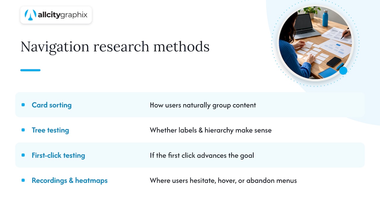
Watching how people actually move through a menu reveals problems that a design review never catches. Tree testing strips away visual design and asks participants to find a specific item within a text-only hierarchy, which isolates whether your labels and structure make sense on their own. Card sorting, done earlier in the process, shows how people naturally group your content before you’ve committed to a menu structure.
First-click testing measures whether a visitor’s first tap or click on a task moves them closer to their goal; a wrong first click strongly predicts a failed task overall. Session recordings and heatmaps add a passive layer on top of these structured tests, showing where visitors hesitate, hover repeatedly, or abandon a menu partway through.
None of these methods require expensive tools to get useful signal. Even five participants in a quick tree test will surface the labels and groupings that confuse people, and that’s often enough to catch the biggest structural problems before they reach production. The goal isn’t a perfect study, it’s catching mismatches between how you organized the site and how visitors actually think about it.
Navigation design trends and their impact on user engagement
Flat, minimal menus have pushed out heavier dropdown-and-icon combinations on most marketing sites, largely because simpler menus load faster and scan more easily on mobile screens, where most traffic now arrives. Sticky headers that stay visible during scroll have become close to a default on content-heavy sites, since they keep navigation one tap away without forcing a scroll back to the top.
Search-first navigation, where a prominent search bar sits alongside or instead of a deep menu, has grown on large ecommerce and content sites where the catalog is too big for any menu structure to cover well. Personalized navigation, which reorders or highlights menu items based on a visitor’s past behavior, shows promise for logged-in experiences but adds complexity that a smaller site rarely needs.
The throughline across these trends is restraint: the sites that engage visitors best tend to be the ones that resist adding every possible link to the main menu and instead commit to a smaller set of well-tested priorities. Chasing a trend without testing it against your own visitors’ behavior risks solving a problem you don’t actually have.
Common navigation pitfalls and how to avoid them
Most navigation failures trace back to a handful of repeated mistakes rather than exotic edge cases.
Overloaded menus, where every department gets a top-level slot regardless of traffic or importance, confuse visitors and dilute the pages that actually matter. Fix this by auditing analytics for your most-visited pages and giving this priority placement, moving the rest to a footer or secondary menu.
Hover-only dropdowns lock out keyboard and touch users entirely, since there’s no equivalent gesture for a mouse hover on those devices. W3C’s supplemental patterns for site structure recommend a visible toggle and keyboard-accessible activation instead.
Inconsistent labeling, where a page is called “Services” in the header and “What We Offer” in the footer, forces visitors to relearn your site on every page. Jargon-heavy labels built around internal department names rather than visitor tasks create the same friction. Finally, missing location cues, like no breadcrumb trail or no current-page indicator, leave visitors unsure whether they’ve found what they’re looking for, which quietly increases bounce rates on deep pages.
What we’ve learned building navigation for real client sites
Every navigation project we take on starts the same way: a discovery session to understand what visitors are actually trying to do on the site, followed by a content inventory, a proposed information architecture, and a clickable prototype before a single line of production code gets written. Testing that prototype with real users, even informally, catches mislabeled menu items and missing pages long before launch.
A few heuristics guide that process consistently: fewer top-level items beat more, task-based labels beat department names, and a navigation structure that passes a five-second usability glance almost always performs better after launch. Our ADA compliance guide covers the accessibility side of this work in more depth for teams planning a redesign.
— Alex
Let us redesign your navigation around how visitors actually use your site
When your menu structure fights your visitors instead of guiding them, the fix usually isn’t a cosmetic refresh, it’s rethinking the information architecture underneath it. We build that process into every web design engagement: a discovery conversation about your priority pages and user tasks, a content inventory, and a navigation structure tested with real visitors before launch.

Our services cover the full scope a navigation overhaul usually touches:
- UX/UI design to map task flows and prototype menu structures before development starts.
- Web design and development to implement accessible, semantic navigation.
- Ongoing support so your navigation keeps working as you add pages and sections after launch.
If your site’s menu has grown messier with every new product or service you’ve added, reach out through our services page to talk through what a cleaner structure would look like for your visitors.
FAQ
What is navigation in a website?
Website navigation is the system of links, menus, and labels that let visitors move between pages and find content. It includes global menus, footers, breadcrumbs, and search, all working together to help visitors complete tasks without getting lost.
What is the most common website navigation?
The most common pattern is a horizontal header menu across the top of the page, often paired with a footer menu for secondary links. On mobile, that header menu typically collapses into a hamburger icon that reveals the same links on tap.
What are the three main types of website navigation?
Most sites rely on global (header) navigation for primary sections, local or sidebar navigation for content within a category, and breadcrumb navigation to show a visitor’s position in the site hierarchy. Utility links like account or cart icons often form a fourth, separate category.
What are the 4 types of navigation?
A common breakdown adds utility navigation, such as account, cart, and search links, to the three main types: global, local, and breadcrumb. Some sites also use an on-page table of contents as a navigation aid within a single long page.
How many items should a main navigation menu have?
There’s no fixed number that works for every site; the right count depends on your content and your users’ goals, as YaleSites notes in its menu-building guidance. A basic navigation menu typically stays within two levels, while a mega menu for very content-dense sites can go to three.
Sources
- Understanding Guideline 2.4: Navigable | WAI | W3C
- Web
- Website navigation: How to structure navigation for users and search engines | Ahrefs
- Building your menu | YaleSites